Working with iPad iOS 6 Auto Layout Constraints in Interface Builder
| Previous | Table of Contents | Next |
| An Introduction to iPad Auto Layout in iOS 6 | An iPad iOS 6 Auto Layout Example |
Learn SwiftUI and take your iOS Development to the Next Level |
By far the most productive and intuitive way to work with constraints is to do so using the auto layout features of Interface Builder. Not only does this avoid the necessity to write time consuming code (though for complex layout requirements some code will be inevitable) but it also provides instant visual feedback on constraints as they are configured.
Within this chapter, a simple example will be used to demonstrate the effectiveness of auto layout together with an in-depth look at the auto layout features of Interface Builder. The chapter will then move on to demonstrate the concepts of content hugging and constraint priorities.
Contents | ||
A Simple Example of Auto Layout in Action
Before digging deeper into the auto layout features of Interface Builder, the first step in this chapter will be to quickly demonstrate the basic concept of auto layout. Begin, therefore, by creating new Xcode project for the iPhone using the Single View Application template. Enter AutoLayout as the product name and class prefix, making sure that the storyboard and automatic reference counting options are both selected.
Enabling and Disabling Auto Layout in Interface Builder
By default, Auto Layout is switched on for user interface design files, both for storyboard and individual NIB files. Begin by selecting the MainStoryboard.storyboard file from the project navigator panel and then display the File Inspector panel (View -> Utilities-> Show File Inspector). Located within this inspector is an option labeled Use Autolayout as illustrated in Figure 18-1:
<google>ADSDAQBOX_FLOW</google>
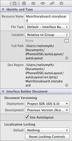
Figure 18-1
Within the File Inspector panel, turn off the Use Autolayout option so that we can demonstrate the effect of not using Auto Layout.
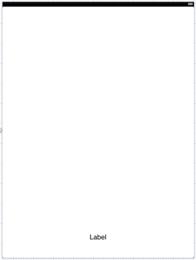
With auto layout turned off, drag a label view from the Object Library and position it towards the bottom of the view in the horizontal center of the view canvas so the vertical blue guideline appears indicating that it is centered before dropping the view into place. In actual fact, the location of the view has just been defined using hard coded absolute x and y coordinates on the screen. As far as the view is concerned, the label is positioned perfectly as long as the device remains in portrait orientation:
Figure 18-2
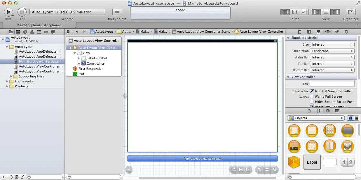
A problem arises, however, when the device rotates to landscape orientation. This can be demonstrated by compiling and running the application on a physical iPhone device or iOS Simulator in the usual way. Alternatively, the effect of an orientation change can be tested within the Interface Builder environment using a feature known as simulated metrics. Within the Document Outline panel (located to the left of the storyboard canvas panel), select the Auto Layout View Controller entry in the Auto Layout View Controller Scene box and, with the entry selected, display the Attributes Inspector in the Utilities panel on the far right. Under the Simulated Metrics heading, locate the Orientation option and change the menu setting from Portrait to Landscape as outlined in Figure 18-3. Similarly, the layout behavior of the user interface on different screens may be tested using the Size setting. For example, the appearance on the 4 inch iPhone 5 screen can be tested by setting the Size menu to Retina 4 Full Screen.
Whilst this is a useful and quick way to check that the layout is working as intended, it is important to note Interface Builder does not output any diagnostic information in the event that constraints are invalid or conflict with each other. If the layout is not behaving as intended in Interface Builder, build and run the application either on a physical device or the simulator and check the console log for warnings about unsatisfiable or conflicting constraints.
Figure 18-3
As illustrated in the above figure, the label is no longer visible. This is because it remains positioned at the same geographical coordinates in relation to the parent view, which in landscape orientation, is outside the visible bounds of the parent view.
In previous versions of iOS, options to address this would have either involved using springs and struts or writing code to detect the rotation of the device and move the label to the new location on the screen. In iOS 6, however, the problem can be solved using auto layout.
Begin by returning the view to portrait orientation in the simulated metrics panel so that the label is once again visible. Display the File Inspector in the Utilities panel and turn on the Use Autolayout option. Pick up the label and move it away from the current location before dragging it back so that Interface Builder knows to implement constraints for the view. By default, Interface Builder will create constraints that it believes provide the desired layout behavior. These can, of course, be viewed and modified, but at this stage the defaults will suffice to demonstrate auto layout in action.
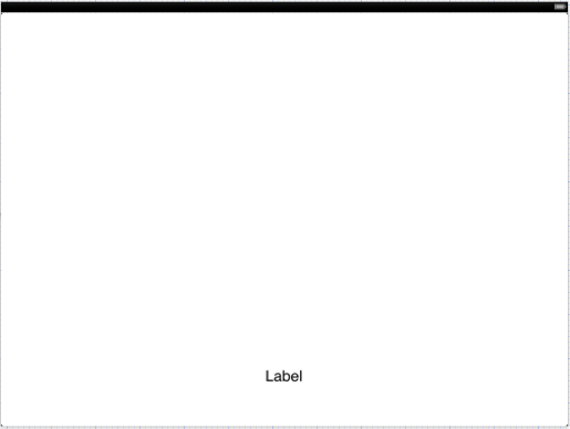
Having switched to auto layout, rotate the orientation once again, noting this time that the label is visible and positioned sensibly:
Figure 18-4
Clearly, Interface Builder has anticipated the layout needs for the user interface. This will not, however, always be the case. In recognition of this fact, Interface Builder provides a wide range of options and visual cues that are designed to ease the task of creating auto layout constraints.
The Auto Layout Features of Interface Builder
A number of features have been added to Interface Builder in order to assist in the implementation of auto layout based constraints. This section will present a guided tour of these features.
Automatic Constraints
As is evident from the previous example, Interface Builder will automatically set constraints on views as they are added to a layout and will continue to add and remove constraints as necessary as changes are made to the layout during the design process. It is important to understand that there is a distinction between constraints added automatically by Interface Builder and those added manually by the developer. In fact, constraints added manually are referred to as user constraints. As will be demonstrated later in this chapter, constraints added by Interface Builder may be removed by first promoting them to be user constraints. User constraints may also be configured for standard spacing as will be demonstrated later in this chapter.
The way that a view is positioned on the layout will also dictate how an Interface Builder constraint is configured. Moving the view to the center of the parent view will cause center guidelines to appear. Dropping the view at that point will result in a center constraint being created. Moving a view close to the edge of the window view will result in a margin guideline appearing as illustrated in Figure 18-10. If placed at that location, Interface Builder will implement a constraint that fixes the corresponding edge of the view from the edge of the display using the Apple recommended standard spacing distance.
Figure 18-5
The same standard setting will also be implemented if one view is moved close to the edge of another view as indicated by the vertical guide that appears on the edge of the view approaching the second view. This guide is visible on the right hand edge of the Save button in Figure 10 6 as it is moved close to the Cancel button:
Figure 18-6
Visual Cues
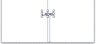
Interface Builder includes a number of visual cues in the layout canvas to highlight the constraints currently configured on a view. When a view is selected within the Interface Builder layout canvas, the constraints that reference that view will be represented visually. Consider, for example, the label view created in our AutoLayout example application. When selected in the canvas, a number of additional lines appear as shown in Figure 18-7:
Figure 18-7
The vertical line that runs through the center of the label indicates the presence of a constraint that positions the label in the horizontal center of the parent view (analogous to the NSLayoutAttributeCenterX attribute). If expressed as an equation, therefore, this would read as:
label.NSLayoutAttributeCenterX = superview.NSLayoutAttributeCenterX
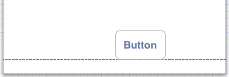
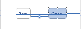
The I-beam line running from the bottom edge of the label view to the bottom edge of the parent view indicates that a vertical space constraint is in place between the two views. The absence of any additional visual information on the line indicates that this is an equality constraint. Figure 18-8 shows an example of a “greater than or equal to” horizontal constraint between two button views:
Figure 18-8
The horizontal line running beneath the Button label text indicates that constraints are in place to horizontally align the content baseline (represented by NSLayoutAttributeBaseline) of the two buttons. It should also be noted that the horizontal space constraint line is drawn thicker and bolder than the horizontal alignment line. The heavier line indicates that this is a user constraint whilst the narrow line indicates a constraint added automatically by Interface Builder.
Width constraints are indicated by an I-beam line running parallel to the edge of the view in the corresponding dimension. The text view object in Figure 18-9, for example, has a “greater than or equal to” width constraint configured:
Figure 18-9
Viewing and Editing Constraints Details
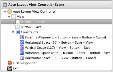
All of the constraints currently set on the views of a user interface may be viewed at any time from within the Document Outline panel that is positioned to the left of the Interface Builder canvas area. Within this outline, a category listed as Constraints will be present which, when unfolded, will list all of the constraints currently configured for the layout. Note that when more than one container view is present in the view hierarchy there will be a separate constraints list for each one. Figure 18-10, for example, lists the constraints for the user interface represented in Figure 18-8 above:
Figure 18-10
As each constraint is selected from the outline list, the corresponding visual cue element will highlight within the layout canvas.
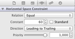
The details of a particular constraint may be viewed and edited at any time using a variety of methods. One method is to select the constraint either from within the layout canvas or in the Document Outline panel. Once selected, display the Size Inspector in the Utilities panel (View -> Utilities -> Attributes Inspector) to view and edit the properties of the constraint. Figure 18-11 illustrates the settings for an equality spacing constraint. The exact settings displayed will depend of the nature of the constraint selected. Note, however, that in this instance it is possible to change the relation, constant, direction and priority of the constraint. To set the constant to a value that reflects the recommended standard spacing, simply select the Standard checkbox:
Figure 18-11
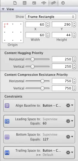
A listing of the constraints that references a specific view can be obtained by selecting that view in the layout canvas and displaying the Size Inspector in the Utilities panel. Figure 18-12, for example, lists the four constraints that reference the currently selected view. Clicking on the settings cog icon on any constraint will provide options to edit or delete the constraint. In the event that the constraint is not a user constraint, the Promote to User Constraint option must first be selected before the Delete option will become accessible. In addition to the constraints, note also that this is where the Content Hugging and Content Compression Resistance Priority values outlined in An Introduction to iPad Auto Layout in iOS 6 are set.
Figure 18-12
Creating New Constraints in Interface Builder
New user constraints can be created in Interface Builder using a variety of approaches, keeping in mind that constraints can relate to more than one view at a time.
One way to add a constraint to a single view (for example a width constraint) is to select the view in the layout canvas and then select the Xcode Edit -> Pin menu. The Pin menu will then provide a list of available constraints that may be applied to the selected view (such as width, height and the connection of all edges to the superview).
The Editor menu may also be used to set constraints that impact more than one view. Select all the required views by holding down the keyboard Shift key whilst clicking on each view and then use the Editor -> Pin menu to once again set constraints. In this case, however, the constraint selections will apply to all selected views. When multiple views are selected, the Editor -> Align menu may also be used to align the selected views using a variety of criteria options (left edges, right edges, baseline etc).
As an alternative to using the Editor menu, it may be quicker to use the mini toolbar bar located in the bottom right hand corner of the Interface Builder main canvas next to the zoom in and out buttons as highlighted in Figure 18-13.
Figure 18-13
Summary
Within this chapter we have looked at a very simplistic example of the benefits of using Auto Layout in iOS 6 user interface design. The remainder of the chapter has been dedicated to providing an overview of the Auto Layout features that have been added to the latest release of Interface Builder.
Learn SwiftUI and take your iOS Development to the Next Level |
| Previous | Table of Contents | Next |
| An Introduction to iPad Auto Layout in iOS 6 | An iPad iOS 6 Auto Layout Example |
