An iPad iOS 6 Auto Layout Example
| Previous | Table of Contents | Next |
| Working with iPad iOS 6 Auto Layout Constraints in Interface Builder | Implementing iPad iOS 6 Auto Layout Constraints in Code |
Learn SwiftUI and take your iOS Development to the Next Level |
Having covered the basics of auto layout and the auto layout features of Interface Builder in the preceding chapters, this chapter will work through an example user interface design intended to demonstrate the use of Interface Builder to create auto layout constraints. This example will also include a demonstration of constraint priorities.
Preparing the Project
Using the Single View Application template, create a new Xcode iPad application project using AutoLayoutExample as both the project name and class prefix with both the Automatic Reference Counting and Storyboard options enabled.
Designing the User Interface
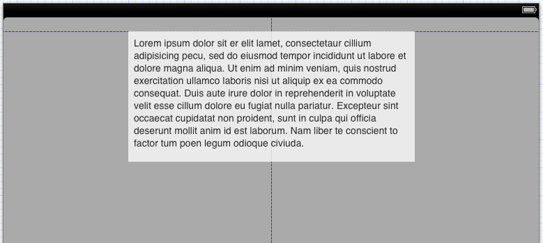
Initially, the user interface will simply require a Label, a Text View and a second View. Begin, however, by selecting the MainStoryboard.storyboard file and selecting the background view canvas. Display the Attribute Inspector in the Utilities panel and change the color to light gray. Drag a Text View from the Object Library and position and resize it so that it is centered horizontally and on the top margin guideline as indicated in Figure 19-1.
Drag a Label view and position it to the left of the Text View, moving it close enough that an automatic constraint is set to the standard spacing distance as outlined in Working with iOS 6 Auto Layout Constraints in Interface Builder.
Figure 19-1
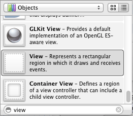
Finally locate the View object in the Object Library. As a shortcut, simply type the word “view” into the search bar located immediately beneath the Object Library panel (Figure 19-2) to narrow the search down and then scroll to find the View object.
Figure 19-2
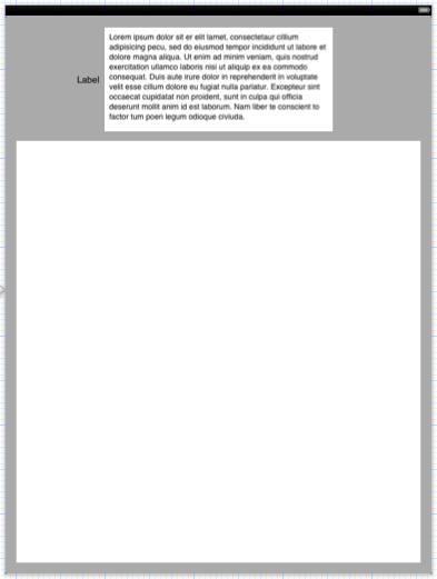
Drag and drop the view onto the layout and resize it to fill the space below the Text View with appropriate margins from the outer edges of the screen:
Figure 19-3
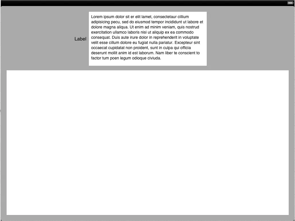
Verify that Interface Builder has automatically set up sensible constraints by rotating the display into landscape mode. To achieve this, select the Auto Layout Example View Controller item from the Document Outline panel located to the left of the Interface Builder canvas. Display the Attribute Inspector in the Utilities panel and change the Orientation value under Simulated Metrics to Landscape. The view should appear correctly in the new orientation as outlined in Figure 19-4.
Figure 19-4
Adjusting Constraint Priorities
Up until this point, the layout is behaving correctly using the Interface Builder default constraints. We are now, however, going to introduce some problems that cannot be handled adequately by the constraints as they currently stand. With the view still in landscape mode, double click on the label and change the text so that it reads Detailed Product Description:.
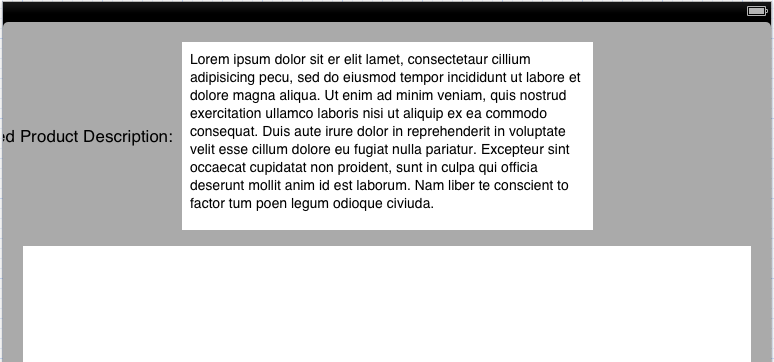
With the view in landscape mode the label appears correctly positioned. Rotate the view to portrait orientation, however, and the label is clearly being clipped by the left hand edge of the parent view:
Figure 19-5
Clearly there is some work to be done to make the user interface appear correctly in both orientations. The first step is to consider the constraints that are currently set on the label and text views. The text view has a constraint that forces it to be centered horizontally in the parent view. The label, on the other hand, has a constraint that connects its trailing edge to the leading edge of the text view using the standard default spacing. The absence of a constraint on the left hand edge of the label is resulting in the label being pushed off the screen in portrait mode.
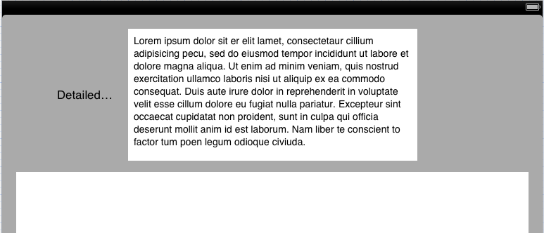
One possible solution to this problem is to create a new constraint on the label that puts some space between the left hand edge of the label and the left hand edge of the parent view. To add this constraint, rotate the view back to landscape so that the label is fully visible, select the label followed by the Editor -> Pin -> Leading Space to Superview menu option. Now rotate to Portrait mode and note that the label is, unfortunately, now compressed.
Figure 19-6
The reason for this problem is that the Text View contains a constraint which forces it to be centered horizontally within the super view with a priority of 1000. Similarly, the label has constraints that dictate that the leading and trailing edges of the label must be the standard width from the superview and text view respectively. Since these also have a priority of 1000, the system has no choice but to compress the label in order to satisfy the constraints. In order for the label to be fully visible, one of these priorities needs to be reduced.
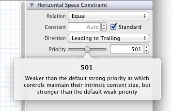
We already know from experience that without the constraint on the leading edge of the label, the left hand edge will be clipped by the superview window when the device is in portrait orientation. Another option is to lower the priority on the space constraint between the label and text view. With this in mind, select the constraint and in the Attribute Inspector slowly move the Priority slider to the left. Note that as the slider moves, a panel appears (Figure 19 7) that describes the implication of the currently selected priority value. When seeking specific layout behavior it is important to make sure that the correct priority is selected.
Figure 19-7
Using the slider, select a priority value close to 500. Check the objects in the view in portrait orientation and note that they are now overlapping. Clearly the space between the labels needs to be a required constraint to prevent overlap. Select the constraint once again, therefore, and return the priority value to 1000.
The only remaining constraint to experiment with is the horizontal center constraint on the Text View. Select the Text View object and display the Size Inspector in the Utilities panel. Under the Constraints section, select the option to Select and Edit the Align Center X to: superview constraint (depending on how the layout was created, this may read Align Center X to: view) and, in the resulting attribute inspector, reduce the priority to 500.
As a result of this setting, the Text View will only be centered when another constraint with a higher priority does not require that the label be moved. As such, the Text View will be centered when the device is in landscape mode but will be pushed off center when the space is needed by the label in portrait orientation.
Figure 19-8
Alignment and Width Equality
The last change that will be made to the layout in this chapter involves the use of constraints to implement alignment and width equality.
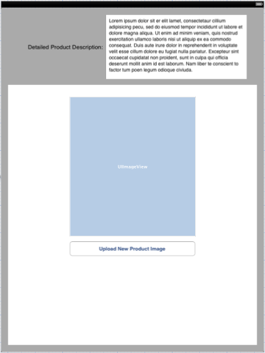
Modify the user interface by dragging an Image View and a Button onto the layout and resize, configure and move the objects so that the layout resembles that of Figure 19-9.
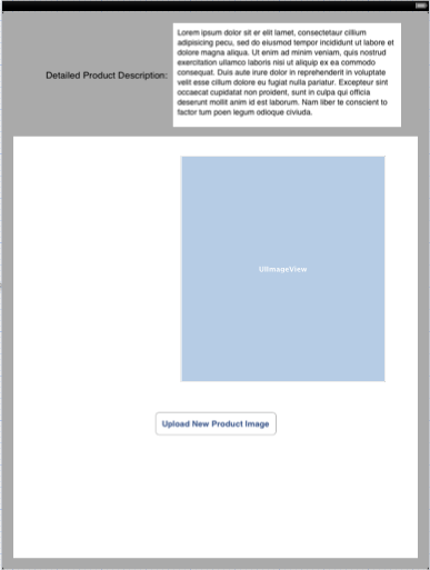
Figure 19-9
The first step is to use constraints to make the button and image view the same width. Hold down the Shift key on the keyboard and click on the button and image view to select both items. Using either the Editor -> Pin menu or the toolbar in the bottom right of the Interface Builder canvas, select the option to configure Widths Equally.
Next, select both views once again and use the Editor -> Align menu option (or the corresponding menu in the canvas menu) to add a constraint to align the Horizontal Centers of the two views. With both views selected, add a vertical space between the bottom of the image view and the top of the button configured to use standard spacing, then drag both selected items to the horizontal center of the superview. Once the changes are complete, the user interface should appear as illustrated in Figure 19 10:
Figure 19-10
Testing the Application
Throughout this tutorial, the behavior of the user interface layout in response to orientation changes has been performed using simulated metrics within Interface Builder. As a full test of the layout, build and run the application either on a physical iPad device or the iOS Simulator and check that the layout handles device rotation. This involves both a visual check that the views appear as intended and a review of the console to ensure no errors are reported with relation to the auto layout constraints.
Summary
Within this chapter, a sequence of steps have been outlined demonstrating the creation of an application that uses auto layout constraints to design a user interface that responds sensibly to orientation changes of the device. The example introduced practical examples of the importance of constraint priorities and the application of constraints to implement width matching and view alignment.
Now that the implementation of auto layout constraints in Interface Builder has been covered, the next chapter will begin to explore the creation of constraints in code.
Learn SwiftUI and take your iOS Development to the Next Level |
| Previous | Table of Contents | Next |
| Working with iPad iOS 6 Auto Layout Constraints in Interface Builder | Implementing iPad iOS 6 Auto Layout Constraints in Code |
