IOS 4 iPhone Rotation, View Resizing and Layout Handling
| Previous | Table of Contents | Next |
| Understanding iPhone iOS 4 Views, Windows and the View Hierarchy | Creating an iOS 4 iPhone Multiview Application using the Tab Bar |
Learn SwiftUI and take your iOS Development to the Next Level |
If you have ever developed an application using a user interface toolkit for a windowing based desktop system (be it Windows, Mac OS X, Linux, Qt or GTK+) you will likely be familiar with the need to design your user interfaces such that they resize appropriately when the user enlarges or reduces the size of a window. This generally involves deciding which visual components of a window move and which ones resize to accommodate the containing window.
Obviously iOS based devices such as the iPhone do not have windows that the user can resize in the conventional sense that we are used to in the world of desktop applications. The device is, however, sensitive to physical rotation, providing the options for a running application to be displayed in either portrait or landscape mode. Given this capability, it is essential that an iOS application user interface layout adapt accordingly should you decide to support different device orientations within your application.
In this chapter we will look at the mechanism for enabling rotation and modifying the layout of user interfaces within an application. In the course of this chapter we will be talking about concepts such as the view, superviews, subviews and view hierarchies. If these concepts are unfamiliar to you we recommend first reading the chapter entitled Understanding iOS 4 iPhone Views, Windows and the View Hierarchy before proceeding.
Setting up the Example
In the remainder of this chapter we will work through a self contained example. To set up this example, start Xcode and create a new iOS View-based iPhone project named layout.
From within Xcode, double click on the layoutViewController.xib file to launch Interface Builder and create a simple interface consisting of a single button object before saving the design and exiting from the tool.
Enabling Rotation
The iOS app templates provided by Xcode do not automatically assume that your application will sensibly support rotation. In fact, the opposite is assumed. In order to enable rotation, therefore, it is necessary to make a minor modification to the template code. Nor is it a given that every app should support rotation. If there is nothing to be gained in terms of the user experience by supporting both landscape and portrait layouts of your iPhone application’s user interface do not feel compelled to implement this capability.
For iPhone models with retina displays (starting with the iPhone 4) the overall window size is 960 pixels high by 640 pixels wide in portrait mode and 640 pixels high and 960 pixels wide in landscape. For older iPhone models the resolutions are 480 pixels high and 320 pixels wide for portrait and 320 pixels high by 480 pixels wide for landscape. Keep in mind that if the application displays the standard status bar the actual display space available will reduced accordingly.
When the device detects that it has been rotated to a new orientation a call is made to the shouldAutorotateToInterfaceOrientation method of the view controller instance. In order to implement rotation support it is necessary to override this method in the currently active view controller for your application (in the case of our example this is the layoutViewController class).
Fortunately, Xcode has placed a template method in our layoutViewController.m file which is currently commented out:
/*
// Override to allow orientations other than the default portrait orientation.
- (BOOL)shouldAutorotateToInterfaceOrientation:(UIInterfaceOrientation)interfaceOrientation {
    // Return YES for supported orientations
    return (interfaceOrientation == UIInterfaceOrientationPortrait);
}
*/
In order to use this method, begin by removing the comment open (/*) and close (*/) markers located the top and bottom of the method. The method takes as a single argument the new orientation value and returns either true or false depending on whether the application will allow the new orientation change to take place. In the template example above, the method only returns true if the orientation passed to the method is portrait (in other word it matches the value represented by UIInterfaceOrientationPortrait). The full range of supported orientations that can be passed through to this method are as follows:
- UIInterfaceOrientationPortrait
- UIInterfaceOrientationPortraitUpsideDown
- UIInterfaceOrientationLandscapeRight
- UIInterfaceOrientationLandscapeLeft
In order to support all orientations, and for the purposes of this example, simply modify the code in this method to return YES:
// Override to allow orientations other than the default portrait orientation.
- (BOOL)shouldAutorotateToInterfaceOrientation:(UIInterfaceOrientation)interfaceOrientation {
    // Return YES for supported orientations
    //return (interfaceOrientation == UIInterfaceOrientationPortrait);
        return YES;
}
Feel free to modify this method to meet your requirements in terms of the orientations you would like your own applications to support. Having made the change, build and run the application.
Testing Rotation Behavior
If you are testing your iOS applications natively on a physical iPhone to iPod Touch device, you can simply rotate the device to test the behavior of your application. If, on the other hand, you are running the application in the iOS Simulator, you can simulate rotation by selecting the Hardware -> Rotate Left and Hardware -> Rotate Right menu options.
Configuring View Autosizing
In order to make the handling of orientation changes a little easier to implement, the UIView class from which visual components are derived provides a feature called Autosizing. Autosizing allows us to define on a view by view basis how a subview will be resized and positioned relative to the superview in which it is contained. These settings can be defined programmatically in code or from within the Size Inspector of the Interface Builder tool during the user interface design process.
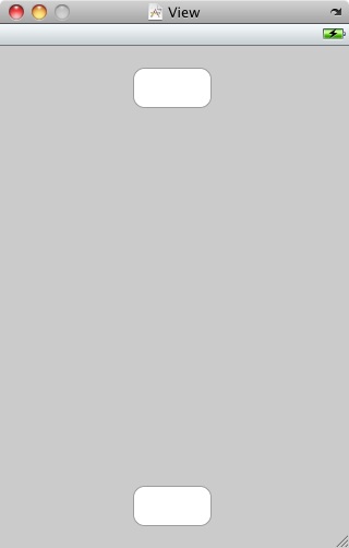
In order to demonstrate autosizing, double click on the layoutViewController.xib file to load it into Interface Builder, add an additional button to the interface and reposition both buttons so that they appear as outlined in the following figure:
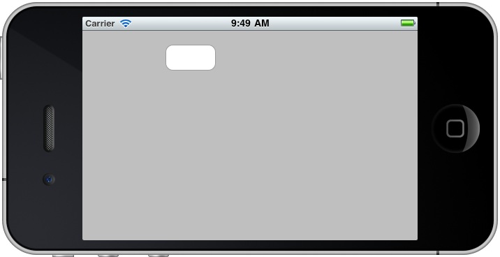
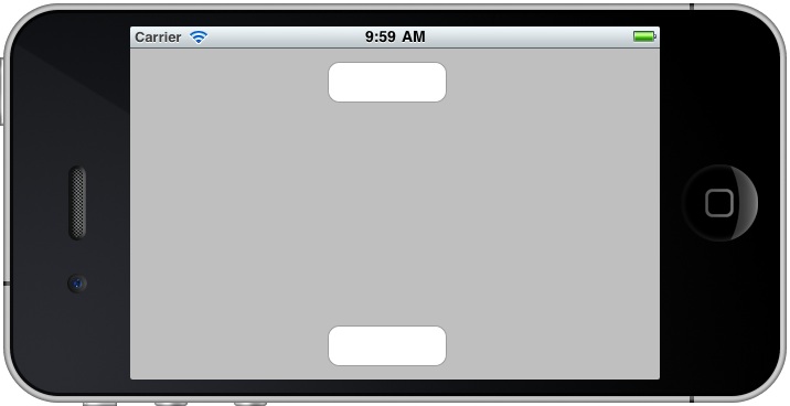
In order to gain an appreciation of the importance of handling orientation changes, save the design and build and run the application. Once the simulator appears, rotate the device by 90⁰. Because we have enabled rotation, the view will rotate to the landscape orientation:
Here we see a classic example of the implications of enabling rotation in an application without taking the additional steps to reformat the view to match the change in orientation. Having rotated the device, only the top button is visible and it is still centered assuming that the device is in portrait mode. The second button is similarly positioned, resulting in it being outside the viewable area of the screen.
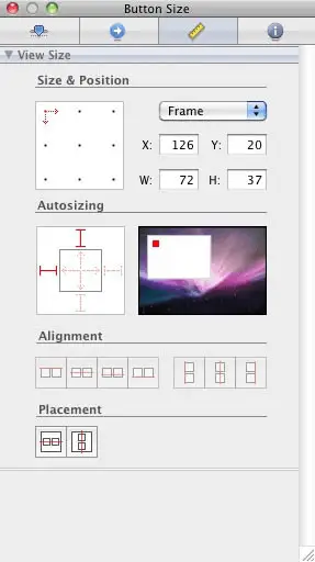
In order to ensure the correct layout of the user interface it is necessary to make some changes to the autosize settings of the two buttons. The current settings for a view are accessed from within Interface Builder by selecting the component and displaying the Size Inspector (Tools -> Size Inspector or Command+3). The following figure shows the Size Inspector for the top button in our user interface:
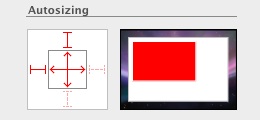
The section of this window that is of interest to us is the area entitled Autosizing and in particular the white box on the left. The outer box represents the superview and the inner box represents the subview that is contained within the superview. Any autosizing settings that are configured on a subview are relative to the superview. Within the subview box are two intersecting lines with arrows at each end. These vertical and horizontal lines indicate whether the height and width of the selected view object should increase or decrease in proportion to size changes in the corresponding superview. A faint dotted line indicates that the currently selected view object is not to resize in relation to the superview. A solid red line, on the other hand, indicates that it should resize proportionally to the parent view. The graphic to the right of the white box provides a visual representation of how the view will behave based on the current settings. The red box represents the subview and the white box represents the containing superview. Click on the horizontal line to change it to solid red and see how the width of the red box representing the button grows and shrinks as the containing superview size changes. Similarly, enable resizing for the height of the button and observe how the height of the button also now changes proportionally to the superview:
These two settings correspond to the UIViewAutoResizingFlexibleHeight and UIViewAutoResizingFlexibleWidth autoresizing mask properties.
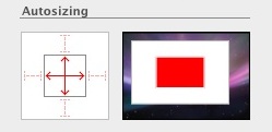
The lines separating the four sides of the inner subview and the outer superview boxes are referred to as struts and control what happens to the margin between each side of the subview and the corresponding sides of the superview when the latter resizes as the result of an orientation change. When a strut is enabled (indicated by the solid red lines) the corresponding margin remains fixed when the superview resizes. In the above example the top and left hand margins are fixed which explains why the position of the top left hand corner of the button does not move in the graphical representation when the superview resizes. When the strut is turned off (symbolized by the faint dotted lines) the margin changes proportionally to the change in size of the superview. Doing so with our example button will cause the subview to remain centered in the superview as illustrated in the following figure:
These struts correspond to the following autoresizing mask values:
- UIViewAutoResizingFlexibleLeftMargin
- UIViewAutoResizingFlexibleRightMargin
- UIViewAutoResizingFlexibleTopMargin
- UIViewAutoResizingFlexibleBottomMargin
When multiple autosize attributes are set on a single axis (for example flexible left and right margins combined with flexible width) the resizing is distributed evenly over each dimension.
In order to modify the resize behavior of the buttons in our example application we want to make sure that both buttons remain centered relative to the width of the superview, so we need to turn off all struts on both buttons. This will also have the effect of making the position of the bottom button relative to the bottom of the superview flexible so that it will be visible after a switch to landscape mode. Finally we want the width of the buttons to change in proportion to the width of the superview so need to turn on horizontal resizing for both buttons and vertical resizing off. With these changes made, compiling and running the application should result in the correct layout appearing when the device is rotated:
Coding Layout and Size Changes
Whilst the autosizing features will work for many situations there are some limitations. It is quite possible for example that you will want to change the entire layout of your user interface depending on whether the device is in portrait or landscape orientation. This might involve not only changing the size of view elements but also moving them to specific locations on the screen. Clearly this is beyond the capabilities of autosizing. A useful approach to this situation involves intercepting the rotation of the device and changing the position and dimensions of the user interface components before the screen is redrawn. In order to achieve this we will need to override the willAnimateRotationToInterfaceOrientation method of the UIViewController class. This is the method that gets called just before the user interface begins to rotate.
In order to demonstrate this technique in action we will use our existing layout project. Within Xcode, select the layoutViewController.h file and add the following outlets so that we can access our two buttons from the controller code:
#import <UIKit/UIKit.h>

@interface layoutViewController : UIViewController {
        UIButton *firstButton;
        UIButton *secondButton;
}
@property (nonatomic, retain) IBOutlet UIButton *firstButton;
@property (nonatomic, retain) IBOutlet UIButton *secondButton;
@end
Next, the layoutViewContoller.m implementation file needs to be edited to synthesize accesss to the outlets and to override the willAnimateRotationToInterfaceOrientation method:
#import "layoutViewController.h"

@implementation layoutViewController
@synthesize firstButton;
@synthesize secondButton;

- (void)willAnimateRotationToInterfaceOrientation:(UIInterfaceOrientation)toInterfaceOrientation duration:(NSTimeInterval)duration
{
        if (toInterfaceOrientation == UIInterfaceOrientationLandscapeLeft ||
                toInterfaceOrientation == UIInterfaceOrientationLandscapeRight)
        {
                firstButton.frame = CGRectMake(20, 20, 210, 260);
                secondButton.frame = CGRectMake(250, 20, 210, 260);
        }
        else
        {
                firstButton.frame = CGRectMake(20, 20, 280, 205);
                secondButton.frame = CGRectMake(20, 233, 280, 207);
        }
}
.
.
- (void)viewDidUnload {
        // Release any retained subviews of the main view.
        // e.g. self.myOutlet = nil;
        self.firstButton = nil;
        self.secondButton = nil;
}
- (void)dealloc {
        [firstButton release];
        [secondButton release];
        [super dealloc];
}
@end
As mentioned previously, the willAnimateRotationToInterfaceOrientation method gets called just before the user interface rotation takes place. Passed through as an argument to this method is the new orientation of the device in the form of the toInterfaceOrientation variable. Within the body of the method we identify if the device has rotated to a landscape or portrait orientation. Using the CGRectMake method (which takes x, y, width and height as arguments) we create a CGRect structure containing the new co-ordinates and dimensions for each button and assign them to the frame property of the button instances. When the method returns, the system will then proceed to draw the buttons using the new frame information that was configured in the overridden method.
With the appropriate code changes made, return to the Interface Builder session for the layoutViewController.xib file and modify the user interface such that appears as follows:
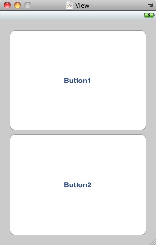
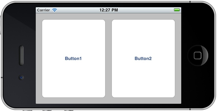
The size and co-ordinates that we specified in our method are designed to position the buttons side by side when the device rotates into a landscape orientation and then back to the above layout when it returns to portrait. Before we try this out, however, we need to set up the connections from the buttons to the two outlets we created in the view controller. To achieve this, hold down the control key and click and drag from the File’s Owner icon to the top button. Release at this point and select firstButton from the resulting menu. Repeat this for the other button, selecting secondButton from the menu. Save the file and return to Xcode where you can build and run the application. Once the application is running, rotate the simulator window by selecting the Hardware -> Rotate Left menu option. The device window should rotate and the buttons appear side by side:
Rotating the device back to portrait orientation should trigger the second part of the if .. else .. construct in the overridden method, thereby returning the buttons to the original layout.
Learn SwiftUI and take your iOS Development to the Next Level |
| Previous | Table of Contents | Next |
| Understanding iPhone iOS 4 Views, Windows and the View Hierarchy | Creating an iOS 4 iPhone Multiview Application using the Tab Bar |


