An Android Layout Editor Sample Data Tutorial
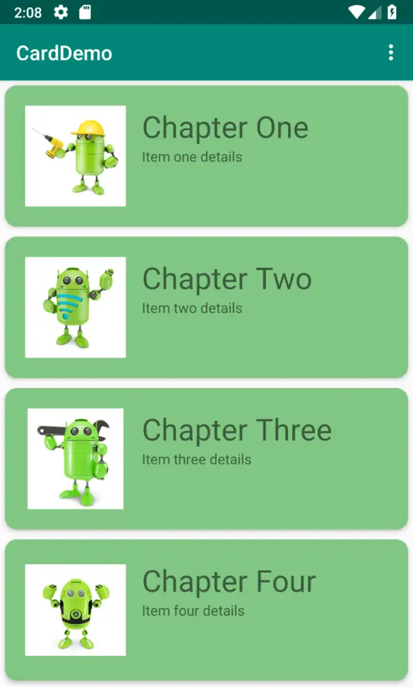
The CardDemo project created in the previous chapter has provided a good example of how it can be difficult to assess from within the layout editor exactly how a user interface is going to appear until the completed app is tested. This is a problem that frequently occurs when the content to be displayed in a user interface is only generated or acquired once the user has the app installed and running.
For some time now, the Android Studio layout editor has provided the ability to specify simple attributes that are active only when the layout is being designed. A design-time only string resource could, for example, be assigned to a TextView within the layout editor that would not appear when the app runs. This capability has been extended significantly with the introduction of sample data support within the Android Studio layout editor and will be used in this chapter to improve the layout editor experience in the CardDemo project.
Adding Sample Data to a Project
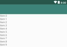
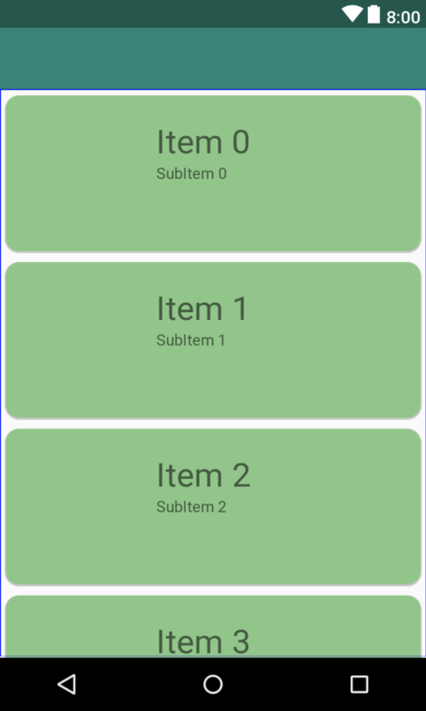
During the design phase of the user interface layout, the RecyclerView instance (Figure 48-1) bears little resemblance to the running app tested at the end of the previous chapter:
In the “Modern Android App Architecture with Jetpack” chapter earlier in the book the concept of sample data was introduced. To demonstrate sample data in use, the project will now be modified so that the fully populated cards appear within the RecyclerView from within the layout editor. Before doing that, however, it is worth noting that the layout editor has a collection of preconfigured sample data templates that can be used when designing user interfaces. To see some of these in action, load the content_card_demo.xml layout file into the layout editor and select the RecyclerView instance. With the view selected, hover the mouse pointer over the view until the buttons shown in Figure 48-2 appear:
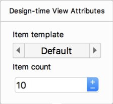
Click on the button showing the wrench icon to display the Design-time View Attributes panel:
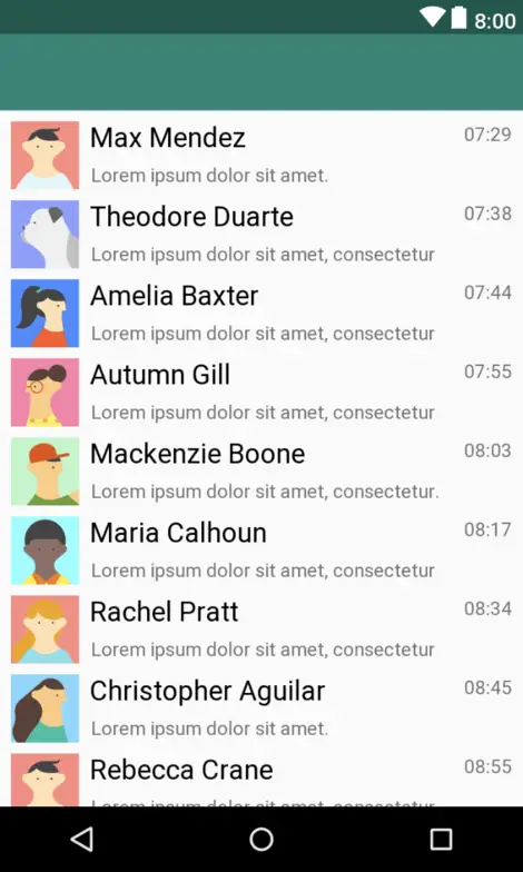
Change the template option to the Email Client option and note that the RecyclerView changes to display data from the template:
These templates can be useful for displaying sample data without any additional work and will often provide enough to complete the layout design. For this example, however, sample data is going to be used to display the cards within the RecyclerView as they are intended to appear in the running app. With the content_card_demo.xml file still loaded in the layout editor, switch to Text mode and locate the RecyclerView element which should read as follows:
<android.support.v7.widget.RecyclerView
    android:id="@+id/recycler_view"
    android:layout_width="0dp"
    android:layout_height="0dp"
    app:layout_behavior="@string/appbar_scrolling_view_behavior"

    app:layout_constraintBottom_toBottomOf="parent"
    app:layout_constraintEnd_toEndOf="parent"
    app:layout_constraintStart_toStartOf="parent"
    app:layout_constraintTop_toTopOf="parent"
    tools:itemCount="10"
    tools:listitem="@layout/recycler_view_item" />
Note the two special tools properties currently configured to display 10 items in the list, each using a layout contained within a file named recycler_view_item.xml. The layout editor provides a range of tools options that may be configured within a layout file. Though coverage of all of these settings is beyond the scope of this book, a full description of each can be found at the following URL:
https://developer.android.com/studio/write/tool-attributes#toolssample_resources
The recycler_view_item.xml file referenced above was generated automatically by the layout editor when the sample data template was selected and can be found in the project tool window.
Switch back to Design mode and, with the RecyclerView selected, use the Design-time View Attributes panel to switch the template back to the default setting. The recycler_view_item.xml file will be removed from the project along with the two tools property lines within the content_card_demo.xml XML file.
To switch to using the card layout for the sample data display, add a listitem property to reference the card_layout.xml file:
tools:listItem="@layout/card_layout" />
Switch back to Design mode and note the card layout is now appearing for each list item, though without any images and using sample text data:
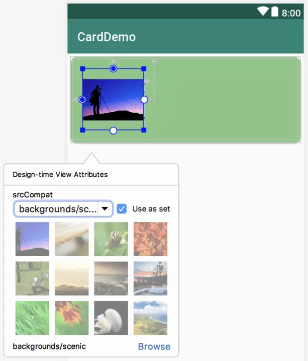
The next step is to display some images and different text on the views within the card layout. This can either take the form of template sample data provided by the layout editor, or custom sample data added specifically for this project. Load the card_layout.xml file into the layout editor, select the ImageView, hover the mouse pointer and display the Design-time View Attributes panel as outlined earlier in the chapter. From the srcCompat menu, select the built-in backgrounds/scenic image set as illustrated in Figure 48-6 below:
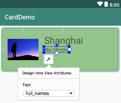
Next, select the item_title TextView object, display the Design-time attributes panel and select the cities text option. Repeat this step for the item_detail view, this time selecting the full_names option as shown in Figure 48-7:
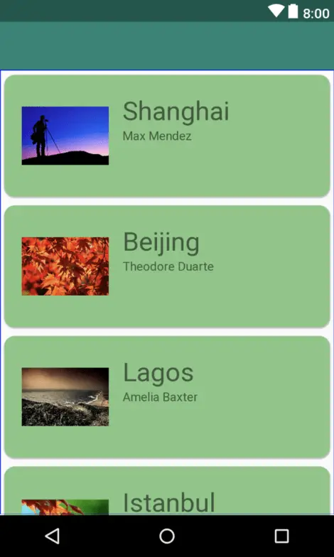
Open the content_card_demo.xml file in Design mode and note that the RecyclerView is now using the built-in images and sample text data:
Using Custom Sample Data
The final step in this chapter is to demonstrate the use of custom sample data and images within the layout editor. This requires the creation of a sample data directory and the addition of some text and image files. Within the Project tool window, right-click on the app entry and select the New -> Sample Data Directory menu option, at which point a new directory named sampledata will appear within the Project tool window.
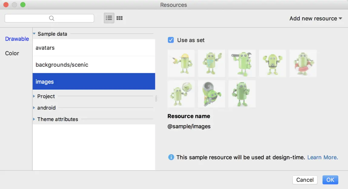
Right-click on the sampledata directory, create a subdirectory named images and copy and paste the Android images into the new folder using the same steps outlined earlier in the chapter. Display the Design-time View Attributes panel for the ImageView once again, this time clicking the Browse link and selecting the newly added Android images in the Resources dialog (if the images folder does not appear try rebuilding the project):
Right-click once again on the sampledata directory, select the New File option, name the file chapters and set the type to Text. After the file has been created, enter the following content:
Chapter One
Chapter Two
Chapter Three
Chapter Four
Chapter Five
Chapter Six
Chapter Seven
Chapter Eight
Next, create a second text file named items with the following content:
Item one details
Item two details
Item three details
Item four details
Item five details
Item six details
Item seven details
Item eight details
With the sample data text files created, all that remains is to reference them in the view elements of the card_layout.xml file as follows:
<TextView
    android:layout_width="wrap_content"
    android:layout_height="wrap_content"
    android:id="@+id/item_title"
    android:layout_toEndOf="@+id/item_image"
    android:layout_toRightOf="@+id/item_image"
    android:layout_alignParentTop="true"
    android:textSize="30sp"
    tools:text="@sample/chapters" />

<TextView
    android:layout_width="wrap_content"
    android:layout_height="wrap_content"
    android:id="@+id/item_detail"
    android:layout_toEndOf="@+id/item_image"
    android:layout_toRightOf="@+id/item_image"
    android:layout_below="@+id/item_title"
    tools:text="@sample/items" />
Return to the layout design in the content_card_layout.xml file where the custom sample data and images should now be displayed within the RecyclerView list:
Instead of having two separate text files and a reference to the image set, another option is to declare the sample data within a JSON file. For example:
{
  "mydata": [
    {
      "chapter" : "Chapter One",
      "details": "Item one details",
      "image": "@sample/images"
    },
    {
      "chapter" : "Chapter Two",
      "details": "Item two details",
      "image": "@sample/images"
    },
.
.
}
Assuming the above was contained within a file named chapterdata.json, the sample data would then be referenced within the view XML elements as follows:
.
.
<ImageView
.
.
    tools:src="@sample/chapterdata.json/mydata/image" />
<TextView
.
.
    tools:text="@sample/chapterdata.json/mydata/chapter" />

<TextView
.
.
    tools:text="@sample/chapterdata.json/mydata/details" />
.
.
Summary
This chapter has demonstrated the use of sample data within the layout editor to provide a more realistic representation of how the user interface will appear at runtime. The steps covered in this tutorial included the use of both pre-existing sample data templates and the integration of custom sample data.
