Creating a Tabbed Interface using the Android TabLayout Component
| Previous | Table of Contents | Next |
| Working with the Floating Action Button and Snackbar | Working with the RecyclerView and CardView Widgets |
The previous chapter outlined the concept of material design in Android and introduced two of the components provided by the design support library in the form of the floating action button and the Snackbar. This chapter will demonstrate how to use another of the design library components, the TabLayout, which can be combined with the ViewPager class to create a tab based interface within an Android activity.
An Introduction to the ViewPager
Although not part of the design support library, the ViewPager is a useful companion class when used in conjunction with the TabLayout component to implement a tabbed user interface. The primary role of the ViewPager is to allow the user to flip through different pages of information where each page is most typically represented by a layout fragment. The fragments that are associated with the ViewPager are managed by an instance of the FragmentPagerAdapter class.
At a minimum the pager adapter assigned to a ViewPager must implement two methods. The first, named getCount(), must return the total number of page fragments available to be displayed to the user. The second method, getItem(), is passed a page number and must return the corresponding fragment object ready to be presented to the user.
An Overview of the TabLayout Component
As previously discussed, TabLayout is one of the components introduced as part of material design and is included in the design support library. The purpose of the TabLayout is to present the user with a row of tabs which can be selected to display different pages to the user. The tabs can be fixed or scrollable, whereby the user can swipe left or right to view more tabs than will currently fit on the display. The information displayed on a tab can be text-based, an image or a combination of text and images. Figure 45-1, for example, shows the tab bar for the Android phone app consisting of three tabs displaying images:
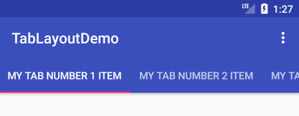
Figure 45-2, on the other hand, shows a TabLayout configuration consisting of four tabs displaying text in a scrollable configuration:
The remainder of this chapter will work through the creation of an example project that demonstrates the use of the TabLayout component together with a ViewPager and four fragments.
Creating the TabLayoutDemo Project
Create a new project in Android Studio, entering TabLayoutDemo into the Application name field and ebookfrenzy.com as the Company Domain setting before clicking on the Next button.
On the form factors screen, enable the Phone and Tablet option and set the minimum SDK setting to API 26: Android 8.0 (Oreo).
Continue through the configuration screens requesting the creation of a Basic Activity named TabLayoutDemoActivity with a corresponding layout file named activity_tab_layout_demo. Click on the Finish button to initiate the project creation process.
Once the project has been created, load the content_tab_layout_demo.xml file into the Layout Editor tool, select the “Hello World” TextView object, and then delete it.
Creating the First Fragment
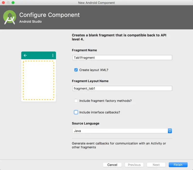
Each of the tabs on the TabLayout will display a different fragment when selected. Create the first of these fragments by right-clicking on the app -> java -> com.ebookfrenzy.tablayoutdemo entry in the Project tool window and selecting the New -> Fragment -> Fragment (Blank) option. In the resulting dialog, enter Tab1Fragment into the Fragment Name: field and fragment_tab1 into the Fragment Layout Name: field. Enable the Create layout XML? and Include interface callbacks? options while disabling the Include fragment factory methods? option. Click on the Finish button to create the new fragment:
Load the newly created fragment_tab1.xml file (located under app -> res -> layout) into the Layout Editor tool, right-click on the FrameLayout entry in the Component Tree panel and select the Convert FrameLayout to ConstraintLayout menu option. In the resulting dialog, verify that all conversion options are selected before clicking on OK.
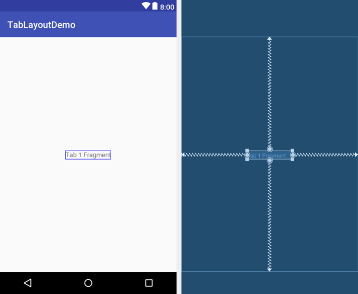
Once the layout has been converted to a ConstraintLayout, delete the TextView from the layout. From the Palette, locate the TextView widget and drag and drop it so that it is positioned in the center of the layout. Edit the text property on the object so that it reads “Tab 1 Fragment” and extract the string to a resource named tab_1_fragment, at which point the layout should match that of Figure 45-4:
Duplicating the Fragments
So far, the project contains one of the four required fragments. Instead of creating the remaining three fragments using the previous steps it would be quicker to duplicate the first fragment. Each fragment consists of a layout XML file and a Java class file, each of which needs to be duplicated.
Right-click on the fragment_tab1.xml file in the Project tool window and select the Copy option from the resulting menu. Right-click on the layout entry, this time selecting the Paste option. In the resulting dialog, name the new layout file fragment_tab2.xml before clicking the OK button. Edit the new fragment_tab2.xml file and change the text on the Text View to “Tab 2 Fragment”, following the usual steps to extract the string to a resource named tab_2_fragment.
To duplicate the Tab1Fragment class file, right-click on the class listed under app -> java -> com.ebookfrenzy.tablayoutdemo and select Copy. Right-click on the com.ebookfrenzy.tablayoutdemo entry and select Paste. In the Copy Class dialog, enter Tab2Fragment into the New name: field and click on OK. Edit the new Tab2Fragment.java file and change the class name and onCreateView() method to inflate the fragment_tab2 layout file:
@Override
public View onCreateView(LayoutInflater inflater, ViewGroup container,
                         Bundle savedInstanceState) {
    // Inflate the layout for this fragment
    return inflater.inflate(R.layout.fragment_tab2, container, false);
}
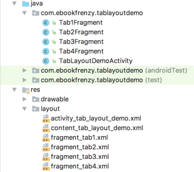
Perform the above duplication steps twice more to create the fragment layout and class files for the remaining two fragments. On completion of these steps the project structure should match that of Figure 45-5:
Adding the TabLayout and ViewPager
With the fragment creation process now complete, the next step is to add the TabLayout and ViewPager to the main activity layout file. Edit the activity_tab_layout_demo.xml file and add these elements as outlined in the following XML listing. Note that the TabLayout component is embedded into the AppBarLayout element while the ViewPager is placed after the AppBarLayout:
<?xml version="1.0" encoding="utf-8"?>
<android.support.design.widget.CoordinatorLayout
    xmlns:android="http://schemas.android.com/apk/res/android"
    xmlns:app="http://schemas.android.com/apk/res-auto"
    xmlns:tools="http://schemas.android.com/tools"
    android:layout_width="match_parent"
    android:layout_height="match_parent"
    android:fitsSystemWindows="true"
    tools:context=".TabLayoutDemoActivity">

    <android.support.design.widget.AppBarLayout
        android:layout_width="match_parent"
        android:layout_height="wrap_content"
        android:theme="@style/AppTheme.AppBarOverlay">

        <android.support.v7.widget.Toolbar
            android:id="@+id/toolbar"
            android:layout_width="match_parent"
            android:layout_height="?attr/actionBarSize"
            android:background="?attr/colorPrimary"
            app:popupTheme="@style/AppTheme.PopupOverlay" />

        <android.support.design.widget.TabLayout
            android:id="@+id/tab_layout"
            android:layout_width="match_parent"
            android:layout_height="wrap_content"
            app:tabMode="fixed"
            app:tabGravity="fill"/>

    </android.support.design.widget.AppBarLayout>

    <android.support.v4.view.ViewPager
        android:id="@+id/pager"
        android:layout_width="match_parent"
        android:layout_height="match_parent"
        app:layout_behavior="@string/appbar_scrolling_view_behavior" />

    <include layout="@layout/content_tab_layout_demo" />

    <android.support.design.widget.FloatingActionButton
        android:id="@+id/fab"
        android:layout_width="wrap_content"
        android:layout_height="wrap_content"
        android:layout_gravity="bottom|end"
        android:layout_margin="@dimen/fab_margin"
        android:src="@android:drawable/ic_dialog_email" />

</android.support.design.widget.CoordinatorLayout>
Creating the Pager Adapter
This example will use the ViewPager approach to handling the fragments assigned to the TabLayout tabs. With the ViewPager added to the layout resource file, a new class which subclasses FragmentPagerAdapter needs to be added to the project to manage the fragments that will be displayed when the tab items are selected by the user.
Add a new class to the project by right-clicking on the com.ebookfrenzy.tablayoutdemo entry in the Project tool window and selecting the New -> Java Class menu option. In the new class dialog, enter TabPagerAdapter into the Name: field and click OK.
Edit the TabPagerAdapter.java file so that it reads as follows:
package com.ebookfrenzy.tablayoutdemo;

import android.support.v4.app.Fragment;
import android.support.v4.app.FragmentManager;
import android.support.v4.app.FragmentPagerAdapter;

public class TabPagerAdapter extends FragmentPagerAdapter {

    int tabCount;

    public TabPagerAdapter(FragmentManager fm, int numberOfTabs) {
        super(fm);
        this.tabCount = numberOfTabs;
    }

    @Override
    public Fragment getItem(int position) {

        switch (position) {
            case 0:
                return new Tab1Fragment();
            case 1:
                return new Tab2Fragment();
            case 2:
                return new Tab3Fragment();
            case 3:
                return new Tab4Fragment();
            default:
                return null;
        }
    }

    @Override
    public int getCount() {
        return tabCount;
    }
}
The class is declared as extending the FragmentPagerAdapter class and a constructor is implemented allowing the number of pages required to be passed to the class when an instance is created. The getItem() method will be called when a specific page is required. A switch statement is used to identify the page number being requested and to return a corresponding fragment instance. Finally, the getCount() method simply returns the count value passed through when the object instance was created.
Performing the Initialization Tasks
The remaining tasks involve initializing the TabLayout, ViewPager and TabPagerAdapter instances and declaring the main activity class as implementing fragment interaction listeners for each of the four tab fragments. Edit the TabLayoutDemoActivity.java file so that it reads as follows:
package com.ebookfrenzy.tablayoutdemo;

import android.os.Bundle;
import android.support.design.widget.FloatingActionButton;
import android.support.design.widget.Snackbar;
import android.support.v7.app.AppCompatActivity;
import  import android.support.v7.widget.Toolbar;
import android.view.View;
import android.view.Menu;
import android.view.MenuItem;
import com.google.android.material.tabs.TabLayout;
import android.support.v4.view.ViewPager;
.
.
    @Override
    protected void onCreate(Bundle savedInstanceState) {
        super.onCreate(savedInstanceState);
        setContentView(R.layout.activity_tab_layout_demo);
        Toolbar toolbar = (Toolbar) findViewById(R.id.toolbar);
        setSupportActionBar(toolbar);

        FloatingActionButton fab =
              FloatingActionButton) findViewById(R.id.fab);
        fab.setOnClickListener(new View.OnClickListener() {
            @Override
            public void onClick(View view) {
                Snackbar.make(view, "Replace with your own action",
                                   Snackbar.LENGTH_LONG)
                        .setAction("Action", null).show();
            }
        });
        configureTabLayout();
    }

    private void configureTabLayout() {
                TabLayout tabLayout =
              (TabLayout) findViewById(R.id.tab_layout);

        tabLayout.addTab(tabLayout.newTab().setText("Tab 1 Item"));
        tabLayout.addTab(tabLayout.newTab().setText("Tab 2 Item"));
        tabLayout.addTab(tabLayout.newTab().setText("Tab 3 Item"));
        tabLayout.addTab(tabLayout.newTab().setText("Tab 4 Item"));

        final ViewPager viewPager =
              (ViewPager) findViewById(R.id.pager);
        final PagerAdapter adapter = new TabPagerAdapter
                (getSupportFragmentManager(),
                            tabLayout.getTabCount());
        viewPager.setAdapter(adapter);

        viewPager.addOnPageChangeListener(new
              TabLayout.TabLayoutOnPageChangeListener(tabLayout));
        tabLayout.addOnTabSelectedListener(new
              TabLayout.OnTabSelectedListener() {
            @Override
            public void onTabSelected(TabLayout.Tab tab) {
                viewPager.setCurrentItem(tab.getPosition());
            }

            @Override
            public void onTabUnselected(TabLayout.Tab tab) {

            }

            @Override
            public void onTabReselected(TabLayout.Tab tab) {

            }

        });
    }
.
.
}
The code begins by obtaining a reference to the TabLayout object that was added to the activity_tab_layout_demo.xml file and creating four tabs, assigning the text to appear on each:
tabLayout.addTab(tabLayout.newTab().setText("Tab 1 Item"));
tabLayout.addTab(tabLayout.newTab().setText("Tab 2 Item"));
tabLayout.addTab(tabLayout.newTab().setText("Tab 3 Item"));
tabLayout.addTab(tabLayout.newTab().setText("Tab 4 Item"));
A reference to the ViewPager instance in the layout file is then obtained and an instance of the TabPagerAdapter class created. Note that the code to create the TabPagerAdapter instance passes through the number of tabs that have been assigned to the TabLayout component. The TabPagerAdapter instance is then assigned as the adapter for the ViewPager and the TabLayout component added to the page change listener:
final ViewPager viewPager = (ViewPager) findViewById(R.id.pager);
final PagerAdapter adapter = new TabPagerAdapter
                (getSupportFragmentManager(),
                     tabLayout.getTabCount());
viewPager.setAdapter(adapter);

viewPager.addOnPageChangeListener(new
       TabLayout.TabLayoutOnPageChangeListener(tabLayout));
Finally, the onTabSelectedListener is configured on the TabLayout instance and the onTabSelected() method implemented to set the current page on the ViewPager based on the currently selected tab number. For the sake of completeness the other listener methods are added as stubs:
tabLayout.setOnTabSelectedListener(new
                     TabLayout.OnTabSelectedListener()
{
       @Override
       public void onTabSelected(TabLayout.Tab tab) {
                  viewPager.setCurrentItem(tab.getPosition());
       }

       @Override
       public void onTabUnselected(TabLayout.Tab tab) {

       }

       @Override
       public void onTabReselected(TabLayout.Tab tab) {

       }
});
Testing the Application
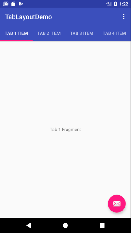
Compile and run the app on a device or emulator and make sure that selecting a tab causes the corresponding fragment to appear in the content area of the screen:
Customizing the TabLayout
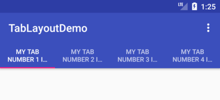
The TabLayout in this example project is configured using fixed mode. This mode works well for a limited number of tabs with short titles. A greater number of tabs or longer titles can quickly become a problem when using fixed mode as illustrated by Figure 45-7:
In an effort to fit the tabs into the available display width the TabLayout has used multiple lines of text. Even so, the second line is clearly truncated making it impossible to see the full title. The best solution to this problem is to switch the TabLayout to scrollable mode. In this mode the titles appear in full length, single line format allowing the user to swipe to scroll horizontally through the available items as demonstrated in Figure 45-8:
To switch a TabLayout to scrollable mode, simply change the app:tabMode property in the activity_tab_layout_demo.xml layout resource file from “fixed” to “scrollable”:
<android.support.design.widget.TabLayout
    android:id="@+id/tab_layout"
    android:layout_width="match_parent"
    android:layout_height="wrap_content"
    app:tabMode="scrollable"
    app:tabGravity="fill"/>
</android.support.design.widget.AppBarLayout>
When in fixed mode, the TabLayout may be configured to control how the tab items are displayed to take up the available space on the screen. This is controlled via the app:tabGravity property, the results of which are more noticeable on wider displays such as tablets in landscape orientation. When set to “fill”, for example, the items will be distributed evenly across the width of the TabLayout as shown in Figure 45-9:
Changing the property value to “center” will cause the items to be positioned relative to the center of the tab bar:
Before proceeding to the final step in this chapter, revert the tabMode and tabGravity attributes in the activity_tab_layout_demo.xml file to “fixed” and “fill” respectively.
Displaying Icon Tab Items
The last step in this tutorial is to replace the text based tabs with icons. Achieve this by modifying the onCreate() method in the TabLayoutDemoActivity.java file to assign some built-in drawable icons to the tab items:
private void configureTabLayout() {

    TabLayout tabLayout = (TabLayout) findViewById(R.id.tab_layout);

    tabLayout.addTab(tabLayout.newTab().setIcon(
                     android.R.drawable.ic_dialog_email));
    tabLayout.addTab(tabLayout.newTab().setIcon(
                     android.R.drawable.ic_dialog_dialer));
    tabLayout.addTab(tabLayout.newTab().setIcon(
                     android.R.drawable.ic_dialog_map));
    tabLayout.addTab(tabLayout.newTab().setIcon(
                     android.R.drawable.ic_dialog_info));

    final ViewPager viewPager =
              (ViewPager) findViewById(R.id.pager);
.
.
Instead of using the setText() method of the tab item, the code is now calling the setIcon() method and passing through a drawable icon reference. When compiled and run, the tab bar should now appear as shown in Figure 45-11. Note if using Instant Run that it will be necessary to trigger a warm swap using Ctrl-Shift-R for the changes to take effect:
Summary
TabLayout is one of the components introduced as part of the Android material design implementation. The purpose of the TabLayout component is to present a series of tab items which, when selected, display different content to the user. The tab items can display text, images or a combination of both. When combined with the ViewPager class and fragments, tab layouts can be created with relative ease, with each tab item selection displaying a different fragment.
| Previous | Table of Contents | Next |
| Working with the Floating Action Button and Snackbar | Working with the RecyclerView and CardView Widgets |


