A Guide to the Android Studio Layout Editor Tool
| Previous | Table of Contents | Next |
| Understanding Android Views, View Groups and Layouts | A Guide to the Android ConstraintLayout |
It is difficult to think of an Android application concept that does not require some form of user interface. Most Android devices come equipped with a touch screen and keyboard (either virtual or physical) and taps and swipes are the primary form of interaction between the user and application. Invariably these interactions take place through the application’s user interface.
A well designed and implemented user interface, an important factor in creating a successful and popular Android application, can vary from simple to extremely complex, depending on the design requirements of the individual application. Regardless of the level of complexity, the Android Studio Layout Editor tool significantly simplifies the task of designing and implementing Android user interfaces.
Basic vs. Empty Activity Templates
As outlined in the chapter entitled “The Anatomy of an Android Application”, Android applications are made up of one or more activities. An activity is a standalone module of application functionality that usually correlates directly to a single user interface screen. As such, when working with the Android Studio Layout Editor we are invariably working on the layout for an activity.
When creating a new Android Studio project, a number of different templates are available to be used as the starting point for the user interface of the main activity. The most basic of these templates are the Basic Activity and Empty Activity templates. Although these seem similar at first glance, there are actually considerable differences between the two options.
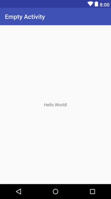
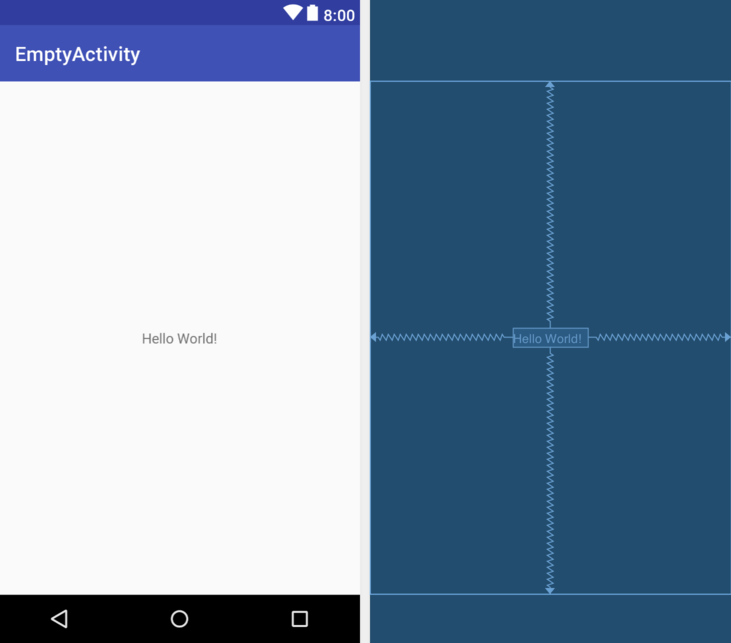
The Empty Activity template creates a single layout file consisting of a ConstraintLayout manager instance containing a TextView object as shown in Figure 16-1:
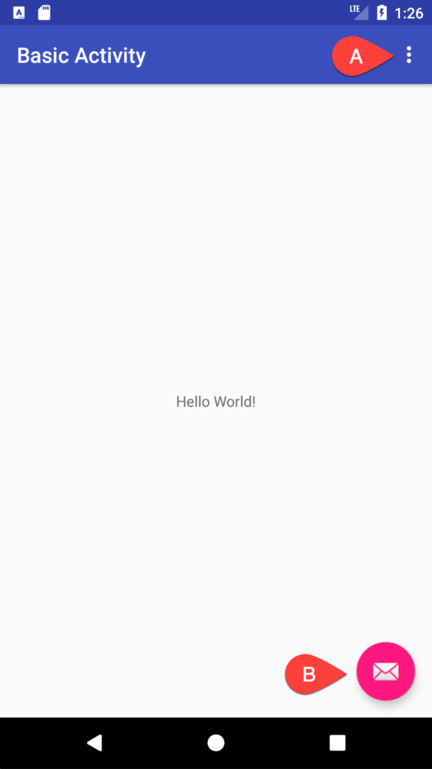
The Basic Activity, on the other hand, consists of two layout files. The top level layout file has a CoordinatorLayout as the root view, a configurable app bar, a menu preconfigured with a single menu item (A in Figure 16-2), a floating action button (B) and a reference to the second layout file in which the layout for the content area of the activity user interface is declared:
Clearly the Empty Activity template is useful if you need neither a floating action button nor a menu in your activity and do not need the special app bar behavior provided by the CoordinatorLayout such as options to make the app bar and toolbar collapse from view during certain scrolling operations (a topic covered in the chapter entitled “Working with the AppBar and Collapsing Toolbar Layouts”). The Basic Activity is useful, however, in that it provides these elements by default. In fact, it is often quicker to create a new activity using the Basic Activity template and delete the elements you do not require than to use the Empty Activity template and manually implement behavior such as collapsing toolbars, a menu or floating action button.
Since not all of the examples in this book require the features of the Basic Activity template, however, most of the examples in this chapter will use the Empty Activity template unless the example requires one or other of the features provided by the Basic Activity template.
For future reference, if you need a menu but not a floating action button, use the Basic Activity and follow these steps to delete the floating action button:
Double-click on the main activity layout file located in the Project tool window under app -> res -> layout to load it into the Layout Editor. This will be the layout file prefixed with activity_ and not the content file prefixed with content_.
With the layout loaded into the Layout Editor tool, select the floating action button and tap the keyboard Delete key to remove the object from the layout.
Locate and edit the Java code for the activity (located under app -> java -> <package name> -> <activity class name> and remove the floating action button code from the onCreate method as follows:
@Override
protected void onCreate(Bundle savedInstanceState) {
    super.onCreate(savedInstanceState);
    setContentView(R.layout.activity_main);
    Toolbar toolbar = (Toolbar) findViewById(R.id.toolbar);
    setSupportActionBar(toolbar);

    FloatingActionButton fab =
        (FloatingActionButton) findViewById(R.id.fab);
    fab.setOnClickListener(new View.OnClickListener() {
        @Override
        public void onClick(View view) {
            Snackbar.make(view, "Replace with your own action",
                  Snackbar.LENGTH_LONG)
                        .setAction("Action", null).show();
        }
    });
}
If you need a floating action button but no menu, use the Basic Activity template and follow these steps:
Edit the activity class file and delete the onCreateOptionsMenu and onOptionsItemSelected methods.
Select the res -> menu item in the Project tool window and tap the keyboard Delete key to remove the folder and corresponding menu resource files from the project.
The Android Studio Layout Editor
As has been demonstrated in previous chapters, the Layout Editor tool provides a “what you see is what you get” (WYSIWYG) environment in which views can be selected from a palette and then placed onto a canvas representing the display of an Android device. Once a view has been placed on the canvas, it can be moved, deleted and resized (subject to the constraints of the parent view). Further, a wide variety of properties relating to the selected view may be modified using the Attributes tool window.
Under the surface, the Layout Editor tool actually constructs an XML resource file containing the definition of the user interface that is being designed. As such, the Layout Editor tool operates in two distinct modes referred to as Design mode and Text mode.
Design Mode
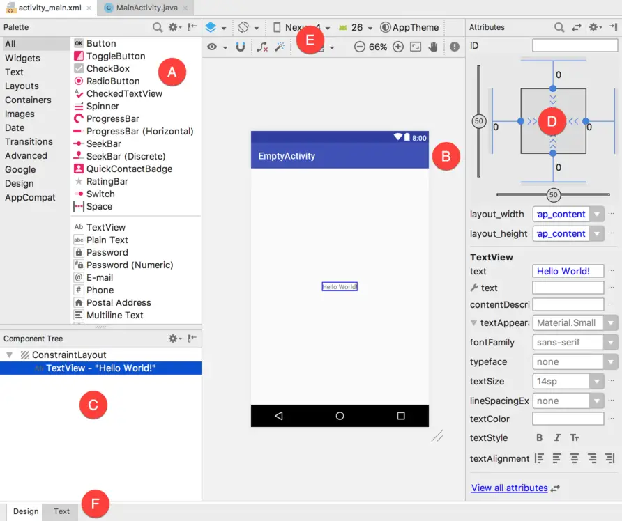
In design mode, the user interface can be visually manipulated by directly working with the view palette and the graphical representation of the layout. Figure 16-3 highlights the key areas of the Android Studio Layout Editor tool in design mode:
- A – Palette – The palette provides access to the range of view components provided by the Android SDK. These are grouped into categories for easy navigation. Items may be added to the layout by dragging a view component from the palette and dropping it at the desired position on the layout.
- B – Device Screen – The device screen provides a visual “what you see is what you get” representation of the user interface layout as it is being designed. This layout allows for direct manipulation of the design in terms of allowing views to be selected, deleted, moved and resized. The device model represented by the layout can be changed at any time using a menu located in the toolbar.
- C – Component Tree – As outlined in the previous chapter (“Understanding Android Views, View Groups and Layouts”) user interfaces are constructed using a hierarchical structure. The component tree provides a visual overview of the hierarchy of the user interface design. Selecting an element from the component tree will cause the corresponding view in the layout to be selected. Similarly, selecting a view from the device screen layout will select that view in the component tree hierarchy.
- D – Attributes – All of the component views listed in the palette have associated with them a set of attributes that can be used to adjust the behavior and appearance of that view. The Layout Editor’s attributes panel provides access to the attributes of the currently selected view in the layout allowing changes to be made.
- E – Toolbar – The Layout Editor toolbar provides quick access to a wide range of options including, amongst other options, the ability to zoom in and out of the device screen layout, change the device model currently displayed, rotate the layout between portrait and landscape and switch to a different Android SDK API level. The toolbar also has a set of context sensitive buttons which will appear when relevant view types are selected in the device screen layout.
- F – Mode Switching Tabs – The tabs located along the lower edge of the Layout Editor provide a way to switch back and forth between the Layout Editor tool’s text and design modes.
The Palette
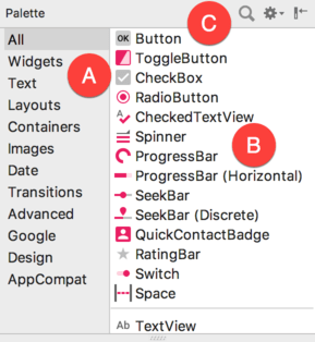
The Layout Editor palette is organized into two panels designed to make it easy to locate and preview view components for addition to a layout design. The category panel (marked A in Figure 16-4) lists the different categories of view components supported by the Android SDK. When a category is selected from the list, the second panel (B) updates to display a list of the components that fall into that category:
To add a component from the palette onto the layout canvas, simply select the item either from the component list or the preview panel, drag it to the desired location on the canvas and drop it into place.
A search for a specific component within the currently selected category may be initiated by clicking on the search button (marked C in Figure 16-4 above) in the palette toolbar and typing in the component name. As characters are typed, matching results will appear in real-time within the component list panel. If you are unsure of the category in which the component resides, simply select the All category either before or during the search operation.
Design and Layout Views
When the Layout Editor tool is in Design mode, the layout can be viewed in two different ways. The view shown in Figure 16-3 above is the Design view and shows the layout and widgets as they will appear in the running app. A second mode, referred to as Layout or Blueprint view can be shown either instead of, or concurrently with the Design view. The toolbar menu shown in Figure 16-5 provides options to display the Design, Blueprint, or both views. A fourth option, Force Refresh Layout, causes the layout to rebuild and redraw. This can be useful when the layout enters an unexpected state or is not accurately reflecting the current design settings:
Whether to display the layout view, design view or both is a matter of personal preference. A good approach is to begin with both displayed as shown in Figure 16-6:
Text Mode
It is important to keep in mind when using the Android Studio Layout Editor tool that all it is really doing is providing a user friendly approach to creating XML layout resource files. At any time during the design process, the underlying XML can be viewed and directly edited simply by clicking on the Text tab located at the bottom of the Layout Editor tool panel. To return to design mode, simply click on the Design tab.
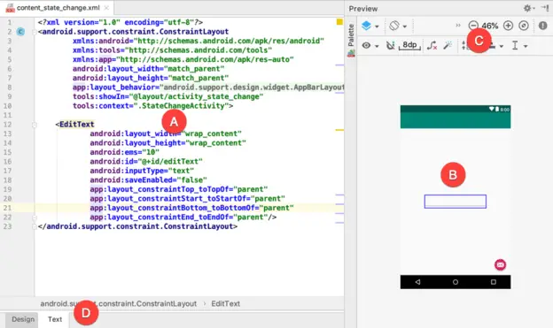
Figure 16-7 highlights the key areas of the Android Studio Layout Editor tool in text mode:
- A – Editor – The editor panel displays the XML that makes up the current user interface layout design. This is the full Android Studio editor environment containing all of the features previously outlined in the “The Basics of the Android Studio Code Editor” chapter of this book.
- B – Preview – As changes are made to the XML in the editor, these changes are visually reflected in the preview window. This provides instant visual feedback on the XML changes as they are made in the editor, thereby avoiding the need to switch back and forth between text and design mode to see changes. The preview also allows direct manipulation and design of the layout just as if the layout were in Design mode, with visual changes being reflected in the editor panel in real-time. As with Design mode, both the Design and Layout views may be displayed using the toolbar buttons highlighted in Figure 16-5 above.
- C – Toolbar – The toolbar in text mode provides access to the same functions available in design mode.
- D - Mode Switching Tabs – The tabs located along the lower edge of the Layout Editor provide a way to switch back and forth between the Layout Editor tool’s Text and Design modes.
Setting Attributes
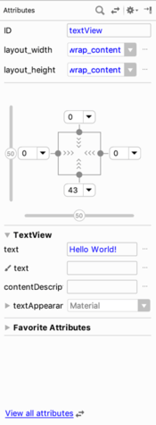
The Attributes panel provides access to all of the available settings for the currently selected component. By default, the attributes panel shows the most commonly changed attributes for the currently selected component in the layout. Figure 16-8, for example, shows this subset of attributes for the TextView widget:
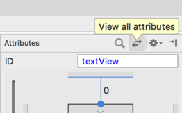
To access all of the attributes for the currently selected widget, click on the button highlighted in Figure 16-9, or use the View all attributes link at the bottom of the attributes panel:
A search for a specific attribute may also be performed by selecting the search button in the toolbar of the attributes tool window and typing in the attribute name. Select the View all attributes button or link either before or during a search to ensure that all of the attributes for the currently selected component are included in the results.
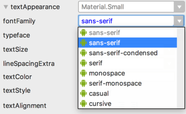
Some attributes contain a button displaying three dots. This indicates that a settings dialog is available to assist in selecting a suitable property value. To display the dialog, simply click on the button. Attributes for which a finite number of valid options are available will present a drop down menu (Figure 16-10) from which a selection may be made.
Configuring Favorite Attributes
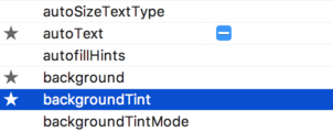
The attributes included on the initial subset attribute list may be extended by configuring favorite attributes. To add an attribute to the favorites list, display all the attributes for the currently selected component and hover the mouse pointer so that it is positioned to the far left of the attribute entry within the attributes tool window. A star icon will appear to the left of the attribute name which, when clicked, will add the property to the favorites list. Figure 16-11, for example, shows the autoText, background and backgroundTint attributes for a TextView widget configured as favorite attributes:
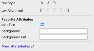
Once added as favorites, the attributes will be listed beneath the Favorite Attributes section in the subject attributes list:
Converting Views
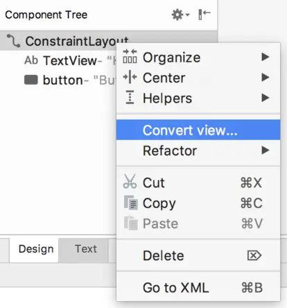
Changing a view in a layout from one type to another (such as converting a TextView to an EditText) can be performed easily within the Android Studio layout editor simply by right-clicking on the view either within the screen layout or Component tree window and selecting the Convert view... menu option (Figure 16-13):
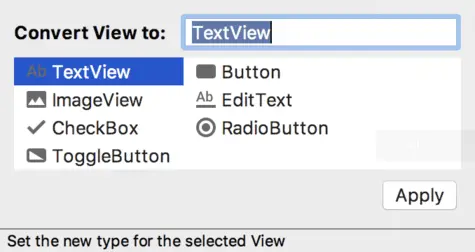
Once selected, a dialog will appear containing a list of compatible view types to which the selected object is eligible for conversion. Figure 16-14, for example shows the types to which an existing TextView view may be converted:
This technique is also useful for converting layouts from one type to another (for example converting a ConstraintLayout to a LinearLayout).
Displaying Sample Data
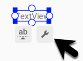
When designing layouts in Android Studio situations will arise where the content to be displayed within the user interface will not be available until the app is completed and running. This can sometimes make it difficult to assess from within the layout editor how the layout will appear at app runtime. To address this issue, the layout editor allows sample data to be specified that will populate views within the layout editor with sample images and data. This sample data only appears within the layout editor and is not displayed when the app runs. Sample data may be configured either by directly editing the XML for the layout, or visually using the design-time helper button which appears when the mouse pointer hovers over a selected view in a layout as highlighted in Figure 16-15:
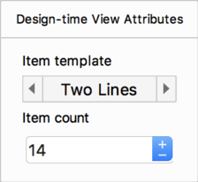
The design-time helper panel will display a range of preconfigured options for sample data to be displayed on the selected view item including combinations of text and images in a variety of configurations. Figure 16-16, for example, shows the sample data options displayed when selecting sample data to appear in a RecyclerView list:
Alternatively, custom text and images may be provided for display during the layout design process. An example of using sample data within the layout editor is included in a later chapter entitled “A Layout Editor Sample Data Tutorial”.
Creating a Custom Device Definition
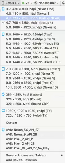
The device menu in the Layout Editor toolbar (Figure 16-17) provides a list of preconfigured device types which, when selected, will appear as the device screen canvas. In addition to the pre-configured device types, any AVD instances that have previously been configured within the Android Studio environment will also be listed within the menu. To add additional device configurations, display the device menu, select the Add Device Definition… option and follow the steps outlined in the chapter entitled “Creating an Android Virtual Device (AVD) in Android Studio”.
Changing the Current Device
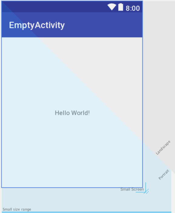
As an alternative to the device selection menu, the current device format may be changed by selecting the Custom option from the device menu, clicking on the resize handle located next to the bottom right-hand corner of the device screen (Figure 16-18) and dragging to select an alternate device display format. As the screen resizes, markers will appear indicating the various size options and orientations available for selection:
Summary
A key part of developing Android applications involves the creation of the user interface. Within the Android Studio environment, this is performed using the Layout Editor tool which operates in two modes. In design mode, view components are selected from a palette and positioned on a layout representing an Android device screen and configured using a list of attributes. In text mode, the underlying XML that represents the user interface layout can be directly edited, with changes reflected in a preview screen. These modes combine to provide an extensive and intuitive user interface design environment.
| Previous | Table of Contents | Next |
| Understanding Android Views, View Groups and Layouts | A Guide to the Android ConstraintLayout |
