Creating an Example Java Android App in Android Studio
The preceding chapters of this book have covered the steps necessary to configure an environment suitable for the development of Android applications using the Android Studio IDE. Before moving on to slightly more advanced topics, now is a good time to validate that all of the required development packages are installed and functioning correctly. The best way to achieve this goal is to create an Android application and compile and run it. This chapter will cover the creation of a simple Android application project using Android Studio. Once the project has been created, a later chapter will explore the use of the Android emulator environment to perform a test run of the application.
About the Project
The project created in this chapter takes the form of a very simple currency conversion calculator (so simple, in fact, that it only converts from dollars to euros and does so using an estimated conversion rate). The project will also make use of the most basic of Android Studio project templates. This simplicity allows us to introduce some of the key aspects of Android app development without overwhelming the beginner by trying to introduce too many concepts, such as the recommended app architecture and Android architecture components, at once. When following the tutorial in this chapter, rest assured that all of the techniques and code used in this initial example project will be covered in much greater detail in later chapters.
Creating a New Android Project
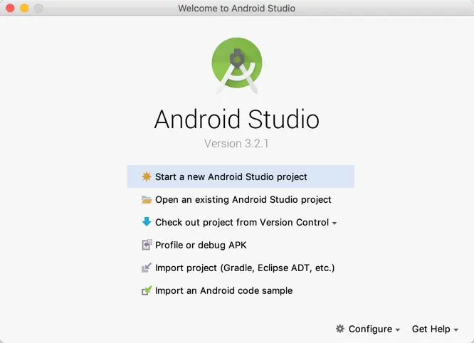
The first step in the application development process is to create a new project within the Android Studio environment. Begin, therefore, by launching Android Studio so that the “Welcome to Android Studio” screen appears as illustrated in Figure 3-1:
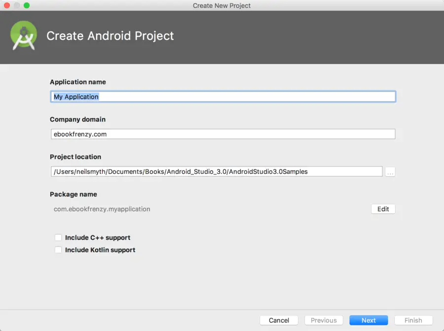
Once this window appears, Android Studio is ready for a new project to be created. To create the new project, simply click on the Start a new Android Studio project option to display the first screen of the New Project wizard as shown in Figure 3-2:
Defining the Project and SDK Settings
In the New Project window, set the Application name field to AndroidSample. The application name is the name by which the application will be referenced and identified within Android Studio and is also the name that would be used if the completed application were to go on sale in the Google Play store.
The Package Name is used to uniquely identify the application within the Android application ecosystem. Although this can be set to any string that uniquely identifies your app, it is traditionally based on the reversed URL of your domain name followed by the name of the application. For example, if your domain is www.mycompany.com, and the application has been named AndroidSample, then the package name might be specified as follows:
com.mycompany.androidsample
If you do not have a domain name you can enter any other string into the Company Domain field, or you may use example.com for the purposes of testing, though this will need to be changed before an application can be published:
com.example.androidsample
The Project location setting will default to a location in the folder named AndroidStudioProjects located in your home directory and may be changed by clicking on the button to the right of the text field containing the current path setting.
Click Next to proceed. On the form factors screen, enable the Phone and Tablet option and set the minimum SDK setting to API 26: Android 8.0 (Oreo). This is the SDK that will be used in most of the projects created in this book unless a necessary feature is only available in a more recent version. While Android Studio allows older SDK versions to be selected, many of the security and privacy features built into Android were only introduced after the API 25 SDK was released. To improve app security, Google announced that starting in August 2018 the Google Play store will only accept new apps built using API 26 or newer. This same restriction is also applied to updates of existing apps after October 2018. Since the project is not intended for Google TV, Android Auto or wearable devices, leave the remaining options disabled before clicking Next. Instant Apps will not be covered until later in this book so make sure that the Include Android Instant App support option is disabled.
Creating an Activity
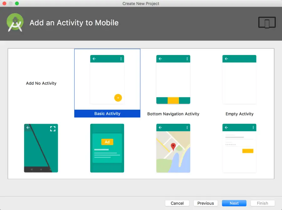
The next step is to define the type of initial activity that is to be created for the application. A range of different activity types is available when developing Android applications, many of which will be covered extensively in later chapters. For the purposes of this example, however, simply select the option to create a Basic Activity. The Basic Activity option creates a template user interface consisting of an app bar, menu, content area and a single floating action button.
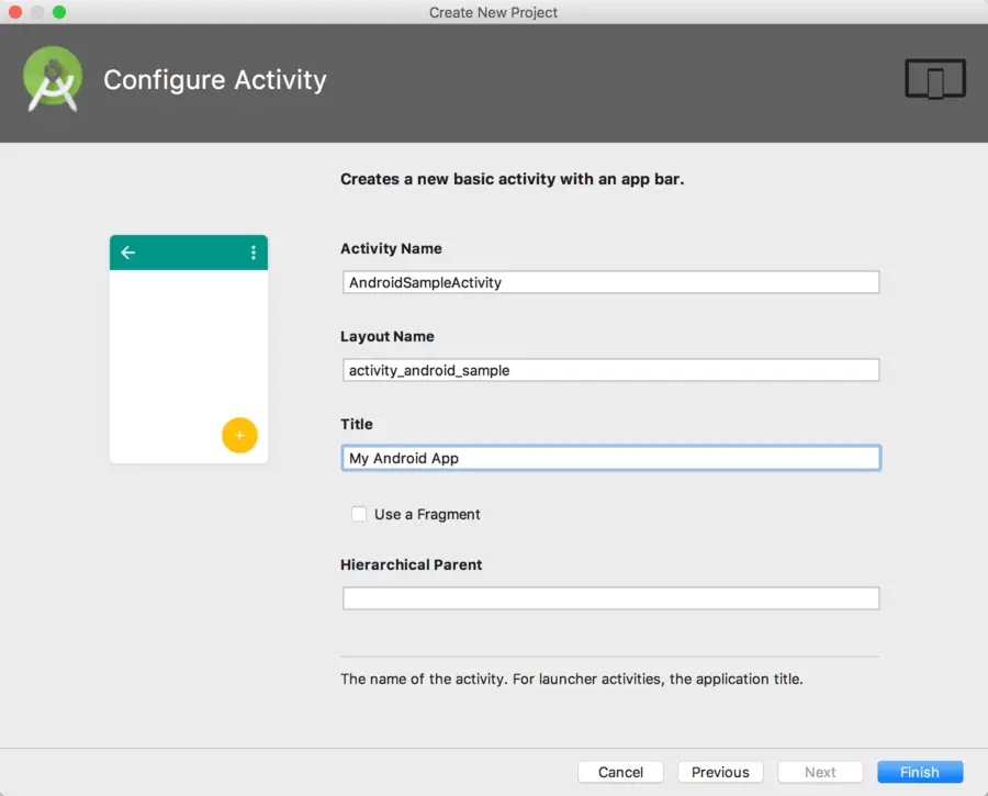
With the Basic Activity option selected, click Next. On the final screen (Figure 3-4) name the activity and title AndroidSampleActivity. The activity will consist of a single user interface screen layout which, for the purposes of this example, should be named activity_android_sample. Finally, enter My Android App into the title field as shown in Figure 3-4:
Click on Finish to initiate the project creation process.
Modifying the Example Application
At this point, Android Studio has created a minimal example application project and opened the main window.
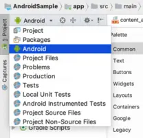
The newly created project and references to associated files are listed in the Project tool window located on the left-hand side of the main project window. The Project tool window has a number of modes in which information can be displayed. By default, this panel will be in Android mode. This setting is controlled by the menu at the top of the panel as highlighted in Figure 3-6. If the panel is not currently in Android mode, use the menu to switch mode:
The example project created for us when we selected the option to create an activity consists of a user interface containing a label that will read “Hello World!” when the application is executed.
The next step in this tutorial is to modify the user interface of our application so that it displays a larger text view object with a different message to the one provided for us by Android Studio.
The user interface design for our activity is stored in a file named activity_android_sample.xml which, in turn, is located under app -> res -> layout in the project file hierarchy. This layout file includes the app bar (also known as an action bar) that appears across the top of the device screen (marked A in Figure 3-7) and the floating action button (the email button marked B). In addition to these items, the activity_android_sample.xml layout file contains a reference to a second file containing the content layout (marked C):
File:As 3.0 new helloworld.png.png
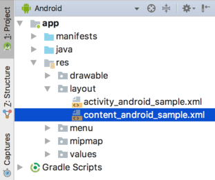
By default, the content layout is contained within a file named content_android_sample.xml and it is within this file that changes to the layout of the activity are made. Using the Project tool window, locate this file as illustrated in Figure 3-8:
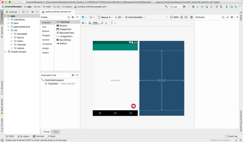
Once located, double-click on the file to load it into the user interface Layout Editor tool which will appear in the center panel of the Android Studio main window:
In the toolbar across the top of the Layout Editor window is a menu (currently set to Nexus 4 in the above figure) which is reflected in the visual representation of the device within the Layout Editor panel. A wide range of other device options are available for selection by clicking on this menu.
To change the orientation of the device representation between landscape and portrait simply use the drop down menu immediately to the left of the device selection menu showing the  icon.
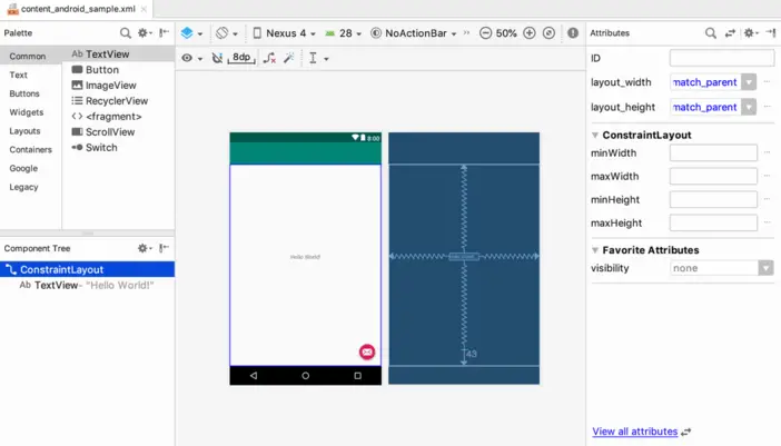
As can be seen in the device screen, the content layout already includes a label that displays a “Hello World!” message. Running down the left-hand side of the panel is a palette containing different categories of user interface components that may be used to construct a user interface, such as buttons, labels and text fields. It should be noted, however, that not all user interface components are obviously visible to the user. One such category consists of layouts. Android supports a variety of layouts that provide different levels of control over how visual user interface components are positioned and managed on the screen. Though it is difficult to tell from looking at the visual representation of the user interface, the current design has been created using a ConstraintLayout. This can be confirmed by reviewing the information in the Component Tree panel which, by default, is located in the lower left-hand corner of the Layout Editor panel and is shown in Figure 3-10:
As we can see from the component tree hierarchy, the user interface layout consists of a ConstraintLayout parent with a single child in the form of a TextView object.
Before proceeding, check that the Layout Editor’s Autoconnect mode is enabled. This means that as components are added to the layout, the Layout Editor will automatically add constraints to make sure the components are correctly positioned for different screen sizes and device orientations (a topic that will be covered in much greater detail in future chapters). The Autoconnect button appears in the Layout Editor toolbar and is represented by a magnet icon. When disabled the magnet appears with a diagonal line through it (Figure 3-11). If necessary, re-enable Autoconnect mode by clicking on this button.
The next step in modifying the application is to add some additional components to the layout, the first of which will be a Button for the user to press to initiate the currency conversion.
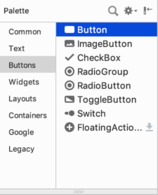
The Palette panel consists of two columns with the left-hand column containing a list of view component categories. The right-hand column lists the components contained within the currently selected category. In Figure 3-12, for example, the Button view is currently selected within the Buttons category:
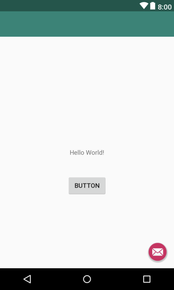
Click and drag the Button object from the Buttons list and drop it in the horizontal center of the user interface design so that it is positioned beneath the existing TextView widget:
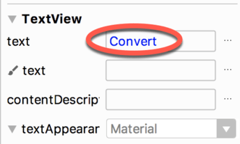
The next step is to change the text that is currently displayed by the Button component. The panel located to the right of the design area is the Attributes panel. This panel displays the attributes assigned to the currently selected component in the layout. Within this panel, locate the text property and change the current value from “Button” to “Convert” as shown in Figure 3-14:
A useful shortcut to changing the text property of a component is to double-click on it in the layout. This will automatically locate the attribute in the attributes panel and select it ready for editing.
The second text property with a wrench next to it allows a text property to be set which only appears within the Layout Editor tool but is not shown at runtime. This is useful for testing the way in which a visual component and the layout will behave with different settings without having to run the app repeatedly.
Just in case the Autoconnect system failed to set all of the layout connections, click on the Infer constraints button (Figure 3-15) to add any missing constraints to the layout:
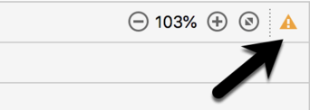
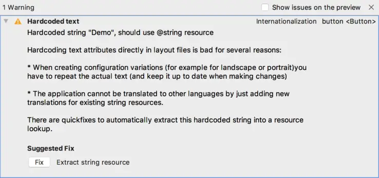
At this point it is important to explain the warning button located in the top right-hand corner of the Layout Editor tool as indicated in Figure 3-16. Obviously, this is indicating potential problems with the layout. For details on any problems, click on the button:
When clicked, a panel (Figure 3-17) will appear describing the nature of the problems and offering some possible corrective measures:
Currently, the only warning listed reads as follows:
Hardcoded string "Convert", should use @string resource
This I18N message is informing us that a potential issue exists with regard to the future internationalization of the project (“I18N” comes from the fact that the word “internationalization” begins with an “I”, ends with an “N” and has 18 letters in between). The warning is reminding us that when developing Android applications, attributes and values such as text strings should be stored in the form of resources wherever possible. Doing so enables changes to the appearance of the application to be made by modifying resource files instead of changing the application source code. This can be especially valuable when translating a user interface to a different spoken language. If all of the text in a user interface is contained in a single resource file, for example, that file can be given to a translator who will then perform the translation work and return the translated file for inclusion in the application. This enables multiple languages to be targeted without the necessity for any source code changes to be made. In this instance, we are going to create a new resource named convert_string and assign to it the string “Convert”.
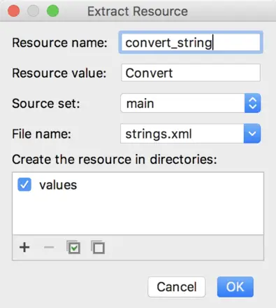
Click on the Fix button in the Issue Explanation panel to display the Extract Resource panel (Figure 3-18). Within this panel, change the resource name field to convert_string and leave the resource value set to Convert before clicking on the OK button.
It is also worth noting that the string could also have been assigned to a resource when it was entered into the Attributes panel. This involves clicking on the button displaying three dots to the right of the property field in the Attributes panel and selecting the Add new resource -> New String Value… menu option from the resulting Resources dialog. In practice, however, it is often quicker to simply set values directly into the Attributes panel fields for any widgets in the layout, then work sequentially through the list in the warnings dialog to extract any necessary resources when the layout is complete.
The next widget to be added is an EditText widget into which the user will enter the dollar amount to be converted. From the widget palette, select the Text category and click and drag a Number (Decimal) component onto the layout so that it is centered horizontally and positioned above the existing TextView widget. With the widget selected, use the Attributes tools window to set the hint property to “dollars”. Click on the warning icon and extract the string to a resource named dollars_hint.
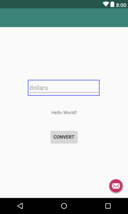
Add any missing layout constraints by clicking on the Infer constraints button. At this point the layout should resemble that shown in Figure 3-19:
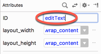
The code written later in this chapter will need to access the dollar value entered by the user into the EditText field. It will do this by referencing the ID assigned to the widget in the user interface layout. The default ID assigned to the widget by Android Studio can be viewed and changed from within the Attributes tool window when the widget is selected in the layout as shown in Figure 3-20:
Change the ID to dollarText before proceeding.
Reviewing the Layout and Resource Files
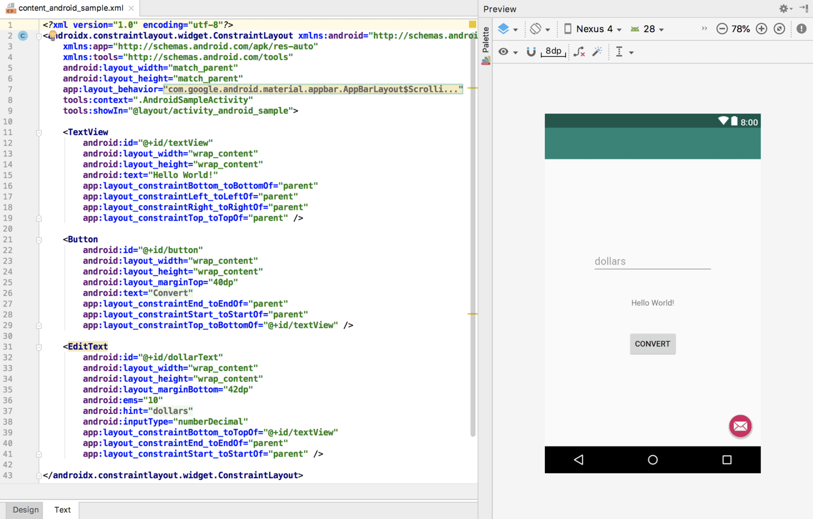
Before moving on to the next step, we are going to look at some of the internal aspects of user interface design and resource handling. In the previous section, we made some changes to the user interface by modifying the content_android_sample.xml file using the Layout Editor tool. In fact, all that the Layout Editor was doing was providing a user-friendly way to edit the underlying XML content of the file. In practice, there is no reason why you cannot modify the XML directly in order to make user interface changes and, in some instances, this may actually be quicker than using the Layout Editor tool. At the bottom of the Layout Editor panel are two tabs labeled Design and Text respectively. To switch to the XML view simply select the Text tab as shown in Figure 3-21:
As can be seen from the structure of the XML file, the user interface consists of the ConstraintLayout component, which in turn, is the parent of the Button object. We can also see that the text property of the Button is set to our convert_string resource. Although varying in complexity and content, all user interface layouts are structured in this hierarchical, XML based way.
One of the more powerful features of Android Studio can be found to the right-hand side of the XML editing panel. If the panel is not visible, display it by selecting the Preview button located along the right-hand edge of the Android Studio window. This is the Preview panel and shows the current visual state of the layout. As changes are made to the XML layout, these will be reflected in the preview panel. The layout may also be modified visually from within the Preview panel with the changes appearing in the XML listing. To see this in action, modify the XML layout to change the background color of the ConstraintLayout to a shade of red as follows:
<?xml version="1.0" encoding="utf-8"?>
<android.support.constraint.ConstraintLayout xmlns:android="http://schemas.android.com/apk/res/android"
    xmlns:app="http://schemas.android.com/apk/res-auto"
    xmlns:tools="http://schemas.android.com/tools"
    android:layout_width="match_parent"
    android:layout_height="match_parent"
    app:layout_behavior="@string/appbar_scrolling_view_behavior"
    tools:context=".AndroidSampleActivity"
    tools:showIn="@layout/activity_android_sample"
    android:background="#ff2438" >
.
.
</android.support.constraint.ConstraintLayout>
Note that the color of the preview changes in real-time to match the new setting in the XML file. Note also that a small red square appears in the left-hand margin (also referred to as the gutter) of the XML editor next to the line containing the color setting. This is a visual cue to the fact that the color red has been set on a property. Change the color value to #a0ff28 and note that both the small square in the margin and the preview change to green.
Finally, use the Project view to locate the app -> res -> values -> strings.xml file and double-click on it to load it into the editor. Currently the XML should read as follows:
<resources>
    <string name="app_name">AndroidSample</string>
    <string name="action_settings">Settings</string>
    <string name="convert_string">Convert</string>
    <string name="dollars_hint">dollars</string>
</resources>
As a demonstration of resources in action, change the string value currently assigned to the convert_string resource to “Convert to Euros” and then return to the Layout Editor tool by selecting the tab for the layout file in the editor panel. Note that the layout has picked up the new resource value for the string.
There is also a quick way to access the value of a resource referenced in an XML file. With the Layout Editor tool in Text mode, click on the “@string/convert_string” property setting so that it highlights and then press Ctrl-B on the keyboard (Cmd-B on macOS). Android Studio will subsequently open the strings.xml file and take you to the line in that file where this resource is declared. Use this opportunity to revert the string resource back to the original “Convert” text.
Resource strings may also be edited using the Android Studio Translations Editor. To open this editor, right-click on the app -> res -> values -> strings.xml file and select the Open Editor menu option. This will display the Translation Editor in the main panel of the Android Studio window:
This editor allows the strings assigned to resource keys to be edited and for translations for multiple languages to be managed.
Adding Interaction
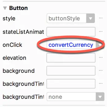
The final step in this example project is to make the app interactive so that when the user enters a dollar value into the EditText field and clicks the convert button the converted euro value appears on the TextView. This involves the implementation of some event handling on the Button widget. Specifically, the Button needs to be configured so that a method in the app code is called when an onClick event is triggered. Event handling can be implemented in a number of different ways and is covered in detail in a later chapter entitled “An Overview and Example of Android Event Handling”. Return the layout editor to Design mode, select the Button widget in the layout editor, refer to the Attributes tool window and specify a method named convertCurrency as shown below:
Next, double-click on the AndroidSampleActivity.java file to load it into the code editor and add the code for the convertCurrency method to the class file so that it reads as follows, noting that it is also necessary to import some additional Android packages:
package com.ebookfrenzy.androidsample;

import android.os.Bundle;
import android.support.design.widget.FloatingActionButton;
import android.support.design.widget.Snackbar;
import android.support.v7.app.AppCompatActivity;
import android.support.v7.widget.Toolbar;
import android.view.View;
import android.view.Menu;
import android.view.MenuItem;
import android.widget.EditText;
import android.widget.TextView;

public class AndroidSampleActivity extends AppCompatActivity {
.
.
    public void convertCurrency(View view) {

        EditText dollarText = findViewById(R.id.dollarText);
        TextView textView = findViewById(R.id.textView);

        if (!dollarText.getText().toString().equals("")) {

            Float dollarValue = Float.valueOf(dollarText.getText().toString());
            Float euroValue = dollarValue * 0.85F;
            textView.setText(euroValue.toString());
        } else {
            textView.setText("No Value");
        }
    }
.
.
}
The method begins by obtaining references to the EditText and TextView objects by making a call to a method named findViewById, passing through the id assigned within the layout file. A check is then made to ensure that the user has entered a dollar value and if so, that value is extracted, converted from a String to a floating point value and converted to euros. Finally, the result is displayed on the TextView widget. If any of this is unclear, rest assured that these concepts will be covered in greater detail in later chapters.
The project is now complete and ready to run, a task that will be performed in the next chapter after an AVD emulator session as been created for testing purposes.
Summary
While not excessively complex, a number of steps are involved in setting up an Android development environment. Having performed those steps, it is worth working through a simple example to make sure the environment is correctly installed and configured. In this chapter, we have created a simple application and then used the Android Studio Layout Editor tool to modify the user interface layout. In doing so, we explored the importance of using resources wherever possible, particularly in the case of string values, and briefly touched on the topic of layouts. Next we looked at the underlying XML that is used to store the user interface designs of Android applications.
While it is useful to be able to preview a layout from within the Android Studio Layout Editor tool, there is no substitute for testing an application by compiling and running it.
Finally, an onClick event was added to a Button connected to a method that was implemented to extract the user input from the EditText component, convert from dollars to euros and then display the result on the TextView.
With the app ready for testing, the steps necessary to set up an emulator for testing purposes will be covered in detail in the next chapter.
