Handling Different Android Devices and Displays in Kotlin
| Previous | Table of Contents | Next |
| A Kotlin Android Fingerprint Authentication Tutorial | Signing and Preparing an Android App for Release |
Before being made available for purchase on the Google Play App Store, an application must first be submitted to the portal for review and approval. One of the most important steps to take before submitting an application is to decide which Android device models the application is intended to support and, more importantly, that the application runs without issue on those devices.
This chapter will cover some of the areas to consider when making sure that an application runs on the widest possible range of Android devices.
Handling Different Device Displays
Android devices come in a variety of different screen sizes and resolutions. The ideal solution is to design the user interface of your application so that it appears correctly on the widest possible range of devices. The best way to achieve this is to design the user interface using layout managers that do not rely on absolute positioning (i.e. specific X and Y coordinates) such as the ConstraintLayout so that views are positioned relative to both the size of the display and each other.
Similarly, avoid using specific width and height properties wherever possible. When such properties are unavoidable, always use density-independent (dp) values as these are automatically scaled to match the device display at application runtime.
Having designed the user interface, be sure to test it on each device on which it is intended to be supported. In the absence of the physical device hardware, use the emulator templates, wherever possible, to test on the widest possible range of devices.
In the event that it is not possible to design the user interface such that a single design will work on all Android devices, another option is to provide a different layout for each display.
Creating a Layout for each Display Size
The ideal solution to the multiple display problem is to design user interface layouts that adapt to the display size of the device on which the application is running. This, for example, has the advantage of having only one layout to manage when modifying the application. Inevitably, however, there will be situations where this ideal is unachievable given the vast difference in screen size between a phone and a tablet. Another option is to provide different layouts, each tailored to a specific display category. This involves identifying the smallest width qualifier value of each display and creating an XML layout file for each one. The smallest width value of a display indicates the minimum width of that display measured in dp units.
Display-specific layouts are implemented by creating additional sub-directories under the res directory of a project. The naming convention for these folders is:
layout-<smallest-width>
For example, layout resource folders for a range of devices might be configured as follows:
res/layout – The default layout file
- res/layout-sw200dp
- res/layout-sw600dp
- res/layout-sw800dp
Alternatively, more general categories can be created by targeting small, normal, large and xlarge displays:
- res/layout – The default layout file
- res/layout-small
- res/layout-normal
- res/layout-large
- res/layout-xlarge
- res/layout-land
Each folder must, in turn, contain a copy of the layout XML file adapted for the corresponding display, all of which must have matching file names. Once implemented, the Android runtime system will automatically select the correct layout file to display to the user to match the device display.
Creating Layout Variants in Android Studio
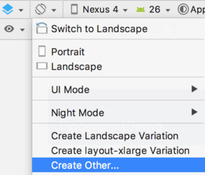
Android Studio makes it easy to add additional layout size variants using the Orientation button located in the Layout Editor toolbar as highlighted in Figure 86-1:
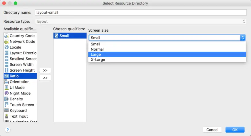
When selected, the menu provides options to create either a preconfigured landscape (res/layout-land) or xlarge (res/layout-xlarge) variants. Alternatively, the Create Other… menu option may be used to create variants for other sizes. To create a custom variant, select the Size qualifier in the Select Resource Directory dialog, click on the button displaying the ‘>>’ character sequence and then make a selection from the Screen size drop-down menu:
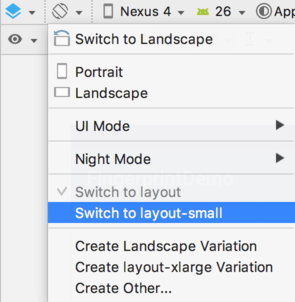
At any time during the layout design process, use the Orientation menu to switch to one of the different variants to see how the user interface will appear when running on a device with the corresponding screen size:
Providing Different Images
User interface layouts are not the only area of concern when adapting an application for different screen densities, dimensions and aspect ratios. Another area to pay attention to is that of images. An image that appears correctly scaled on a large tablet screen, for example, might not appear correctly scaled on a smaller phone based device. As with layouts, however, multiple sets of images can be bundled with the application, each tailored to a specific display. This can once again be achieved by referencing the smallest width value. In this case, drawable folders need to be created in the res directory. For example:
- res/drawable – The default image folder
- res/drawable-sw200dp
- res/drawable-sw600dp
- res/drawable-sw800dp
Having created the folders, simply place the display specific versions of the images into the corresponding folder, using the same name for each of the images.
Alternatively, the images may be categorized into broader display densities using the following directories based on the pixel density of the display:
- res/drawable-ldpi - Images for low density screens (approx. 120 dpi)
- res/drawable-mdpi – Images for medium-density screens (approx. 160 dpi)
- res/drawable-hdpi – Images for high-density screens (approx. 240 dpi)
- res/drawable-xhdpi – Images for extra high-density screens (approx. 320 dpi)
- res/drawable-tvdpi – Images for displays between medium and high density (approx. 213 dpi)
- res/drawable-nodpi – Images that must not be scaled by the system
Checking for Hardware Support
By now, it should be apparent that not all Android devices were created equal. An application that makes use of specific hardware features (such as a microphone or camera) should include code to gracefully handle the absence of that hardware. This typically involves performing a check to find out if the hardware feature is missing, and subsequently reporting to the user that the corresponding application functionality will not be available.
The following method can be used to check for the presence of a microphone:
private fun hasMicrophone(): Boolean {
    return packageManager.hasSystemFeature(
            PackageManager.FEATURE_MICROPHONE)
}
Similarly, the following method is useful for checking for the presence of a front facing camera:
private fun hasCamera(): Boolean {
    return packageManager.hasSystemFeature(
            PackageManager.FEATURE_CAMERA_FRONT)
}
Providing Device Specific Application Binaries
Even with the best of intentions, there will inevitably be situations where it is not possible to target all Android devices within a single application (though Google certainly encourages developers to target as many devices as possible within a single application binary package). In this situation, the application submission process allows multiple application binaries to be uploaded for a single application. Each binary is then configured to indicate to Google the devices with which the binary is configured to work. When a user subsequently purchases the application, Google ensures that the correct binary is downloaded for the user’s device.
It is also important to be aware that it may not always make sense to try to provide support for every Android device model. There is little point, for example, in making an application that relies heavily on a specific hardware feature available on devices that lack that specific hardware. These requirements can be defined using Google Play Filters as outlined at:
http://developer.android.com/google/play/filters.html
Summary
There is more to completing an Android application than making sure it works on a single device model. Before an application is submitted to the Google Play Developer Console, it should first be tested on as wide a range of display sizes as possible. This includes making sure that the user interface layouts and images scale correctly for each display variation and taking steps to ensure that the application gracefully handles the absence of certain hardware features. It is also possible to submit to the developer console a different application binary for specific Android models, or to state that a particular application simply does not support certain Android devices.
| Previous | Table of Contents | Next |
| A Kotlin Android Fingerprint Authentication Tutorial | Signing and Preparing an Android App for Release |
