Working with iOS 7 Auto Layout Constraints in Interface Builder
| Previous | Table of Contents | Next |
| An Introduction to Auto Layout in iOS 7 | An iOS 7 Auto Layout Example |
Learn SwiftUI and take your iOS Development to the Next Level |
By far the most productive and intuitive way to work with constraints is to do so using the auto layout features of Interface Builder. Not only does this avoid the necessity to write time consuming code (though for complex layout requirements some code will be inevitable) but it also provides instant visual feedback on constraints as they are configured.
Within this chapter, a simple example will be used to demonstrate the effectiveness of auto layout together with an in-depth look at the auto layout features of Interface Builder. The chapter will then move on to demonstrate the concepts of content hugging and constraint priorities.
A Simple Example of Auto Layout in Action
Before digging deeper into the auto layout features of Interface Builder, the first step in this chapter will be to quickly demonstrate the basic concept of auto layout. Begin, therefore, by creating a new Xcode project for the iPhone using the Single View Application template. Enter AutoLayout as both the product name and class prefix.
Enabling and Disabling Auto Layout in Interface Builder
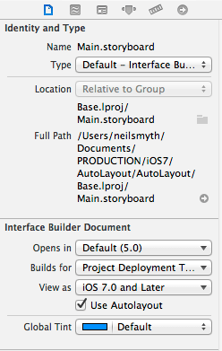
By default, Auto Layout is switched on for user interface design files, both for storyboard and individual XIB files. Begin by selecting the Main.storyboard file from the project navigator panel and then display the File Inspector panel (View -> Utilities-> Show File Inspector). Located within this inspector is an option labeled Use Autolayout as illustrated in Figure 15-1.
Figure 15-1
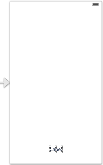
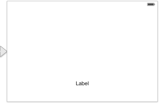
Although auto layout is enabled by default, the Interface Builder tool does not automatically apply any default constraints as views are added to the layout. Views are instead positioned using absolute x and y coordinates. To see this in action, drag a label view from the Object Library and position it towards the bottom of the view in the horizontal center of the view canvas so the vertical blue guideline appears indicating that it is centered before dropping the view into place. In actual fact, the location of the view has just been defined using hard coded absolute x and y coordinates on the screen. As far as the view is concerned, the label is positioned perfectly as long as the device remains in portrait orientation:
Figure 15-2
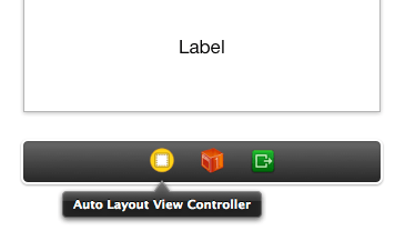
A problem arises, however, when the device rotates to landscape orientation. This can be demonstrated by compiling and running the application on a physical iPhone or iPad device or iOS Simulator in the usual way. Alternatively, the effect of an orientation change can be tested within the Interface Builder environment using a feature known as simulated metrics. To access these settings, begin by selecting the view controller in the storyboard canvas. This can be achieved by clicking on the view controller item in the toolbar beneath the view as illustrated in Figure 15-3:
Figure 15-3
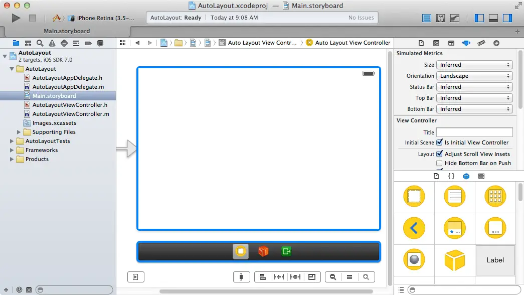
With the view controller selected, display the Attributes Inspector in the Utilities panel on the far right. Under the Simulated Metrics heading, locate the Orientation option and change the menu setting from Inferred to Landscape as outlined in Figure 15 5. Similarly, the layout behavior of the user interface on different screens may be tested using the Size setting. For example, the appearance on the 4 inch iPhone 5 screen can be tested by setting the Size menu to Retina 4 Full Screen. The device form factor setting can also be toggled by using the button in the bottom right hand corner of the storyboard canvas (the control on the far left of the array of controls illustrated in Figure 15-4):
Figure 15-4
Note that when switching to a smaller display form factor in portrait orientation, the label is once again positioned outside the viewable area. Clearly layout is important, not only for handling device orientation, but also to ensure correct user interface appearance on different device models.
Figure 15-5
As illustrated in the above figure, the label is no longer visible. This is because it remains positioned at the same geographical coordinates in relation to the parent view, which in landscape orientation, is outside the visible bounds of the parent view.
Prior to the introduction of auto layout, options to address this would have either involved using springs and struts or writing code to detect the rotation of the device and to move the label to the new location on the screen. Now, however, the problem can be solved using auto layout.
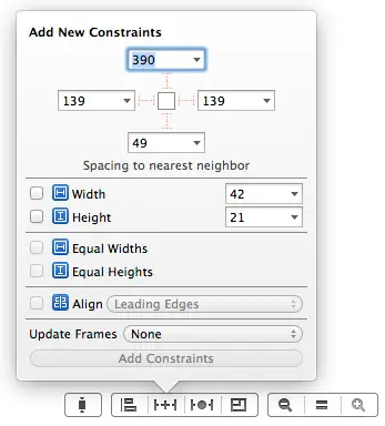
Begin by returning the view to portrait orientation in the simulated metrics panel so that the label is once again visible and select the label within the view canvas. Xcode provides a number of different ways to add constraints to a layout. These options will be covered later in this chapter but by far the easiest is to use the toolbar illustrated in Figure 15 4. With the label selected, click on the Pin menu (Figure 15-6):
Figure 15-6
The goal for this example is to add a constraint to the label such that the bottom edge of the label is always positioned the same distance from the bottom of the containing superview. To do this we are interested in the Spacing to nearest neighbor section of this panel. This provides a visual representation of the view in question (in this case the label) which is represented by the square in the middle. Extending from each side of the square are faded and dotted I-beam icons that connect with fields containing values. The fact that the I-beams are dotted and faded indicates that these are constraints that have not been set. The values indicate the current distances within the layout of the corresponding side to the nearest neighbor. The “nearest neighbor” will either be the nearest view to that side of the currently selected view, or the corresponding side of the superview.
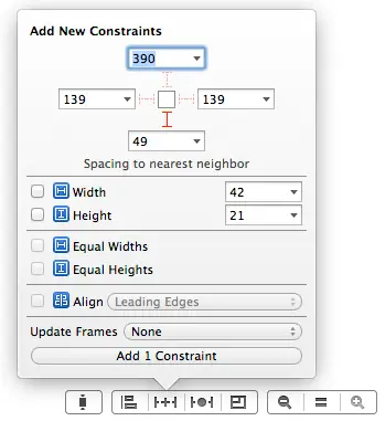
Select the constraint I-beam icon located beneath the view so that appears in solid red (as shown in Figure 15-7) to indicate that the constraint is now set before clicking on the Add 1 Constraint button to add the constraint to the view.
Figure 15-7
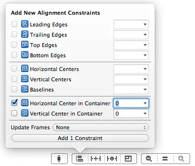
Having added a constraint, auto layout now knows that the bottom edge of the label must always be positioned a fixed distance from the bottom edge of the containing superview. The layout is still missing a constraint to designate the horizontal position of the label in the superview. One way to add this constraint is to make use of the Align menu. With the label still selected in the view canvas and the Align menu panel displayed, enable the checkbox next to the Horizontal Center in Container property (Figure 15-8). Since no offset from the center is required, leave the offset value at 0.
Figure 15-8
With the constraint appropriately configured, click on the Add 1 Constraint button to add the constraint to the view.
Having configured some constraints, rotate the orientation once again, noting this time that the label is visible and positioned sensibly. Switching between display form factors should also demonstrate that the constraints are working to keep the label correctly positioned for different devices.
Figure 15-9
In this example so far only a small subset of the auto layout features provided by Xcode 5 has been used. In actual fact, Xcode 5 provides a wide range of options and visual cues that are designed to ease the task of creating auto layout constraints.
The Auto Layout Features of Interface Builder
A number of features have been added to Xcode 5 in order to assist in the implementation of auto layout based constraints. This section will present a guided tour of these features.
Suggested Constraints
When objects are added to a layout canvas, Interface Builder does not implement any default constraints on those views leaving the developer to add constraints as needed. There is, however, the option to have Interface Builder apply suggested constraints. When this option is used, Interface Builder will apply what it believes to be the correct constraints for the layout based on the positioning of the views. Suggested constraints can be added either to the currently selected view objects, or to an entire scene layout.
In situations where constraints are missing from a layout resulting in warnings, Interface Builder also provides the option to automatically add the constraints that it believes are missing.
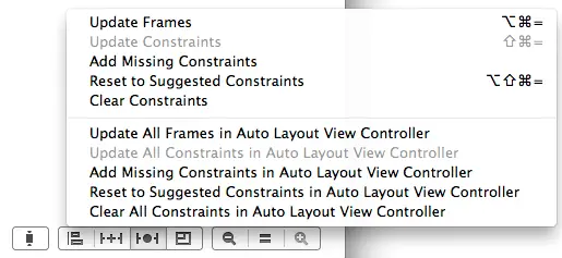
The options to perform these tasks are accessed via the Resolve Auto Layout Issues menu in the toolbar as illustrated in Figure 15-10.
The top section of the menu represents tasks that relate to the currently selected views in the canvas, whilst the options in the lower section apply to all views in the currently selected view controller scene.
Figure 15-10
Most of the time, the suggested constraints will exactly match the required layout behavior and occasionally, the suggested constraints will be incorrect. Most of the time, however, the suggested constraints provide an excellent starting point for implementing auto layout. A typical process for designing a user interface might, therefore, involve positioning the views by dragging and dropping them into place, applying suggested constraints and then editing and fine tuning those constraints to perfect the layout.
To see suggested constraints in action, select the label view in the AutoLayout project and select the Clear Constraints option from the Resolve Auto Layout Issues menu. At this point there are no constraints in the layout and the old positioning problem appears when the view is rotated. With the label still selected, choose the Reset to Suggested Constraints menu option. A review of the view canvas, and change of orientation should demonstrate that Interface Builder has suggested and applied the exact same constraints that we previously added manually.
Visual Cues
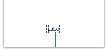
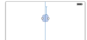
Interface Builder includes a number of visual cues in the layout canvas to highlight the constraints currently configured on a view and to draw attention to areas where problems exist. When a view is selected within the layout canvas, the constraints that reference that view will be represented visually. Consider, for example, the label view created in our AutoLayout example application. When selected in the canvas, a number of additional lines appear as shown in Figure 15-11:
Figure 15-11
The vertical line that runs through the center of the label indicates the presence of a constraint that positions the label in the horizontal center of the parent view (analogous to the NSLayoutAttributeCenterX attribute). If expressed as an equation, therefore, this would read as:
label.NSLayoutAttributeCenterX = superview.NSLayoutAttributeCenterX
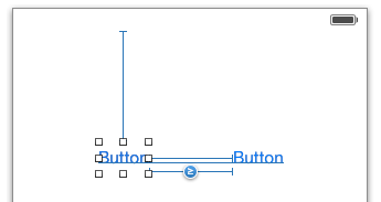
The I-beam line running from the bottom edge of the label view to the bottom edge of the parent view indicates that a vertical space constraint is in place between the two views. The absence of any additional visual information on the line indicates that this is an equality constraint. Figure 15-12 shows an example of a “greater than or equal to” horizontal constraint between two button views:
Figure 15-12
The horizontal line running beneath the Button label text indicates that constraints are in place to horizontally align the content baseline (represented by NSLayoutAttributeBaseline) of the two buttons.
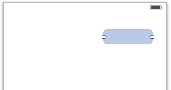
Width constraints are indicated by an I-beam line running parallel to the edge of the view in the corresponding dimension. The text view object in Figure 15 13, for example, has a “greater than or equal to” width constraint configured:
Figure 15-13
Learn SwiftUI and take your iOS Development to the Next Level |
Highlighting Constraint Problems
<google>ADSDAQBOX_FLOW</google> Interface Builder also uses a range of visual cues and decorations to indicate that constraints are either missing, ambiguous or in conflict. Valid and complete auto layout configurations are drawn using blue lines. When part of a layout is ambiguous the constraint lines are orange.
Ambiguity typically occurs when a constraint is missing. Take for example the label view used earlier in the chapter. If only the horizontal center constraint is set, that constraint line will appear in orange because auto layout does not know where to position the view in the vertical plane. Once the second constraint is set between the bottom edge of the label and the bottom of the superview the constraint line will turn blue to indicate that the layout is no longer ambiguous.
Red constraint lines are used to indicate that constraints are in conflict. Consider, for example, a view object on which two width constraints have been configured, each for a different width value. The auto layout system categorizes such a situation as a constraint conflict and Interface Builder draws the offending constraint lines on the layout canvas in red. Figure 15 14, for example, illustrates a conflict where one constraint is attempting to set the width of a view to 94 points while a second constraint dictates that the width must be greater than or equal to 99 points:
Figure 15-14
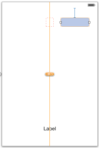
The layout canvas does not dynamically update the positions and sizes of the views that make up a user interface as constraints are added. It is possible, therefore, to have constraints configured that will result in layout behavior different to that currently displayed within the canvas. When such a situation arises, Interface Builder will draw a dotted orange outline indicating the actual size and location of the frame for the currently selected item. This is, perhaps, best demonstrated with an example. Within the AutoLayout project, add a Text View object to the layout so that it is positioned near to the top of the view and to the right of the horizontal center as shown in Figure 15-15:
Figure 15-15
Select the new Text View object and, using the Pin menu, establish a spacing to nearest neighbor constraint from the top of the text view to the top of the superview. Using the Align menu, add another constraint that aligns the view with the horizontal center in the container. Having established these constraints, review the constraint lines within the view canvas. As outlined in Figure 15-16, the horizontal center constraint appears in orange with a number assigned to it. A dotted box also appears on this line, level with the text view object. Interface Builder is attempting to warn us that the size and position of this view is going to resemble the dotted orange box at run time, and not the size and position currently shown for the view in the canvas. The number on the horizontal center constraint tells us that the horizontal position of the object is going to be 84.5 points to the left of the current position.
Figure 15-16
To reset the view to the size and position dictated by the constraints so that the canvas matches the runtime layout, simply select the Text View object, display the Resolve Auto Layout Issues menu and select the Update Frames menu option. The canvas will subsequently update to reflect the correct layout appearance (Figure 15-17). Alternatively, the Update All Frames menu option can be used to update all the frames in the current view controller scene.
Figure 15-17
Viewing, Editing and Deleting Constraints
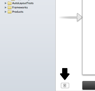
All of the constraints currently set on the views of a user interface may be viewed at any time from within the Document Outline panel that is positioned to the left of the Interface Builder canvas area. Hidden by default, this panel can be displayed by clicking on the button in the bottom left hand corner of the storyboard canvas (marked by the arrow in Figure 15-18).
Figure 15-18
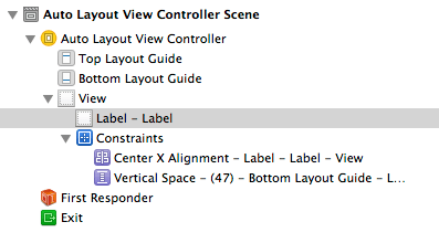
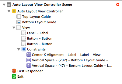
Within this outline, a category listed as Constraints will be present which, when unfolded, will list all of the constraints currently configured for the layout. Note that when more than one container view is present in the view hierarchy there will be a separate constraints list for each one. Figure 15-19, for example, lists the constraints for the user interface represented in Figure 15-11 above:
Figure 15-19
As each constraint is selected from the outline list, the corresponding visual cue element will highlight within the layout canvas.
The details of a particular constraint may be viewed and edited at any time using a variety of methods. One method is simply to double click on the constraint line in the canvas to display a constraint editing panel:
Figure 15-20
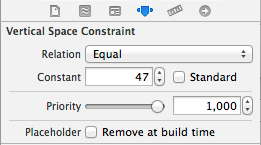
Another option is to select the constraint either from within the layout canvas or in the Document Outline panel. Once selected, display the Attributes Inspector in the Utilities panel (View -> Utilities -> Show Attributes Inspector) to view and edit the properties of the constraint. Figure 15-21 illustrates the settings for an equality spacing constraint. The exact settings displayed will depend on the nature of the constraint selected. Note, however, that in this instance it is possible to change the relation, constant and priority of the constraint. To set the constant to a value that reflects the recommended standard spacing, simply select the Standard checkbox:
Figure 15-21
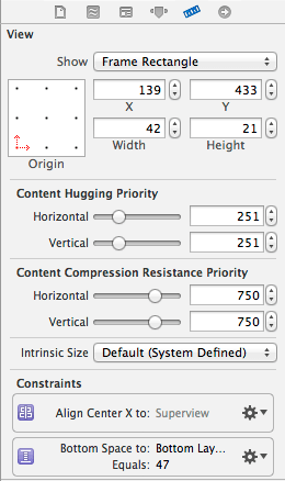
A listing of the constraints associated with a specific view can be obtained by selecting that view in the layout canvas and displaying the Size Inspector in the Utilities panel. Figure 15-22, for example, lists two constraints that reference the currently selected view. Clicking on the settings cog icon on any constraint will provide options to edit or delete the constraint. In addition, constraints can be removed by selecting them in the layout canvas and pressing the keyboard Delete key.
Figure 15-22
Creating New Constraints in Interface Builder
New user constraints can be created in Interface Builder using a variety of approaches, keeping in mind that constraints can relate to more than one view at a time. For example to configure an alignment constraint, all of the views which are to be included in the alignment operation must be selected before creating the constraints.
One of the easiest ways, as demonstrated earlier in this chapter, is to use the various options in the toolbar in the bottom right hand corner of the storyboard canvas (Figure 15-4).
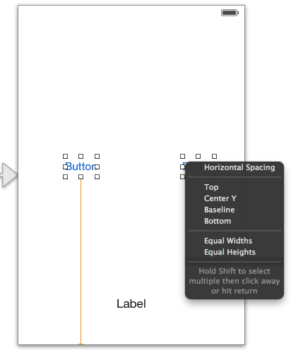
Another useful option is simply to Ctrl-click within a view and then drag the resulting line outside of the boundary of the view. On releasing the line, a context menu will appear providing constraint options. The menu options provided will depend on the direction in which the line was dragged. If the line is dragged downwards, for example, the menu will include options to add a constraint to the bottom of the view, or to center vertically within the container. Dragging horizontally, on the other hand, provides the option to attach to the corresponding edge of the container or to center horizontally. Dragging the line to another view in the canvas will provide options (Figure 15-23) to set up spacing, alignment and size equality constraints between those views.
Figure 15-23
Resolving Auto Layout Problems
Another advantage of implementing auto layout constraints in Xcode is that a number of features have been added in Xcode 5 to assist in resolving problems. In the first instance, descriptions of current issues can be obtained by clicking on the yellow warning triangle in the top right hand corner of the canvas area:
Figure 15-24
Solutions to some problems may be implemented by using the options in the Resolve Auto Layout Issues menu to perform tasks such as automatically adding missing constraints or resetting to suggested constraints.
More detailed resolution options are available from within the document outline panel. When issues need to be resolved, a red circle with a white arrow appears next to the corresponding view controller name in the outline panel as shown in Figure 15 25:
Figure 15-25
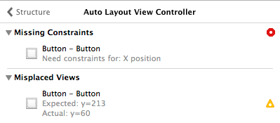
Clicking on the red circle displays all current layout issues listed by category:
Figure 15-26
Hovering over a category title (for example Missing Constraints) will display an information symbol which, when clicked, will display a detailed description of the problem type.
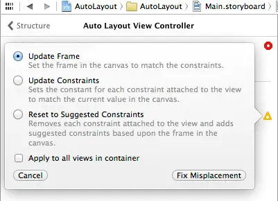
Clicking on the error or warning symbol will display a panel providing one or more possible solutions together with a button to apply the selected change:
Figure 15-27
Summary
Within this chapter we have looked at a very simplistic example of the benefits of using Auto Layout in iOS 7 user interface design. The remainder of the chapter has been dedicated to providing an overview of the Auto Layout features that have been added to the latest release of Xcode.
Learn SwiftUI and take your iOS Development to the Next Level |
| Previous | Table of Contents | Next |
| An Introduction to Auto Layout in iOS 7 | An iOS 7 Auto Layout Example |
