Working with the Android 6 GridLayout using XML Layout Resources
| Previous | Table of Contents | Next |
| Using the Android 6 GridLayout Manager in Android Studio Designer | An Overview and Example of Android 6 Event Handling |
The previous chapter (entitled Using the Android 6 GridLayout Manager in Android Studio Designer) introduced the basic concepts of the Android GridLayout manager before explaining how to create a GridLayout based user interface design using the design mode of the Android Studio Designer tool. Visually designing a GridLayout based user interface is not, however, the only available method of working with the GridLayout class. Such layouts may also be implemented by directly writing Java code or manually creating elements in an XML layout file, the latter of which is the topic of this chapter.
GridLayouts in XML Resource Files
A GridLayout is declared within an XML file using the <GridLayout> element tag. For example:
<GridLayout xmlns:android="http://schemas.android.com/apk/res/android"
    xmlns:tools="http://schemas.android.com/tools"
    android:id="@+id/GridLayout1"
    android:layout_width="wrap_content"
    android:layout_height="wrap_content"
    android:orientation="vertical"
    tools:context=".GridLayoutActivity">

</GridLayout>
The above XML syntax applies when the GridLayout is the root element of a user interface design (in other words the top most layout in the view hierarchy). In situations where the GridLayout is nested as a child of another container the syntax changes slightly. The following XML, for example, shows a GridLayout instance embedded in a RelativeLayout manager where the RelativeLayout is the root element of the user interface:
<RelativeLayout xmlns:android="http://schemas.android.com/apk/res/android"
    xmlns:tools="http://schemas.android.com/tools"
    android:layout_width="match_parent"
    android:layout_height="match_parent"
    tools:context=".GridLayoutActivity">

    <GridLayout
        android:layout_width="wrap_content"
        android:layout_height="wrap_content"
        android:layout_alignParentTop="true"
        android:layout_alignParentLeft="true"
        android:layout_alignParentStart="true"
        android:orientation="vertical">

    </GridLayout>

</RelativeLayout>
The number of rows and columns within the grid can be declared using the android:rowCount and android:columnCount properties. Typically, however, if the number of columns is declared the GridLayout will infer the number of rows based on the number of occupied cells making the use of the rowCount property unnecessary.
Similarly, the orientation of the GridLayout may optionally be defined via the android:orientation property. The following example XML declares a 2 x 2 GridLayout configuration in horizontal orientation:
<GridLayout xmlns:android="http://schemas.android.com/apk/res/android"
    xmlns:tools="http://schemas.android.com/tools"
    android:id="@+id/GridLayout1"
    android:layout_width="wrap_content"
    android:layout_height="wrap_content"
    android:columnCount="2"
    android:rowCount="2"
    android:orientation="horizontal"
    tools:context=".GridLayoutActivity">
</GridLayout>
Adding Child Views to the GridLayout
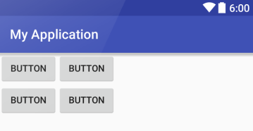
Child views can be added to a GridLayout by declaring the elements within the <GridLayout> structure in the XML file. If no row and column values are declared for a child it is positioned automatically by the GridLayout class based on the configuration of the layout and the position of the view in the XML file. The following XML places four buttons within the above GridLayout, with each view placed in the top left hand corner of the encapsulating cell:
<GridLayout xmlns:android="http://schemas.android.com/apk/res/android"
    xmlns:tools="http://schemas.android.com/tools"
    android:id="@+id/GridLayout1"
    android:layout_width="wrap_content"
    android:layout_height="wrap_content"
    android:columnCount="2"
    android:rowCount="2"
    android:orientation="horizontal"
    tools:context=".GridLayoutActivity">

    <Button
        android:id="@+id/button1"
        android:layout_gravity="start|top"
        android:text="Button" />

    <Button
        android:id="@+id/button2"
        android:layout_gravity="start|top"
        android:text="Button" />

    <Button
        android:id="@+id/button3"
        android:layout_gravity="start|top"
        android:text="Button" />

    <Button
        android:id="@+id/button4"
        android:layout_gravity="start|top"
        android:text="Button" />

</GridLayout>
<google>ADSDAQBOX_FLOW</google> The above layout would be visually represented as illustrated in Figure 19-1:
Figure 19-1
Note that after entering the above XML code it may be necessary to click on the refresh button located in the Designer toolbar in order for the user interface to appear correctly.
A view can be placed within a specific cell by specifying the intersecting row and column number of the destination cell. The following Button view, for example, will be placed in the cell located at row 1, column 2 of the parent GridLayout:
<Button
     android:id="@+id/button5"
     android:layout_column="2"
     android:layout_row="1"
     android:layout_gravity="start|top"
     android:text="Button" />
Declaring Cell Spanning, Gravity and Margins
The child of a GridLayout can be configured to span multiple cells using the android:layout_rowSpan and android:layout_columnSpan properties. The gravity of the child is controlled via the android:layout_gravity property.
In the XML fragment below, a Button view is configured to span 3 columns and 2 rows and to fill the space available both horizontally and vertically:
<Button
     android:id="@+id/button4"
     android:layout_columnSpan="3"
     android:layout_rowSpan="2"
     android:layout_gravity="fill"
     android:text="Button" />
The margins around a view within a cell can be declared for all sides of the view using the android:layout_margin margin property. Alternatively, margins for individual sides may be defined using the topMargin, bottomMargin, leftMargin and rightMargin properties. The following Button view declares a 10dp margin on all four sides:
    <Button
        android:id="@+id/button3"
        android:layout_gravity="left|top"
        android:layout_margin="10dp"
        android:text="Button" />
    <GridLayout
        android:layout_width="wrap_content"
        android:layout_height="wrap_content"

        <Button
            android:layout_width="wrap_content"
            android:layout_height="wrap_content"
            android:text="New Button"
            android:id="@+id/button4"
            android:layout_row="1"
            android:layout_column="0"
            android:layout_columnSpan="2"
            android:layout_gravity="fill_horizontal" />

        <Button
            android:layout_width="wrap_content"
            android:layout_height="wrap_content"
            android:text="New Button"
            android:id="@+id/button"
            android:layout_row="0"
            android:layout_column="1" />

        <Button
            android:layout_width="wrap_content"
            android:layout_height="wrap_content"
            android:text="New Button"
            android:id="@+id/button3"
            android:layout_row="0"
            android:layout_column="0" />

        <Button
            android:layout_width="wrap_content"
            android:layout_height="wrap_content"
            android:text="New Button"
            android:id="@+id/button2"
            android:layout_row="0"
            android:layout_column="2"
            android:layout_rowSpan="2"
            android:layout_gravity="fill_vertical" />
    </GridLayout>
The above resource file fragment appears exactly as it was created within the Android Studio Designer tool in the preceding chapter. As can be seen, it contains a GridLayout manager and four Button views with cell positions specified by row and column properties. Finally, the row and column span values, along with gravity properties are used to make two of the buttons span multiple cells. When deployed within an application, this XML layout would appear as illustrated in Figure 18-13.
Summary
As an alternative to using the Android Studio Designer tool in design mode to create GridLayout based user interface elements, the same objective may also be achieved by manually creating XML layout resources. Having covered the use of the graphical layout approach in the previous chapter, this chapter has covered the concepts of declaring a GridLayout and positioning and configuring child views within an XML resource file.
| Previous | Table of Contents | Next |
| Using the Android 6 GridLayout Manager in Android Studio Designer | An Overview and Example of Android 6 Event Handling |


