An Overview of iOS 6 Collection View and Flow Layout
| Previous | Table of Contents | Next |
| An iPhone iOS 6 Gesture Recognition Tutorial | An iPhone iOS 6 Storyboard-based Collection View Tutorial |
Learn SwiftUI and take your iOS Development to the Next Level |
The Collection View and Flow Layout have been introduced as part of iOS 6 and combine to provide a new, flexible, and some might say long overdue, way to present content to the user. This is essentially achieved by providing a mechanism by which data driven content can be displayed in cells and the arrangement, appearance and behavior of those cells configured to meet a variety of different layout and organizational needs.
Before the introduction of Collection Views and Flow Layout, the closest iOS came to providing organized data presentation involved the use of the Table View. Whilst still a powerful user interface design option, the Table View was intended to fill a very specific need and, as such, has some limitations in terms of flexibility. Table View, for example, displays data in cells arranged in a single column layout. Collections views, on the other hand, provide a high degree of flexibility, allowing cells to be organized in just about any configuration imaginable, including grids, stacks, tiles and circular arrangements.
The goal of this chapter is to present an overview of the key elements that make up collection views prior to working through a step by step tutorial in the next chapter, entitled An iPhone iOS 6 Storyboard-based Collection View Tutorial.
An Overview of Collection Views
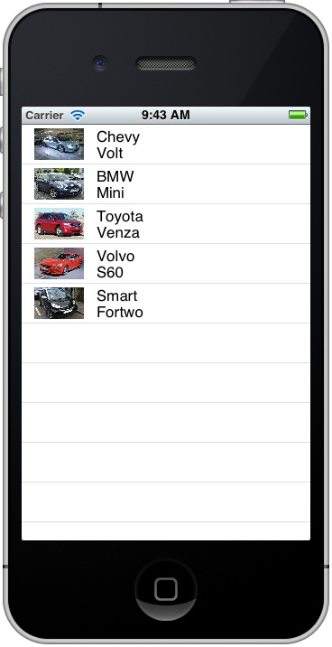
In the chapter entitled Using Xcode Storyboards to Build Dynamic TableViews with Prototype Table View Cells, a Table View layout was used to display a list of cars and corresponding images (Figure 48-1).
Figure 48-1
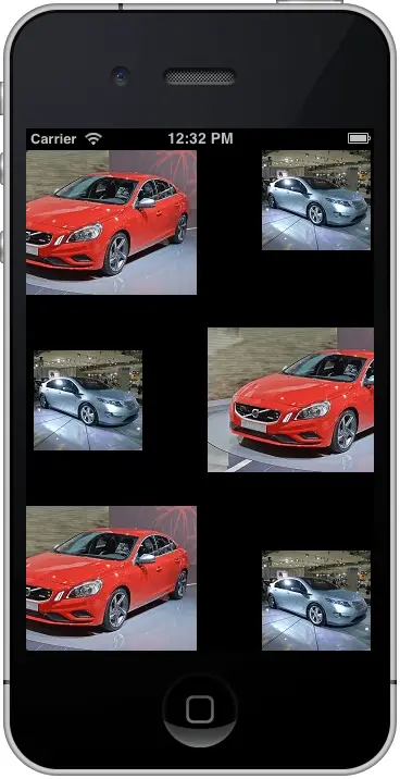
The fact is that whilst this presented the necessary information, the Table View provided very little in the way of customization options. Had the user interface been designed using a collection view, a much more visually appealing user interface could have been implemented. Figure 48-2, for example, illustrates how some of the car images associated with the earlier table view example could have been organized using a collection view configuration.
Figure 48-2
Whilst not entirely obvious from the previous screenshot, the collection view is actually scrollable, allowing the user to swipe left or right to view other car images. It is also important to note that this example is just the default behavior of a collection view with a flow layout. Customization options far beyond this are possible using collection views.
At an abstract level, a collection view consists of four key elements consisting of cells, supplementary views, decoration views and a layout object. A cell is a representation of an item of data to be displayed (for example an image or a set of text based data).
As with the Table View, a collection view may be divided into multiple sections. Supplementary views are objects that provide additional information about a section in a collection view. These are somewhat similar to section headers and footers in table views but are more general purpose and provide a greater level of flexibility in terms of positioning and content.
Decoration views can be used to provide a decorative background for the collection view which scrolls along with the content. The classic example of a decoration view in Apple’s own demonstrations involves constructing the image of a bookshelf behind a collection view containing photo images. It is important to note that the standard Flow Layout class does not support decoration views.
In practical terms, a collection view consists of multiple class instances, each of which will be described in more detail in the remainder of this chapter.
The UICollectionView Class
The UICollectionView class is responsible for managing the data items that are to be displayed to the user. The collection view instance needs a data source object from which to obtain the data items to be displayed, together with a delegate object to handle user interaction with the collection. These objects must implement the UICollectionViewDataSource and UICollectionViewDelegate protocols respectively.
Perhaps the most important requirement for the UICollectionView class is a layout object to control the layout and organization of the cells. By default, the UICollectionViewFlowLayout class is used by instances of the UICollectionView class. In the event that the flow layout does not provide the necessary behavior, this class may also be subclassed and extended to provide additional functionality. Perhaps the most impressive fact, however, is that an entirely new layout class may be created by subclassing UICollectionViewLayout and implementing application specific layout capabilities within that class. The custom layout is then essentially “plugged in” to the UICollectionView instance where it will dictate the layout of the data cells as it has been designed to do.
The UICollectionView class also includes a wide range of methods that can be used to perform such tasks as to add, remove, move, modify and select items.
The UICollectionViewCell Class
As the name suggests, the UICollectionViewCell class is responsible for displaying whatever data is provided to the UICollectionView instance by the data source with one cell corresponding to one data item. In terms of architecture, this class consists of two background views and one content view. The two background views may be used to provide a visual cue to the user when the corresponding cell is selected or highlighted. The content view contains the objects necessary to display the data to the user and can consist of any combination of valid UIKit classes. When adding subviews to a cell it is imperative that those objects be added to the contentView and not the background views, otherwise the objects will not be visible to the user.
There is a clear separation between layout and the contents of a cell. The cell only knows what to display, the sizing and positioning of the cell within the wider context of the collection view is controlled by the layout object assigned to the collection view.
Instances of UICollectionViewCell class are not typically instantiated directly in code. Instead, the class is registered as the cell class for a collection view and is then created internally as needed. Collection views are scrollable and, consequently, at any one time only a subset of the cells in a collection are visible. This enables the system to reuse cell objects that are currently scrolled outside of the viewable area of the screen and only create new ones when necessary. This is achieved using a queuing mechanism and results in improved performance, particularly when dealing with larger data sets.
The UICollectionReusableView Class
The base class from which the UICellCollectionView class is derived, this class is most typically subclassed in application code to create supplementary views.
The UICollectionViewFlowLayout Class
The UICollectionViewFlowLayout class is the default layout class for collection views and is designed to layout cells in a grid-like manner.
This class requires a delegate object that conforms to the UICollectionViewDelegateFlowLayout protocol which is typically the collection view’s UICollectionViewDelegate object.
By default, flow is implemented in a manner similar to that of “line wrapping” in a text editor. When one row of cells is full, the cells flow onto the next row and so on until all cells capable of fitting into the currently visible display region are visible. The flow layout class supports both horizontal and vertical scrolling configurable via the scrollDirection property. In addition, properties such as the spacing between lines of cells in the grid and cells in a row may be configured, together with default sizes for cells and supplementary views (unless overridden via methods implemented in the delegate object).
The UICollectionViewLayoutAttributes Class
- alpha – the transparency of the item.
- center – the location of the center of the item.
- frame – the CGRect frame in which the item is displayed.
- hidden – whether or not the item is currently visible.
- indexPath – the index path location of the item in the collection view.
- representedElementCategory – The type of item for which the attributes apply (i.e. for a cell, supplementary or decoration view).
- size – the size of the item.
- transform3D – the current transform of the item. Attribute can be used to perform tasks such as rotating or scaling the item.
- zIndex – controls the position of the item in the z axis (in other words whether or not it is on top of or below other overlapping items).
The UICollectionViewDataSource Protocol
The UICollectionViewDataSource protocol needs to be implemented by the class responsible for supplying the collection view with the pre-configured cells and supplementary views to be displayed to the user. This basically consists of a number of methods that define information such how many items of data are to be displayed, how the data is divided into different sections and, most importantly, supplies the collection view with the cell objects to be displayed.
Mandatory methods in the protocol are as follows:
- collectionView:numberOfItemsInSection: - Returns the number of items to be displayed in the specified section of the collection view.
- collectionView:cellForItemAtIndexPath: - This method is called by the collection view when it is ready to display a cell at the specified index path location in the collection view. It is required to return a cell object configured appropriately for the referenced index.
Optional methods in the protocol are as follows:
- numberOfSectionsInCollectionView: - Indicates to the collection view the number of sections into which the collection view is to be divided.
- collectionView:viewForSupplementaryElementOfKind:atIndexPath: - Called by the collection view to request a supplementary view of the specified kind. Returns an appropriately configured object to be displayed. In terms of the UICollectionViewFlowLayout class, the layout will request a supplementary view for either a header (UICollectionElementKindSectionHeader) or footer (UICollectionElementKindSectionFooter).
The UICollectionViewDelegate Protocol
The UICollectionViewDelegate protocol defines a set of optional methods which, if implemented, will be called when certain events take place within the corresponding collection. These methods relate primarily to handling user interaction with the collection view elements (such as selecting a specific cell). Some of the key methods in this protocol include:
- collectionView:shouldSelectItemAtIndexPath: - Returns a boolean value indicating whether the specified item is selectable by the user.
- collectionView:didSelectItemAtIndexPath: - Called by the collection view when the specified item has been selected by the user.
- collectionView:shouldDeselectItemAtIndexPath: - Returns a boolean value to indicate whether the specified item may be deselected by the user.
- collectionView:didDeselectItemAtIndexPath: - Called by the collection view when the specified item has been selected by the user.
- collectionView:shouldHighlightItemAtIndexPath: - Returns a boolean value indicating whether the specified item should be highlighted as a pre-cursor to possible selection by the user.
- collectionView:didHighlightItemAtIndexPath: - Called by the collection view when the specified item has been highlighted.
- collectionView:didUnhighlightItemAtIndexPath: - Called by the collection view when the specified item has been un-highlighted.
- collectionView:didEndDisplayingCell:forItemAtIndexPath: - Called by the collection view when the specified cell has been removed from the collection view.
- collectionView:didEndDisplayingSupplementaryView:forElementOfKind:atIndexPath: - Called by the collection view when the specified supplementary view has been removed from the collection view.
The UICollectionViewDelegateFlowLayout Protocol
The UICollectionViewFlowLayout class has a number of properties that can be set to globally set default characteristics for items within a collection view (for example section inset, item spacing, line spacing, inter-cell spacing, supplementary view header and footer sizing etc). Alternatively, these values may be overridden on a per-cell and per-section basis by implementing the following delegate methods in a class which conforms to the UICollectionViewDelegateFlowLayout protocol. In most cases, this will be the same class as that implementing the UICollectionViewDelegate protocol. Note that in each case, the method is passed a reference either to the cell or section for which information is required:
- collectionView:layout:sizeForItemAtIndexPath: - Required to return to the flow layout object the size attributes for the item at the specified index path.
- collectionView:layout:insetForSectionAtIndex: - Required to return the inset value for the specified collection view section.
- collectionView:layout:minimumLineSpacingForSectionAtIndex: - Required to return the inset value for the specified collection view section.
- collectionView:layout:minimumInteritemSpacingForSectionAtIndex: - Required to return the interim spacing between cells in a row for the specified collection view section.
- collectionView:layout:referenceSizeForHeaderInSection: - Required to return the size for the header supplementary view for specified collection view section. Note that if a size is not specified, the view will not appear.
- collectionView:layout:referenceSizeForFooterInSection: - Required to return the size for the footer supplementary view for specified collection view section. Note that if a size is not specified, the view will not appear.
Cell and View Reuse
As previously discussed, the code for a typical application using a collection view will not directly create instances of either the cell or supplementary view classes. The reasoning behind this becomes evident when performance and memory requirements are taken into consideration. Consider, for example, a collection view that is required to display 1000 photo images. It can be assumed with a reasonable degree of certainty that only a small percentage of cells will be visible to the user at any one time. If the application were permitted to create each of the 1000 cells in advance the device would very quickly run into memory limitations.
Instead, the application begins by registering with the collection view the class to be used for cell objects, along with a reuse identifier. If the cell class was written in code, the registration is performed using the registerClass: method of UICollectionView. For example:
[self.myCollectionView registerClass:[MyCollectionViewCell class] forCellWithReuseIdentifier:@"MYCELL"];
In the event that the cell is contained within an Interface Builder NIB file, the registerNib: method is used instead.
The same concept applies to supplementary views which must also be registered with the collection view using either the registerClass:forSupplementaryViewOfKind: and registerNib:forSupplementaryViewOfKind: methods.
Perhaps the most important point to remember from this chapter is that if the cell or supplementary views are created using prototypes within a storyboard it is not necessary to register the class in code and, in fact, doing so will prevent the cell or view from appearing when the application runs.
As the collection view initializes, it calls the cellForItemAtIndexPath: method of the datasource class passing through the index path for which a cell object is required. This method will then call the dequeueReusableCellWithReuseIdentifier: method of the collection view, passing through both the index path and the reuse ID assigned to the cell class when it was registered, to find out if there is a reusable cell object in the queue that can be used for this new cell. Since this is the initialization phase and no cells have been deemed eligible for reuse, the method will create a new cell and return it. Once all the visible cells have been created the collection view will stop asking for more cells. The code for the cellForItemAtIndexPath: will typically read as follows (though the code to customize the cell before returning it will be implementation specific):
-(UICollectionViewCell *)collectionView:(UICollectionView *)collectionView cellForItemAtIndexPath:(NSIndexPath *)indexPath
{
    CollectionViewCell *myCell =
         [collectionView
                 dequeueReusableCellWithReuseIdentifier:@"MYCELL"
                 forIndexPath:indexPath];

    UIImage *image;

    if ([indexPath row] % 2)
            image = [UIImage imageNamed:@"volvo_s60_small.jpg"];
    else
        image = [UIImage imageNamed:@"chevy_volt.jpg"];

    myCell.myImage.image = image;

    return myCell;
}
As the user scrolls through the collection view, some cells will move out of the visible frame. When this happens, the collection view places them on the reuse queue. As cells are moving out of view, new ones are likely to be coming into view. For each cell moving into the view area, the collection view will call cellForItemAtIndexPath:. This time, however, when a call to dequeueReusableCellWithReuseIdentifier: is made, it is most likely that an existing cell object will be returned from the reuse queue, thereby avoiding the necessity to create a new object.
These same reuse concepts apply equally to supplementary views, with the exception that the collection view will call the viewForSupplementaryElementOfKind: method of the data source when seeking a view object which must, in turn, call dequeueReusableSupplementaryViewOfKind:.
Summary
Collection view and the flow layout were introduced into iOS 6 to provide a flexible approach to displaying data items to the user. The key objectives of collection views are flexibility and performance.
This chapter has outlined the overall concepts behind collection views and flow layout before looking in some detail at the different classes that can be brought together to implement collection views in iOS 6 applications. Finally, the chapter provided an explanation of cell and supplementary view object reuse.
The next chapter will work through the creation of an example application that utilizes collection views to present a gallery of images to the user.
Learn SwiftUI and take your iOS Development to the Next Level |
| Previous | Table of Contents | Next |
| An iPhone iOS 6 Gesture Recognition Tutorial | An iPhone iOS 6 Storyboard-based Collection View Tutorial |


