Using the Android 6 GridLayout Manager in Android Studio Designer
| Previous | Table of Contents | Next |
| Creating an Android 6 User Interface in Java Code | Working with the Android 6 GridLayout using XML Layout Resources |
A useful layout manager that was introduced as part of the Android 4.0 SDK is the GridLayout manager class. As the name suggests, this class allows child views to be arranged in a grid layout. There are a number of ways to implement the GridLayout within the user interface of an Android application, including through the use of layout resources and Java code. Perhaps the easiest approach, however, is to make use of some GridLayout specific features built into the Android Studio Designer tool.
This chapter will introduce the basics of the GridLayout class before exploring the creation of a GridLayout-based user interface using Android Studio Designer. Directly creating GridLayout user interface designs using XML layout resources as an alternative to using the Designer tool will be covered in the next chapter, entitled Working with the Android GridLayout using XML Layout Resources.
Introducing the Android GridLayout and Space Classes
The purpose of the GridLayout is to allow child views to be positioned in a grid arrangement. The GridLayout essentially consists of a number of invisible horizontal and vertical grid lines that serve to divide the layout view into a series of rows and columns, with each intersecting row and column forming a cell which can, in turn, contain one or more views. The grid lines are referred to as indices, which are numbered starting at 0 for the line at the leading edge of the layout. Row and column numbering also starts at 0 beginning in the top left hand corner of the grid.
The positioning of a view within a cell can be defined through the use of gravity settings on that child view. The gravity of a child view can, for example, be configured such that the view appears centered, fills the entire cell or is positioned in a specific corner of the cell within which it resides.
In addition, a child view of a GridLayout parent may also be configured to span multiple rows and columns through the use of the rowSpan and columnSpan properties of the child.
Another useful class that can be used in conjunction with the GridLayout is the Space class. This is a very simple class, the sole purpose of which is to create gaps within layouts. In the case of the GridLayout class, a Space view can be placed in any cell much like any other view object.
In addition to using the Space class to create gaps, the spacing around views in cells can be controlled via the various margin layout properties (top, bottom, left and right) of each child.
The GridLayout Example
Given the visual nature of both the GridLayout class and the Android Studio Designer tool, the best way to gain a level of familiarity with the concepts involved is to work through an example. The remainder of this chapter, therefore, will create an example application that demonstrates some of the key features of the GridLayout class within the context of the Designer tool.
Creating the GridLayout Project
Begin by launching Android Studio and creating a new project. Within the New Project dialog, enter GridLayoutSample into the Application name field and ebookfrenzy.com as the Company Domain setting before clicking on the Next button.
Creating the GridLayout Instance
<google>ADSDAQBOX_FLOW</google> Within the project tool window, navigate to the app -> res -> layout folder and double click on the activity_grid_layout_sample.xml file to load it into the Android Studio Designer.
With the layout displayed, select the “Hello World!” Text View object and press the keyboard Delete key to remove it from the layout.
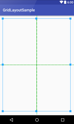
The layout design currently consists solely of a RelativeLayout manager to which we can now add a GridLayout manager instance. From the Layouts section of the Designer palette, select a GridLayout manager and drag and drop it on the device screen. The layout should fill the screen with padding margins on each side as shown in Figure 18-1:
Figure 18-1
For the purposes of this tutorial, the GridLayout is only required to be large enough to accommodate the child views contained therein. As such, the height and width parameters of the GridLayout view need to be changed from match_parent to wrap_content. One way to make this change is to locate the properties in the Designer tool’s Properties panel. A quicker option is to select the GridLayout instance and use the two buttons in the Designer toolbar. Set the width property by clicking on the layout width button as highlighted in Figure 18-2:
Figure 18-2
Having set the width property to wrap_content, click on the adjacent toolbar button to similarly set the layout_height property. These settings will have the effect of shrinking the layout down to a small square ready to accommodate some child views. If the GridLayout instance is still positioned in the center of the screen, click and drag it to the upper left hand corner.
Adding Views to GridLayout Cells
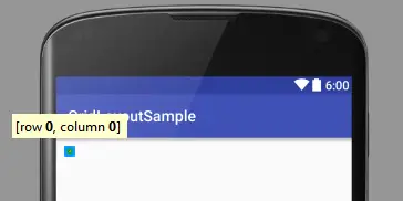
To place view objects into the cells of a GridLayout, simply click on the required view in the palette and drag it to the GridLayout instance in the device screen layout canvas. As the view passes over the GridLayout, information will appear indicating the placement of the view if it is dropped at that point. Begin by clicking and dragging a Button view from the palette over to the top left hand corner of the GridLayout as illustrated in Figure 18-3:
Figure 18-3
As is evident from the message displayed by the tool, releasing the view at this point will position it in the cell referenced by the co-ordinates of 0,0.
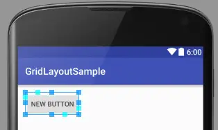
Release the view at this point and note that the Button is placed in the cell as shown in Figure 18-4:
Figure 18-4
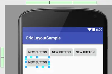
Note also that green bars have appeared in the margins on the upper and right-hand sides of the main Designer area. These bars represent the rows and columns present in the GridLayout (currently the layout has one row and one column).
Repeat the above steps to place a second button into the GridLayout so that it is positioned in row zero and after column 0 such that it appears immediately to the right of the first button.
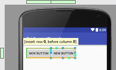
Drag a third Button view to a position to the left of the first Button view until the message shown in Figure 18 5 appears providing the option to shift column 0 right and insert the new view into the cell at 0,0:
Figure 18-5
When the view is dropped at this position, the existing columns will be shifted one place to the right, a new column will be inserted at the left hand edge of the GridLayout and the new button placed into the cell.
Figure 18-6
Moving and Deleting Rows and Columns
Note that as additional rows and columns have been added, additional green bars have appeared in the margins to represent those rows and columns. These bars are not purely informational. Entire rows and columns can be moved by clicking and dragging the corresponding green block to a new position within the same axis. Right-clicking on a block and selecting Delete from the resulting menu will remove the entire row or column from the GridLayout.
Implementing Cell Row and Column Spanning
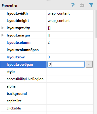
For the next phase of this tutorial, two of the Button views will be modified to span multiple cells. To begin with, the far right hand button in the top row will be modified to span both rows. To achieve this, select the button from the layout and locate the layout:rowSpan property listed in the Properties panel. Once located, enter the value of 2 into the field as highlighted in Figure 18-7:
Figure 18-7
Next, select the sole Button view on the second row, this time changing the corresponding layout:columnSpan value in the Properties panel to 2.
These two views are now configured to span multiple cells. A review of the layout canvas, however, shows that the views have remained the same size even though the cells in which they reside now span multiple rows or columns. The reason for this is that the gravity settings for these views need to be changed.
Changing the Gravity of a GridLayout Child
The gravity properties of the child views of a GridLayout dictate the size and positioning of those views relative to the cell in which those views are contained. By default, the views added so far in this chapter have been set up to be aligned with the top left hand corner of the containing cells. In order to make the above cell spanning visible, the gravity of the two Button views need to be changed so that the views occupy the space available.
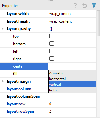
One option is to center the child view within the cell. Begin by selecting the top right hand Button view. In the Properties panel, locate the layout:gravity line and click on the center value field to drop down a list of available options. From the list, select the vertical value as shown in Figure 18-8:
Figure 18-8
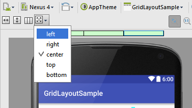
A subset of gravity properties may also be configured using the Designer toolbar Gravity button as illustrated in Figure 18-9:
Figure 18-9
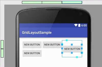
Having set this property, the Button view will now be centered vertically between the two cells:
Figure 18-10
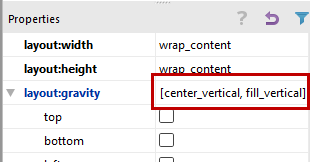
Figure 18-11
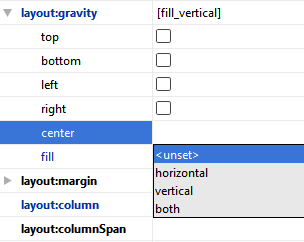
Since the center_vertical property is no longer required, turn it off by dropping down the center property menu (Figure 18-12) and selecting the <unset> option:
Figure 18-12
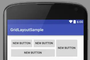
Add a gravity property to the second row button, this time enabling the fill_horizontal gravity setting. After changing the gravity flags, the two buttons should have expanded to fill the spanned cells:
Figure 18-13
Summary
The GridLayout class allows views to be arranged in a grid layout where one or more views are contained within grid cells. Each child can be configured to span multiple cells both horizontally and vertically. The position and sizing behavior of a child view within a cell or range of cells is controlled through the configuration of gravity settings.
GridLayouts may be implemented either using the Android Studio Designer in design mode, or through the use of Java code or XML layout resources. This chapter has covered the design mode approach. The next chapter will look at the use of XML layout resources to implement GridLayout configurations.
| Previous | Table of Contents | Next |
| Creating an Android 6 User Interface in Java Code | Working with the Android 6 GridLayout using XML Layout Resources |


