Using the Android GridLayout Manager in the Graphical Layout Tool
| Previous | Table of Contents | Next |
| Creating an Android User Interface in Java Code | Working with the Android GridLayout in XML Layout Resources |
<google>BUY_ANDROID</google>
A useful layout manager that was recently added to the Android SDK is the GridLayout manager class. As the name suggests, this class allows child views to be arranged in a grid layout. There are a number of ways to use the GridLayout within the user interface of an Android application, including through the use of layout resources and Java code. Perhaps the easiest approach, however, is to make use of some GridLayout specific features that have been added to the Graphical Layout tool.
This chapter will introduce the basics of the GridLayout class before exploring the creation of a GridLayout-based user interface using the Graphical Layout tool. Using XML layout resources as an alternative to using the Graphical Layout tool will be covered in the next chapter, entitled Working with the Android GridLayout in XML Layout Resources.
Introducing the Android GridLayout and Space Classes
The purpose of the GridLayout is to allow child views to be positioned in a grid arrangement. The GridLayout essentially consists of a number of invisible horizontal and vertical grid lines that serve to divide the layout view into a series of rows and columns, with each intersecting row and column forming a cell which can, in turn, contain one or more views. The grid lines are referred to as indices, which are numbered starting at 0 for the line at the leading edge of the layout. Row and column numbering also starts at 0 beginning in the top left hand corner of the grid (though, as will be discovered later in this chapter, the Graphical Layout tool considers this to be position 1).
The positioning of a view within a cell can be defined through the use of gravity settings on that child view. The gravity of a child view can, for example, be configured such that the view appears centered, fills the entire cell or is positioned in a specific corner of the cell within which it resides.
In addition, a child view of a GridLayout parent may also be configured to span multiple rows and columns through the use of the rowSpan and columnSpan properties of the child.
Another useful class that can be used in conjunction with the GridLayout is the Space class. This is a very simple class, the sole purpose of which is to create gaps within layouts. In the case of the GridLayout class, a Space view can be placed in any cell much like any other view object.
In addition to using the Space class to create gaps, the spacing around views in cells can be controlled via the various margin layout properties (top, bottom, left and right) of each child.
The GridLayout Example
Given the visual nature of both the GridLayout class and the Graphical Layout tool, the best way to gain a level of familiarity with the concepts involved is to work through an example. The remainder of this chapter, therefore, will create an example application that demonstrates some of the key features of the GridLayout class within the context of the Graphical Layout tool.
Creating the GridLayout Project
Begin by launching Eclipse and selecting the File -> New - > Android Application Project menu option. Within the resulting New Android Application dialog, enter GridLayoutSample as both the application and project names. Declare a suitable package name, or use com.example.gridlayoutsample as a placeholder name.
Set the SDK menus to the latest SDK available (at time of writing this is Android 4.4 Kit Kat) before clicking Next. On the subsequent screens simply accept the default settings until the Blank Activity screen appears at which point the activity should be named GridLayoutSampleActivity with a corresponding layout and fragment layout named activity_grid_layout_sample and fragment_grid_layout_sample respectively.
Click on the Finish button to initiate the project creation process.
Creating the GridLayout Instance
On creation of the new project, Eclipse should have displayed the Graphical Layout tool and pre-loaded the fragment_grid_sample.xml file. In the event that this is not the case, simply navigate to GridLayoutSample -> <package name> -> res -> layout in the Package Explorer panel and double click on the fragment_grid_layout.xml file.
With the layout displayed, select the Hello World! Text View object and press the keyboard Delete key to remove it from the layout. Next, right-click on the white layout view background and select Change Layout… from the resulting menu. In the Change Layout dialog, select GridLayout from the New Layout Type: menu and click on OK to change the layout type.
For the purposes of this tutorial, the GridLayout is only required to be large enough to accommodate the child views contained therein. As such, the height and width parameters of the view need to be changed from match_parent to wrap_content. To make this change, select the layout, either by clicking on the white background of the user interface canvas, or from within the Outline panel. With the view selected, unfold the Layout Parameters section of the Properties panel and change the Width and Height values to wrap_content as illustrated in Figure 15-1:
<google>ADSDAQBOX_FLOW</google>
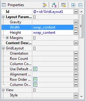
Figure 15-1
Finally, switch to the XML view of the layout resource file by clicking on the fragment_grid_layout.xml tab located along the bottom edge of the Graphical Layout panel and edit the XML to remove the padding properties:
<GridLayout xmlns:android="http://schemas.android.com/apk/res/android"
    xmlns:tools="http://schemas.android.com/tools"
    android:id="@+id/GridLayout1"
    android:layout_width="wrap_content"
    android:layout_height="wrap_content"
    android:paddingBottom="@dimen/activity_vertical_margin"
    android:paddingLeft="@dimen/activity_horizontal_margin"
    android:paddingRight="@dimen/activity_horizontal_margin"
    android:paddingTop="@dimen/activity_vertical_margin"
    tools:context=".GridLayoutActivity" >

</GridLayout>
The GridLayout instance is now ready to have some views placed within cells.
An Overview of the GridLayout in the Graphical Layout Tool
The first point to note about the Graphical Layout tool is that some additional toolbar buttons (Figure 15-2) appear when a GridLayout is present in the user interface.
Figure 15-2
The left-most button switches the tool in and out of Grid Model Mode. Grid Model Mode provides a greater level of control over adding, deleting and inserting rows and columns. When dragging views from the palette on to the layout canvas in this mode, options will be provided to insert and add rows to the GridLayout to accommodate the current position of the view as it is dragged over the GridLayout area. When in Grid Model Mode, the two right hand buttons are also visible, allowing new columns and rows to be added respectively. When rows and columns already exist within the grid, two additional buttons appear as shown in Figure 15-3 for the purposes of deleting rows and columns:
Figure 15-3
The second button from the left is the Show Structure button which turns on and off visible guidelines indicating the structure of the grid.
When Grid Model Mode is disabled, the add/remove buttons disappear and a new Snap to Grid button (the right-most of the buttons in Figure 15-4) appears:
Figure 15-4
When enabled, a range of dots will appear in the layout to which views will snap when added to cells.
By far the most flexible way to manage the views in a GridLayout when using the Graphical Layout tool is to do so in Grid Model Mode with the Show Structure option enabled. With this in mind, make sure that these two modes are selected before proceeding to the next section.
<google>BUY_ANDROID</google>
Adding Views to GridLayout Cells
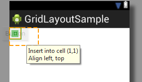
To place view objects into the cells of a GridLayout, simply click on the required view in the palette and drag it to the GridLayout instance in the layout canvas. As the view passes over the GridLayout, information will appear indicating the placement of the view if it is dropped at that point. Begin by clicking and dragging a Button view from the palette over to the top right hand corner of the GridLayout as illustrated in Figure 15-5:
Figure 15-5
As is evident from the message displayed by the tool, releasing the view at this point will position it in the cell referenced by the co-ordinates of 1,1 with the view aligned to the top left hand corner of the cell. As previously discussed, rows and columns in a GridLayout are numbered started at 0. For some reason, however, the Graphical Layout tool indexes cells starting at 1 instead of 0. Cell position 1,1, therefore, is actually the cell represented by the intersection of row 0 and column 0.
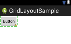
Release the view at this point and note that the Button is placed in the cell as shown in Figure 15-6:
Figure 15-6
Repeat the above steps to place a second button into the cell located at position 2,1 so it appears immediately to the right of the first button.
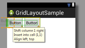
As an example of how the Grid Model Mode allows columns and rows to be inserted, drag a third Button view to a position to the left of the first Button view to until the message shown in Figure 15-7 appears providing the option to shift column 1 right and insert the new view into the cell at 1,1:
Figure 15-7
When the view is dropped at this position, the existing columns will be shifted one place to the right, a new column will be inserted at the left hand edge of the GridLayout and the new button placed into the cell.
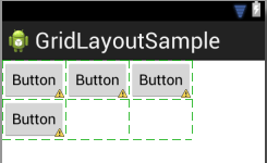
Following the same sequence of steps, add one Button view on the second row of the grid positioned at cell location 1,2 so that the layout resembles that of Figure 15-8:
Figure 15-8
Implementing Cell Row and Column Spanning
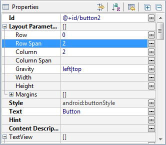
For the next phase of this tutorial, two of the Button views will be modified to span multiple cells. To begin with, the far right hand button in the top row will be modified to span both rows. To achieve this, select the button from the layout and locate the Row Span property listed under Layout Parameters in the Properties panel. Once located enter the value of 2 into the field as highlighted in Figure 15-9:
Figure 15-9
Next, select the sole Button view on the second row, this time changing the corresponding Column Span value in the Properties panel to 2.
These two views are now configured to span multiple cells. A review of the layout canvas, however, shows that the views have remained the same size and confined to a single cell. The reason for this is that the gravity settings for these views need to be changed.
Changing the Gravity of a GridLayout Child
The gravity properties of the child views of a GridLayout dictate the size and positioning of those views relative to the cell in which those views are contained. By default, the views added so far in this chapter have been set up to be aligned with the top left hand corner of the containing cells. In order to make the above cell spanning visible, the gravity of the two Button views need to be changed so that the views occupy the space available.
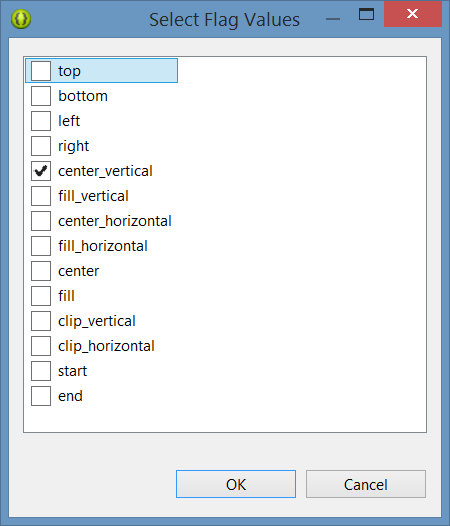
One option is to center the view within the spanned cells. Begin by selecting the top right hand Button view. In the Properties panel, click on the “…” button on the Gravity line in the Layout Parameters section to display the range of available options (Figure 15-10). From within the panel, turn off the top and left values and enable the center_vertical setting before clicking on “OK”.
Figure 15-10
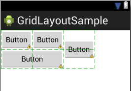
The Button view will now be centered vertically between the two cells:
Figure 15-11
An alternative option to using the properties panel to set gravity flags is to use the Gravity toolbar button. Located to the left of the Grid Model Mode toolbar button, the Gravity menu allows gravity flags to be set on the currently selected view object.
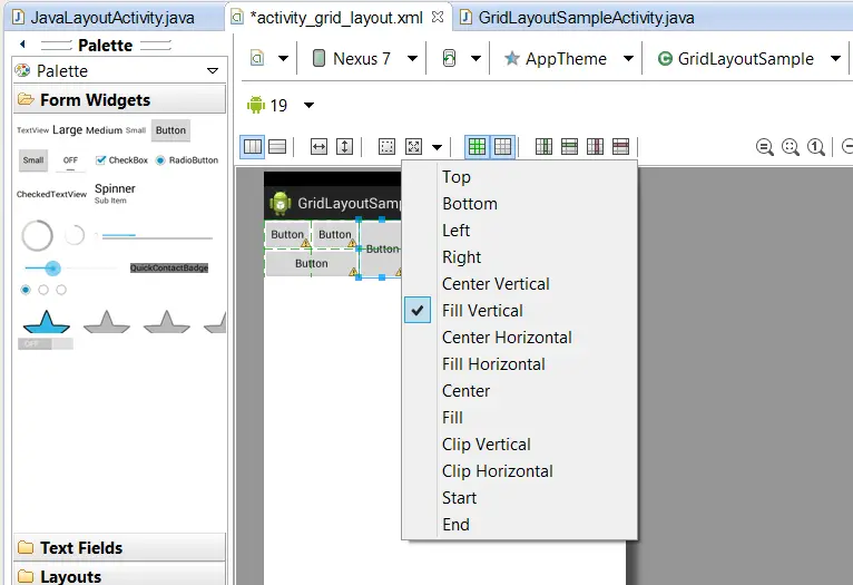
Another option is for the child view to fill the space available. To achieve this using the Gravity toolbar menu, select the far right button object in the user interface layout, click on the Gravity menu as illustrated in Figure 15-12 and choose the fill_vertical option.
Figure 15-12
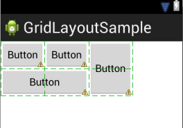
Repeat this for the second row button, but this time enabling the fill_horizontal setting. After changing the gravity flags, the two buttons should have expanded to fill the spanned cells:
Figure 15-13
Summary
The GridLayout class allows views to be arranged in a grid layout where one or more views are contained within grid cells. Each child can be configured to span multiple cells both horizontally and vertically. The position of a child view within a cell or range of cells is controlled through the configuration of gravity settings.
GridLayouts may be implemented either using the Graphical Layout editor, or through the use of Java code or XML layout resources. This chapter has covered the Graphical Layout tool approach. The next chapter will look at the use of XML layout resources to implement GridLayout configurations.
<google>BUY_ANDROID</google>
| Previous | Table of Contents | Next |
| Creating an Android User Interface in Java Code | Working with the Android GridLayout in XML Layout Resources |
