An iOS 8 Auto Layout Example
| Previous | Table of Contents | Next |
| Working with iOS 8 Auto Layout Constraints in Interface Builder | Implementing iOS 8 Auto Layout Constraints in Swift Code |
Learn SwiftUI and take your iOS Development to the Next Level |
Having covered the basics of Auto Layout and the Auto Layout features of Interface Builder in the preceding chapters, this chapter will work through an example user interface design intended to demonstrate the use of Interface Builder to create Auto Layout constraints. This example will also include a demonstration of constraint priorities.
Preparing the Project
Launch Xcode and load the AutoLayoutExample project created in the previous chapter. Once loaded, select the Main.storyboard file and remove the Label view and any other views added whilst working through the chapter.
Designing the User Interface
Initially, the user interface will simply require two Label views and a second View object. Begin, however, by selecting the Main.storyboard file and selecting the background view canvas. Display the Attributes Inspector in the Utilities panel and change the background color to a light shade of gray.
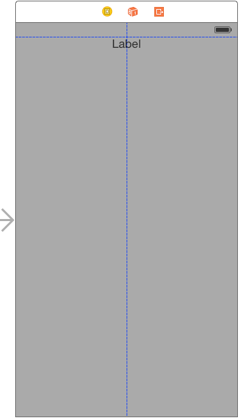
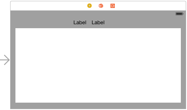
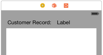
Drag a Label view from the Object Library and position it so that it is centered horizontally and on the top margin guideline as indicated in Figure 20-1. Drag a second Label view and position it to the left of the first label.
Figure 20-1
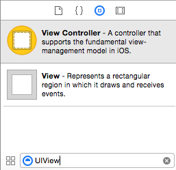
Finally, locate the View object in the Object Library. As a shortcut, type the word “UIView” into the search bar located immediately beneath the Object Library panel (Figure 20-2) to narrow the search criteria and then scroll to find the View object.
Figure 20-2
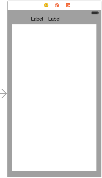
Drag and drop the View object onto the layout and resize it to fill the space below the two labels with appropriate margins from the outer edges of the screen. Cancel the Object Library search filter by clicking on the “x” at the right hand edge of the search box.
Figure 20-3
Adding Auto Layout Constraints
A number of constraints now need to be added to the layout so that it resizes and positions the views correctly when the device is rotated.
Select the view object in the layout and display the Pin menu from the toolbar in the bottom right hand corner of the storyboard canvas. In the Spacing to nearest neighbor section of the panel enable constraints on each of the four sides of the view with the Constrain to margins option enabled as outlined in Figure 20-4:
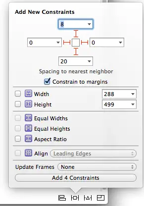
Figure 20-4
With the settings entered, click on the Add 4 Constraints button to implement the constraints.
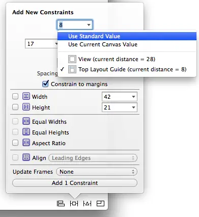
Next, select the right most of the two labels, display the Pin menu and enable the Spacing to nearest neighbor constraint for the top edge of the view. Instead of entering a point value into the spacing field, use the drop down menu to select Use Standard Value. Note that this menu also provides the option to set the constraint to the top edge of the View or to the Top Layout Guide. The top layout guide is the blue dotted line that appears when a view is moved close to the edge of the containing view (the horizontal line in Figure 20-1). For the purposes of this example, leave the Top Layout Guide option selected.
Figure 20-5
Learn SwiftUI and take your iOS Development to the Next Level |
All that now remains is to establish some constraints between the two labels. Ctrl-click on the left most label and drag the line to the right hand label before releasing the line. From the resulting menu, hold down the Shift key on the keyboard and select the Baseline and Horizontal Spacing options to align the content baselines of the two labels and to add a spacing constraint. With both options selected, hit the keyboard return key to add the constraints.
Rotate the canvas display into landscape mode by selecting the view controller and clicking on the left most icon in the layout scene toolbar so that the view is highlighted in blue. Display the Attributes Inspector in the Utilities panel and change the Orientation value under Simulated Metrics to Landscape. Note that the layout now re-organizes to accommodate the orientation change:
Figure 20-6
Adjusting Constraint Priorities
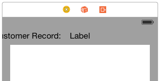
With the view in landscape mode the label appears correctly positioned. Rotate the view to portrait orientation, however, and the label is clearly being clipped by the left hand edge of the parent view:
Figure 20-7
Clearly there is some work to be done to make the user interface appear correctly in both orientations. The first step is to consider the constraints that are currently set on the label views. The right hand label has a constraint that forces it to be centered horizontally in the parent view. The left hand label, on the other hand, has a constraint that connects its trailing edge to the leading edge of the second label. The absence of a constraint on the left hand edge of the Customer Record label is resulting in the label being pushed off the screen in portrait mode.
One possible solution to this problem might be to create a new constraint on the Customer Record label that puts some space between the left hand edge of the customer record label and the left hand edge of the parent view. To add this constraint, rotate the view back to landscape so that the label is fully visible, select the Customer Record label, display the Pin menu, turn off the Constrain to margins option and establish a standard space constraint between the left hand edge of the view and the nearest neighbor. Before adding the constraint, change the Update Frames option from None to Items of New Constraints so that the frame for the view is updated to reflect the new constraint when it is added.
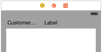
Now rotate to Portrait mode and note that the label is, unfortunately, now clipped on the right hand edge.
Figure 20-8
The reason for this problem is that the right hand label contains a constraint which forces it to be centered horizontally within the super view with a priority of 1000. Similarly, the customer record label has constraints that dictate that the leading and trailing edges of the label must be the standard width from the superview and right hand label respectively. Since these also have a priority of 1000, the system has no choice but to clip the label in order to satisfy the constraints. In order for the label to be fully visible, one of these priorities needs to be reduced.
We already know from experience that without the constraint on the leading edge of the customer record label, the left hand edge will be clipped by the superview window when the device is in portrait orientation. Another option is to lower the priority on the space constraint between the two labels. Unfortunately, this will just cause the left hand label to overlap the right hand label within the layout.
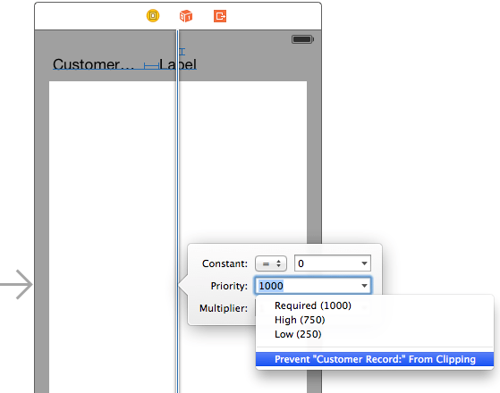
The only remaining constraint to experiment with is the horizontal center constraint on the right hand label. Select this label so that the constraints for that view are drawn on the canvas and double click on the horizontal center constraint (the vertical blue line) to display the constraint settings as shown in Figure 20-9. Using the drop down menu, reduce the priority by selecting the Prevent “Customer Record:” From Clipping menu option. When this option is selected, Xcode will calculate the optimal priority to ensure the label is not clipped.
Figure 20-9
As a result of this setting, the label will only be centered when another constraint with a higher priority does not require that the label be moved. As such, the label will be centered when the device is in landscape mode but will be pushed off center when the space is needed by the Customer Record label in portrait orientation.
Figure 20-10
Testing the Application
Throughout this tutorial, the behavior of the user interface layout in response to orientation changes has been performed using simulated metrics within Xcode. As a full test of the layout, build and run the application either on a physical iPhone device or the iOS Simulator and check that the layout handles device rotation. This involves both a visual check that the views appear as intended and a review of the console to ensure no errors are reported with relation to the Auto Layout constraints.
Summary
Within this chapter, a sequence of steps have been outlined demonstrating the creation of an application that uses Auto Layout constraints to design a user interface that responds sensibly to orientation changes of the device. The example also introduced practical examples of the importance of constraint priorities.
Now that the implementation of Auto Layout constraints in Interface Builder has been covered, the next chapter will begin to explore the creation of constraints in code.
Learn SwiftUI and take your iOS Development to the Next Level |
| Previous | Table of Contents | Next |
| Working with iOS 8 Auto Layout Constraints in Interface Builder | Implementing iOS 8 Auto Layout Constraints in Swift Code |
