A Guide to using ConstraintLayout in Android Studio
As mentioned more than once in previous chapters, Google has made significant changes to the Android Studio Designer tool, many of which were made solely to support user interface layout design using ConstraintLayout. Now that the basic concepts of ConstraintLayout have been outlined in the previous chapter, this chapter will explore these concepts in more detail while also outlining the ways in which the Designer tool allows ConstraintLayout-based user interfaces to be designed and implemented.
Design and Layout Views
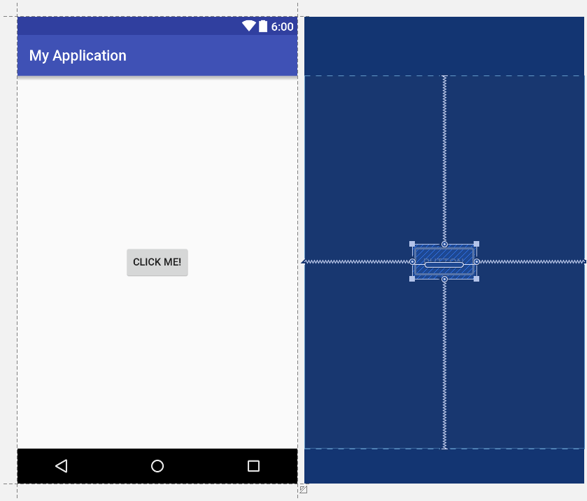
The chapter entitled A Guide to the Android Studio Designer Tool explained that the Android Studio Designer tool provides two ways to view the user interface layout of an activity in the form of Design and Layout (also known as blueprint) views. These views of the layout may be displayed individually or, as in Figure 18-1, side by side:
Figure 18-1
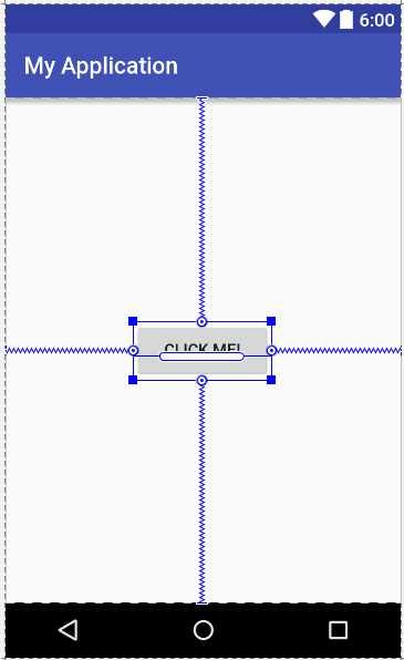
The Design view (positioned on the left in the above figure) presents a “what you see is what you get” representation of the layout, wherein the layout appears as it will within the running app. Layout view, on the other hand, displays a blueprint style of view where the widgets are represented by shaded outlines. As can be seen in Figure 18 1 above, Layout view also displays the constraint connections (in this case opposing constraints used to center a button within the layout). These constraints are also overlaid onto the Design view when a specific widget in the layout is selected as illustrated in Figure 18-2:
Figure 18-2
In addition to the two modes of displaying the user interface layout, the Designer tool also provides three different ways of establishing the constraints required for a specific layout design.
Autoconnect Mode
Autoconnect is the default mode for the Designer tool and, as the name suggests, automatically establishes constraint connections as items are added to the layout. Autoconnect mode may be enabled and disabled using the toolbar button indicated in Figure 18-3:
Figure 18-3
Autoconnect mode uses algorithms to decide the best constraints to establish based on the position of the widget and the widget’s proximity to both the sides of the parent layout and other elements in the layout. In the event that any of the automatic constraint connections fail to provide the desired behavior, these may be changed manually as outlined later in this chapter.
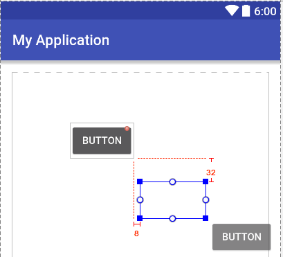
It is important to be aware that in some instances the constraint requirements will not be evident to the autoconnect system. As such, no constraints will be added to the widget when it is dropped onto the layout. If the system is able to identify appropriate constraints, guidelines will appear as the widget is being dragged over the layout canvas. In Figure 18-4, for example, guidelines are visible indicating that the widget will be constrained using the displayed margins when dropped onto the layout:
Figure 18-4
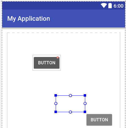
If no guidelines are shown (as is the case in Figure 18-5) the autoconnect system was unable to ascertain the requirements for the widget and, as such, it will be added to the layout without constraints being applied automatically if dropped at this position:
Figure 18-5
Inference Mode
Inference mode uses a heuristic approach involving algorithms and probabilities to automatically implement constraint connections after widgets have already been added to the layout. This mode is usually used when the autoconnect feature has been turned off and objects have been added to the layout without any constraint connections. This allows the layout to be designed simply by dragging and dropping objects from the palette onto the layout canvas and making size and positioning changes until the layout appears as required. In essence this involves “painting” the layout without worrying about constraints. Inference mode may also be used at any time during the design process to fill in missing constraints within a layout.
Constraints are automatically added to a layout when the Infer constraints button (Figure 18-6) is clicked:
Figure 18-6
As with autoconnect mode, there is always the possibility that the Designer tool will infer incorrect constraints, though these may be modified and corrected manually.
Manipulating Constraints Manually
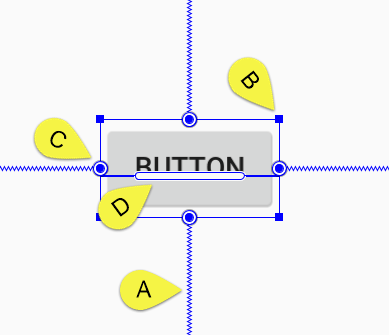
The third option for implementing constraint connections is to do so manually. When doing so, it will be helpful to understand the various handles that appear around a widget within the Designer tool. Consider, for example, the widget shown in Figure 18-7:
Figure 18-7
Clearly the spring-like lines (A) represent established constraint connections leading from the sides of the widget to the targets. The small square markers (B) in each corner of the object are resize handles which, when clicked and dragged, serve to resize the widget. The small circle handles (C) located on each side of the widget are the side constraint anchors. To create a constraint connection, click on the handle and drag the resulting line to the element to which the constraint is to be connected as outlined in Figure 18 8. When connecting to the side of another widget, simply drag the line to the side constraint handle of that widget and, when it turns green, release the line.
Figure 18-8
The final marker (D) indicates the anchor point for baseline constraints whereby the content within the widget (as opposed to outside edges) is used as the alignment point. To establish a constraint connection from a baseline constraint handle, simply hover the mouse pointer over the handle until it begins to flash before clicking and dragging to the target (such as the baseline anchor of another widget).
Deleting Constraints
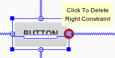
To delete an individual constraint, simply click within the anchor to which it is connected. The constraint will then be deleted from the layout:
Figure 18-9
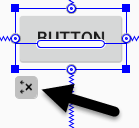
Alternatively, remove all of the constraints on a widget by selecting it and clicking on the Delete All Constraints button which appears both in the toolbar and next to the widget when it is selected in the layout as highlighted in Figure 18-10:
Figure 18-10
To remove all of the constraints from every widget in a layout, right-click on the layout and select the Clear all constraints option from the resulting menu.
Adjusting Constraint Bias
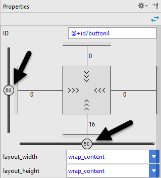
In the previous chapter, the concept of using bias settings to favor one opposing constraint over another was outlined. Bias within the Android Studio Designer tool is adjusted using the Inspector located in the Properties tool window and shown in Figure 18-11. The two sliders indicated by the arrows in the figure are used to control the bias of the vertical and horizontal opposing constraints of the currently selected widget.
Figure 18-11
Understanding ConstraintLayout Margins
Constraints can be used in conjunction with margins to implement fixed gaps between a widget and another element (such as another widget, a guideline or the side of the parent layout). Consider, for example, the horizontal constraints applied to the Button object in Figure 18-12:
Figure 18-12
As currently configured, horizontal constraints run to the left and right edges of the parent ConstraintLayout. As such, the widget has opposing horizontal constraints indicating that the ConstraintLayout layout engine has some discretion in terms of the actual positioning of the widget at runtime. This allows the layout some flexibility to accommodate different screen sizes and device orientation. The horizontal bias setting is also able to control the position of the widget right up to the right-hand side of the layout. Figure 18-13, for example, shows the same button with 100% horizontal bias applied:
Figure 18-13
ConstraintLayout margins can appear at the end of constraint connections and represent a fixed gap into which the widget cannot be moved even when adjusting bias or in response to layout changes elsewhere in the activity. In Figure 18-14, the right-hand constraint now includes a 50dp margin into which the widget cannot be moved even though the bias is still set at 100%.
Figure 18-14
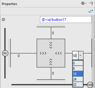
Existing margin values on a widget can be modified from within the Inspector. As can be seen in Figure 18-15, a dropdown menu is being used to change the right hand margin on the currently selected widget to 16dp. Alternatively, clicking on the current value also allows a number to be typed into the field.
Figure 18-15
The default margin for new constraints can be changed at any time using the option in the toolbar highlighted in Figure 18-16:
Figure 18-16
Margin constraints can also be created by clicking in the constraint handle of a widget, pressing and holding the Ctrl key and then dragging the line to the target. Once released, the margin constraint will be set at a fixed distance based on the current position of the widget.
The Importance of Opposing Constraints and Bias
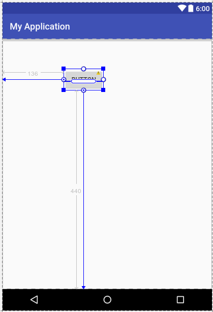
As discussed in the previous chapter, opposing constraints, margins and bias form the cornerstone of responsive layout design in Android when using the ConstraintLayout. When a widget is constrained without opposing constraint connections, those constraints are essentially margin constraints. This is indicated visually within the Designer tool by solid straight lines accompanied by margin measurements as shown in Figure 18-17.
Figure 18-17
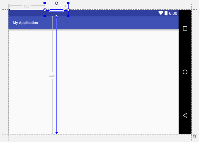
The above constraints essentially fix the widget at that position. The result of this is that if the device is rotated to landscape orientation, the widget will no longer be visible since the vertical constraint pushes it beyond the top edge of the device screen (as is the case in Figure 18-8). A similar problem will arise if the app is run on a device with a smaller screen than that used during the design process.
Figure 18-18
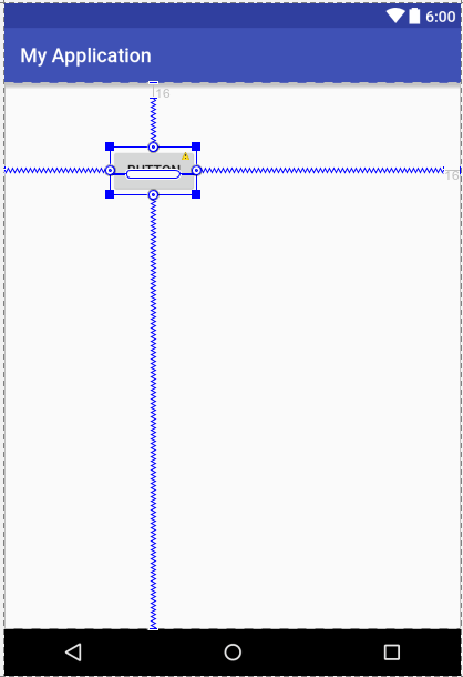
When opposing constraints are implemented, the constraint connection is represented by the spring-like jagged line (the spring metaphor is intended to indicate that the position of the widget is not fixed to absolute X and Y coordinates):
Figure 18-19
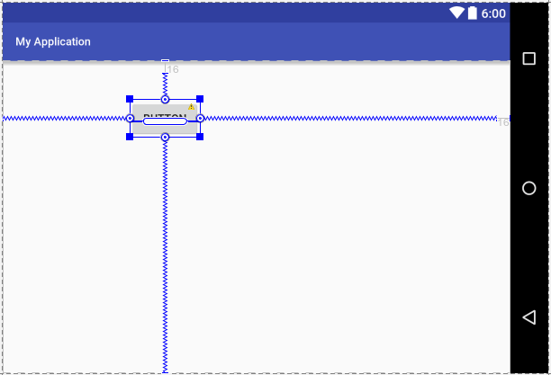
In the above layout, vertical and horizontal bias settings have been configured such that the widget will always be positioned 90% of the distance from the bottom and 35% from the left hand edge of the parent layout. When rotated, therefore, the widget is still visible and positioned in the same location relative to the dimensions of the screen:
Figure 18-20
When designing a responsive and adaptable user interface layout, it is important to take into consideration both bias and opposing constraints when manually designing a user interface layout and making corrections to automatically created constraints.
Configuring Widget Dimensions
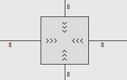
The inner dimensions of a widget within a ConstraintLayout can also be configured using the Inspector. As outlined in the previous chapter, widget dimensions can be set to wrap content, fixed or any size modes. The prevailing settings for each dimension on the currently selected widget are shown within the square representing the widget in the Inspector as illustrated in Figure 18-21:
Figure 18-21
In the above figure, both the horizontal and vertical dimensions are set to wrap content mode (indicated by the inward pointing chevrons). The inspector uses the following visual indicators to represent the three dimension modes:
![]() - Fixed size
- Fixed size
![]() - Any Size
- Any Size
![]() - Wrap content
- Wrap content
To change the current setting, simply click on the indicator to cycle through the three different settings.
In addition, the size of a widget can be expanded either horizontally or vertically to the maximum amount allowed by the constraints and other widgets in the layout using the Expand horizontally and Expand vertically buttons. These are accessible in the toolbar (Figure 18-22) and, when used, cause the currently selected widget to increase in size horizontally or vertically to fill the available space around it.
Figure 18-22
Adding Guidelines
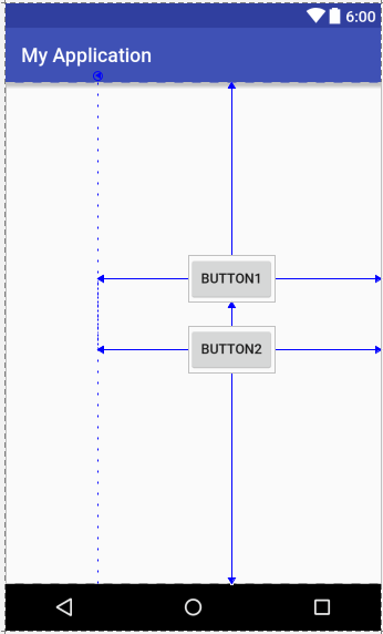
Guidelines provide additional elements to which constraints may be anchored. Guidelines are added by right-clicking on the layout and selecting either the Add Vertical Guideline or Add Horizontal Guideline menu option. Once added, a guideline will appear as a dashed line in the layout and may be moved simply by clicking and dragging the line. To establish a constraint connection to a guideline, click in the constraint handler of a widget and drag to the guideline before releasing. In Figure 18-23, the left sides of two Buttons are connected by constraints to a vertical guideline:
Figure 18-23
Widget Group Alignment and Distribution
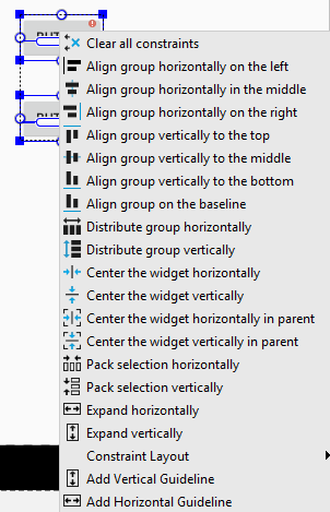
The Android Studio Designer tool provides a range of alignment and distribution actions that can be performed when two or more widgets are selected in the layout. Simply shift-click on each of the widgets to be included in the action, right-click on the layout and make a selection from the many options displayed in the menu:
Figure 18-24
As shown in Figure 18-25 below, these options are also available as buttons in the Designer toolbar:
Figure 18-25
These alignment and distribution options work in different ways depending on whether autoconnect mode is enabled within the Designer tool. When autoconnect is disabled, these options only move the selected widgets to the appropriate positions, but no constraints are added to the layout. If the widgets are to be positioned and constrained, autoconnect must be enabled before making a group action selection.
Converting other Layouts to ConstraintLayout
For existing user interface layouts that make use of one or more of the other Android layout classes (such as RelativeLayout or LinearLayout), the Designer tool provides an option to convert the user interface to use the ConstraintLayout.
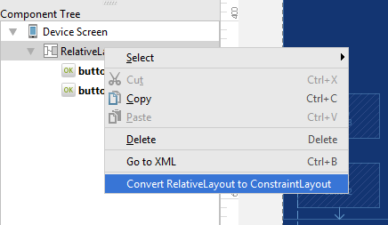
When the Designer tool is open and in Design mode, the Component Tree panel is displayed beneath the Palette. To convert a layout to ConstraintLayout, locate it within the Component Tree, right-click on it and select the Convert <current layout> to Constraint Layout menu option:
Figure 18-26
When this menu option is selected, Android Studio will convert the selected layout to a ConstraintLayout and use inference to establish constraints designed to match the layout behavior of the original layout type.
Summary
A redesigned Designer tool combined with ConstraintLayout makes designing complex user interface layouts with Android Studio a relatively fast and intuitive process. This chapter has covered the concepts of constraints, margins and bias in more detail while also exploring the ways in which ConstraintLayout-based design has been integrated into the Designer tool.
