Difference between revisions of "A Guided Tour of the Firebase Analytics Dashboard"
(Created page with "Google Analytics for Firebase provides a vast array of charts, tables and graphs containing information covering not only the way in which users interact with the app, but als...") |
|||
| Line 7: | Line 7: | ||
| − | [[File:]] | + | [[File:firebase_analytics_dashboard.png]] |
Figure 39‑1 | Figure 39‑1 | ||
| Line 21: | Line 21: | ||
| − | [[File:]] | + | [[File:firebase_analytics_data_filters.png]] |
Figure 39‑2 | Figure 39‑2 | ||
| Line 34: | Line 34: | ||
The Active Users card contains a graph tracking the number of users that were actively using the app over 1-day, 7-day and 30-day periods. | The Active Users card contains a graph tracking the number of users that were actively using the app over 1-day, 7-day and 30-day periods. | ||
| − | [[File:]] | + | [[File:firebase_analytics_dashboard_active_users.png]] |
Figure 39‑3 | Figure 39‑3 | ||
| Line 44: | Line 44: | ||
| − | [[File:]] | + | [[File:firebase_analytics_dashboard_arpu.png]] |
Figure 39‑4 | Figure 39‑4 | ||
| Line 56: | Line 56: | ||
| − | [[File:]] | + | [[File:firebase_analytics_dashboard_first_open.png]] |
Figure 39‑5 | Figure 39‑5 | ||
| Line 65: | Line 65: | ||
| − | [[File:]] | + | [[File:firebase_analytics_dashboard_cohorts.png]] |
Figure 39‑6 | Figure 39‑6 | ||
| Line 85: | Line 85: | ||
| − | [[File:]] | + | [[File:firebase_analytics_dashboard_user_engagement.png]] |
Figure 39‑7 | Figure 39‑7 | ||
| Line 97: | Line 97: | ||
| − | [[File:]] | + | [[File:firebase_analytics_dashboard_purchases.png]] |
Figure 39‑8 | Figure 39‑8 | ||
| Line 109: | Line 109: | ||
| − | [[File:]] | + | [[File:firebase_analytics_dashboard_app_version.png]] |
Figure 39‑9 | Figure 39‑9 | ||
| Line 119: | Line 119: | ||
| − | [[File:]] | + | [[File:firebase_analytics_dashboard_devices.png]] |
Figure 39‑10 | Figure 39‑10 | ||
| Line 129: | Line 129: | ||
| − | [[File:]] | + | [[File:firebase_analytics_dashboard_location.png]] |
Figure 39‑11 | Figure 39‑11 | ||
| Line 138: | Line 138: | ||
| − | [[File:]] | + | [[File:firebase_analytics_dashboard_demographics.png]] |
Figure 39‑12 | Figure 39‑12 | ||
| Line 148: | Line 148: | ||
| − | [[ | + | [[File:firebase_analytics_dashboard_interests.png]] |
Figure 39‑13 | Figure 39‑13 | ||
Revision as of 14:31, 28 August 2017
Google Analytics for Firebase provides a vast array of charts, tables and graphs containing information covering not only the way in which users interact with the app, but also details about the users themselves. An important part of getting up to speed using Firebase Analytics involves gaining a familiarity with the various screens that make up the Analytics section of the Firebase console. This chapter will provide a tour of the Analytics Dashboard provided by the Firebase console together with an outline of the types of information you can expect to find within each chart and graph. The next chapter, entitled An Overview of the Firebase Analytics Screens, will provide details of the other screens available within Firebase Analytics.
The Firebase Analytics Dashboard
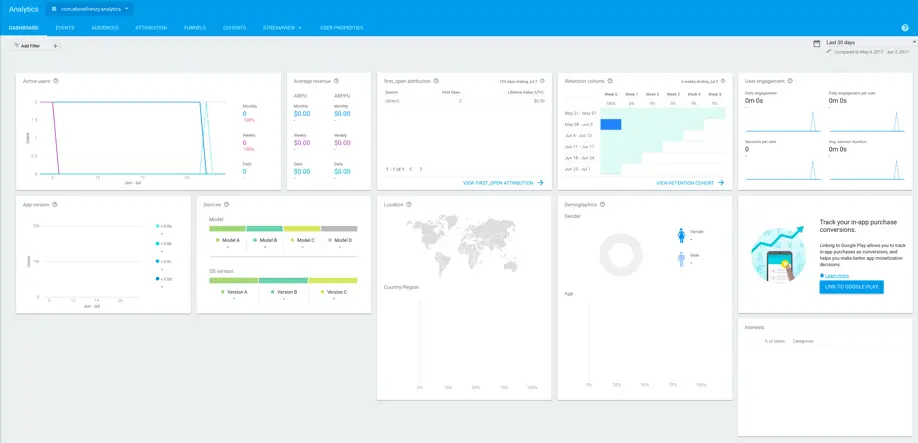
Firebase Analytics data is accessed by opening the Firebase console in a browser window, selecting a project and then clicking on the Analytics option located at the top of the navigation panel. The first screen to appear is always the Dashboard which is shown in reduced size in Figure 39‑1:
Figure 39‑1
The purpose of the Dashboard is to provide an overview of the key metrics in a single screen. Before exploring these metrics, it is important to be aware of the filtering options that are available to tailor the results being displayed.
Filtering the Data
A single Firebase project can contain multiple apps. The menu (marked A in Figure 39‑2) allows the app for which data is being shown to be selected. The Add Filter (B) button is also provided to allow the data to be filtered based on audiences, user properties, and demographic data.
The area marked C allows configurable date ranges to be specified. The top entry represents the date range for which data is to be displayed. The bottom date range represents a data range against which the current data will be compared within certain sets of data (for example comparing whether user engagement for the currently selected data range has increased since a previous time period).
Figure 39‑2
The rest of the Dashboard contains a collection of cards, each of which shows specific metrics related to the currently selected app and any prevailing filtering options. Some of these cards provide a summary of information which is available in greater detail on other Analytics screens.
These cards can be summarized as follows:
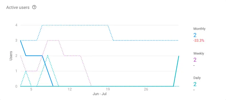
Active users
The Active Users card contains a graph tracking the number of users that were actively using the app over 1-day, 7-day and 30-day periods.
Figure 39‑3
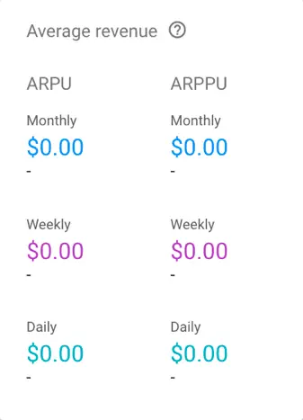
Average revenue
The Average Revenue card reports the average revenue per user (ARPU) and average revenue per paying user (ARPPU). The ARPU is calculated by dividing the revenue earned during the specified period by the total number of users. The ARPPU, on the other hand, divides the revenue by the number of users that made a purchase.
Figure 39‑4
The data is captured for this report via the ecommerce_purchase and in_app_purchase events. Note that while in_app_purchase events are recorded automatically, the ecommerce_purchase event must be triggered within the app.
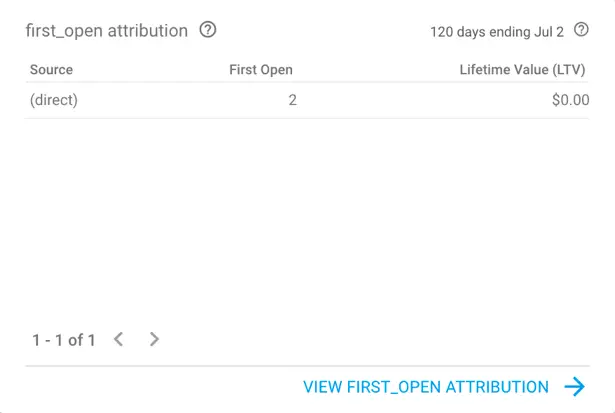
first_open attribution
The term first_open attribution refers to the tracking of the number times the app has been opened for the first time. This essentially tracks users who not only install the app, but also launch it. This card also contains the lifetime value, an indicator of the total amount of revenue earned during the first 120 days of app use. A more detailed breakdown of the first open events and revenue sources (such as advertising) is available in the main attributions screen which may be accessed using either the tab located in the console toolbar, or by clicking on the link located at the bottom of the card.
Figure 39‑5
Retention cohorts
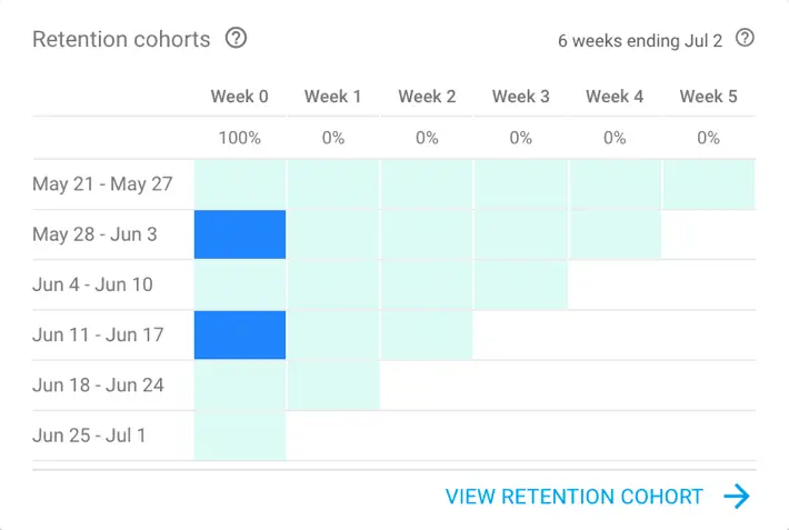
A cohort in this context refers to a group of users who all started using the app within the same time period. This card shows the retention for each cohort, in other words the percentage of users within each cohort who continued to use the app within subsequent weeks. Each row in the table represents a cohort and each block in the row a percentage value indicating the retention rate for that group of users. The darker the shading of the block, the higher the retention rate.
Figure 39‑6
A decline on retention as weeks progress is a warning sign that users tend to lose interest with the app over time.
User engagement
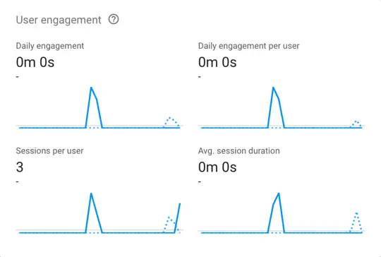
As illustrated in Figure 39‑2 above, the Dashboard allows a date range for which metrics are to be provided to be specified. A comparison date range is also selected for the purposes of comparing metrics for different date ranges. The user engagement card compares the following engagement statistics between the specified date ranges.
• Daily engagement – The total amount of time spent by users engaging with the app.
• Daily engagement per user – The average duration of engagement per user.
• Sessions per user – The total number of sessions divided by the total number of active users.
• User engagement per screen – An analysis of the user engagement time on a per screen basis within the app.
Figure 39‑7
In each graph in the above figure, the solid line represents the currently selected date range and the dotted line the comparison date range. The percentage value indicates the amount by which each of the engagement metrics has changed between the two ranges.
In-app purchases
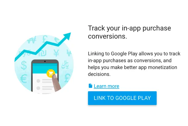
In order to track in-app purchases, the Firebase project must be linked to the app entry in the Google Play account through which in-app purchases are being processed. If the account is not yet linked, click on the Link to Google Play button and complete the linking process:
Figure 39‑8
Once linked, the In-app Purchase card will report comparison data for the selected date ranges for the number of users who have completed a purchase, the percentage of those users relative to the entire user base and the total number and value of the purchase transactions. In-app purchases are recorded automatically via the in_app_purchase event.
App version
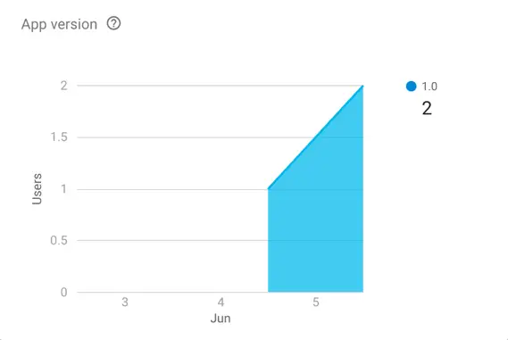
The app version card displays the number of users currently using each of the top three versions of the app.
Figure 39‑9
Devices
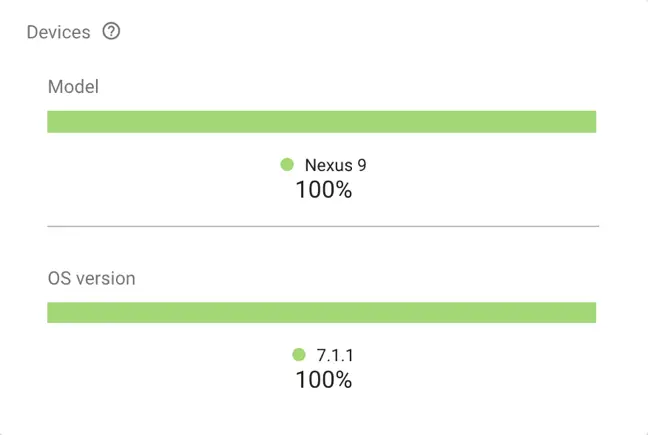
The Devices card presents a percentage breakdown of the top three device and operating system versions on which the app is running together with a fourth category representing all other device types and operating system versions:
Figure 39‑10
Location
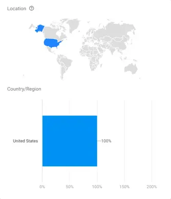
The Location card simply reports the breakdown of app sessions listed by country.
Figure 39‑11
Demographics
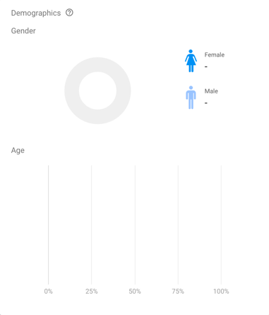
The demographics card reports app usage categorized by user gender and age group. Firebase Analytics gathers this information using the Google Play Android Advertising ID which is used by Google to create anonymous user profiles for each Android device for advertising targeting purposes.
Figure 39‑12
Interests
Reports the number of users in specific interest groups. Interest groups are created by Google using the Android Advertising ID and include topics such as finance, health, education, real estate, shopping and sports.
Figure 39‑13
Summary
Firebase Analytics involves the collection and analysis of data relating to the users of an app. The Firebase Analytics Dashboard provides a single location in which all of the key metrics gathered by the analytics system can be reviewed. The dashboard is comprised of a collection of cards containing visual summaries of data logged for the currently selected app during a specified date range. A filter option is also provided to customize the data using a range of demographic and event based criteria.
As will be outlined in the next chapter, additional detail beyond that provided by the dashboard is available using dedicated Firebase console analytics screens.
