Difference between revisions of "An Android Studio Designer ConstraintLayout Tutorial"
(Created page with "<br><br> By far the easiest and most productive way to design a user interface for an Android application is to make use of the Android Studio Designer tool. The goal of this...") |
(No difference)
|
Revision as of 18:17, 6 June 2016
By far the easiest and most productive way to design a user interface for an Android application is to make use of the Android Studio Designer tool. The goal of this chapter is to provide an overview of how to create a ConstraintLayout-based user interface using this approach. The exercise included in this chapter will also be used as an opportunity to outline the creation of an activity starting with a “bare-bones” Android Studio project.
Having covered the use of the Android Studio Designer, the chapter will also introduce the Layout Inspector and Hierarchy Viewer tools.
An Android Studio Designer Tool Example
The first step in this phase of the example is to create a new Android Studio project. Begin, therefore, by launching Android Studio and closing any previously opened projects by selecting the File -> Close Project menu option. Within the Android Studio welcome screen click on the Start a new Android Studio project quick start option to display the first screen of the new project dialog. Enter LayoutSample into the Application name field and ebookfrenzy.com as the Company Domain setting before clicking on the Next button and set the minimum SDK to API 9: Android 2.3 (Gingerbread). This is the oldest API level for which ConstraintLayout support is available, making the app compatible with the largest possible range of devices while still making use of this new layout class.
In previous examples, we have requested that Android Studio create a template activity for the project. We will, however, be using this tutorial to learn how to create an entirely new activity and corresponding layout resource file manually, so click Next once again and make sure that the Add No Activity option is selected before clicking on Finish to create the new project.
Creating a New Activity
Once the project creation process is complete, the Android Studio main window should appear with a blank background containing a message that reads “No files are open”. The next step in the project is to create a new activity. This will be a valuable learning exercise since there are many instances in the course of developing Android applications where new activities need to be created from the ground up.
Begin by displaying the Project tool window using the Alt-1 keyboard shortcut. Once displayed, unfold the hierarchy by clicking on the right facing arrows next to the entries in the Project window. The objective here is to gain access to the app -> java -> com.ebookfrenzy.layoutsample folder in the project hierarchy. Once the package name is visible, right-click on it and select the New -> Activity -> Empty Activity menu option as illustrated in Figure 19-1:
Figure 19-1
In the resulting New Activity dialog, name the new activity LayoutSampleActivity and the layout activity_layout_sample. The activity will, of course, need a layout resource file so make sure that the Generate Layout File option is enabled.
In order for an application to be able to run on a device it needs to have an activity designated as the launcher activity. Without a launcher activity, the operating system will not know which activity to start up when the application first launches and the application will fail to start. Since this example only has one activity, it needs to be designated as the launcher activity for the application so make sure that the Launcher Activity option is enabled before clicking on the Finish button.
At this point Android Studio should have added two files to the project. The Java source code file for the activity should be located in the app -> java -> com.ebookfrenzy.layoutsample folder. In addition, the XML layout file for the user interface should have been created in the app -> res -> layout folder. Note that the Empty Activity template was chosen for this activity so the layout is contained entirely within the activity_layout_sample.xml file and there is no separate content layout file.
Finally, the new activity should have been added to the AndroidManifest.xml file and designated as the launcher activity. The manifest file can be found in the project window under the app -> manifests folder and should contain the following XML:
<?xml version="1.0" encoding="utf-8"?>
<manifest xmlns:android="http://schemas.android.com/apk/res/android"
    package="com.ebookfrenzy.layoutsample" >

    <application
        android:allowBackup="true"
        android:icon="@mipmap/ic_launcher"
        android:label="@string/app_name"
        android:supportsRtl="true"
        android:theme="@style/AppTheme" >
        <activity android:name=".LayoutSampleActivity" >
            <intent-filter>
                <action android:name="android.intent.action.MAIN" />

                <category android:name="android.intent.category.LAUNCHER" />
            </intent-filter>
        </activity>
    </application>

</manifest>
Preparing the Designer Environment
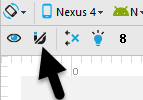
Locate and double click on the activity_layout_sample.xml layout file located in the app -> res -> layout folder to load it into the Designer tool. Since the purpose of this tutorial is to gain experience with the use of constraints, turn off the autoconnect feature using the button located in the Designer toolbar. Once disabled, the button will appear with a line through as is the case in Figure 19-2:
Figure 19-2
The user interface design will also make use of the ImageView object to display an image. Before proceeding, this image should be added to the project ready for use later in the chapter. This file is named galaxys6.png and can be found in the project_icons folder of the sample code download available from the following URL:
[http://www.ebookfrenzy.com/print/androidstudioA7/index.php
Locate this image in the file system navigator for your operating system and copy the image file. Right-click on the app -> res -> drawable entry in the Project tool window and select Paste from the menu to add the file to the folder. When the copy dialog appears, click on OK to accept the default settings.
Figure 19-3
Adding the Widgets to the User Interface
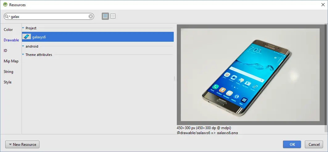
From within the Images & Media palette category, drag an ImageView object into the center of the display view. Note that horizontal and vertical dashed lines appear indicating the center axes of the display. When centered, release the mouse button to drop the view into position. Once placed within the layout, the Resources dialog will appear seeking the image to be displayed within the view. In the search bar located at the top of the dialog, enter “galaxy” to locate the galaxys6.png resource as illustrated in Figure 19-4.
Figure 19-4
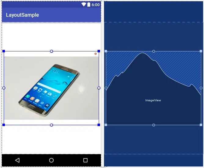
Select the image and click on OK to assign it to the ImageView object. If necessary, reduce the size of the ImageView using the resize handles and reposition it in the center of the layout. At this point the layout should match Figure 19-5:
Figure 19-5
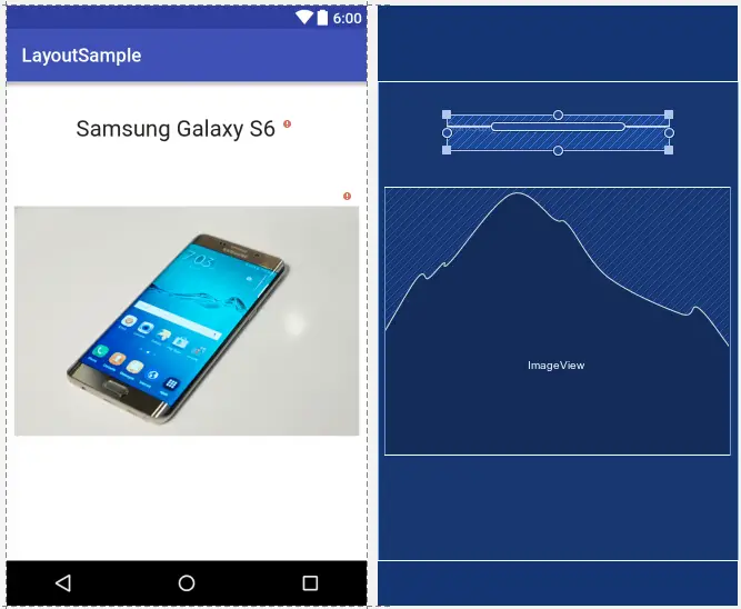
Click and drag a TextView object from the Widgets section of the palette and position it so that it appears above the ImageView as illustrated in Figure 19-6.
Using the Properties panel, change the textSize property to 24sp, the textAlignment setting to center and the text to “Samsung Galaxy S6”.
Figure 19-6
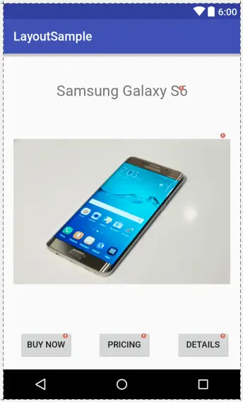
Next, add three Button widgets along the bottom of the layout and set the text properties of these views to “Buy Now”, “Pricing” and “Details”. Shift-click on the buttons so that they are all selected before right-clicking on the layout and selecting Distribute group horizontally from the resulting menu. Right-click again, this time selecting the Align group vertically to the middle menu option. These steps will ensure that the three buttons are distributed proportionally across the width of the layout and aligned horizontally. The completed layout should now match Figure 19-7:
Figure 19-7
Note the small red exclamation mark indicators on each element in the layout. These indicate that the widgets are not sufficiently constrained for the layout engine to be able to position and size the widgets at runtime. Were the app to run now, all of the widgets would be positioned in the top left-hand corner of the display.
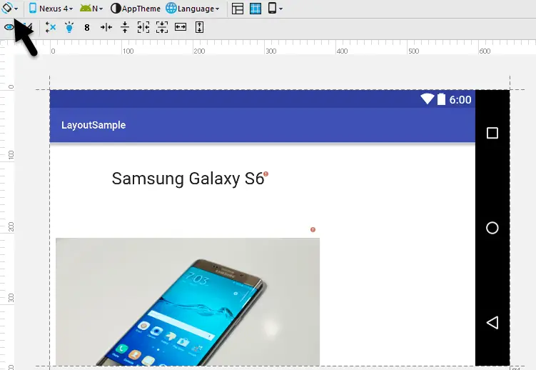
With the widgets added to the layout, use the device rotation button located in the Designer toolbar (indicated by the arrow in Figure 19-8) to view the user interface in landscape orientation:
Figure 19-8
The absence of constraints results in a layout that fails to adapt to the change in device orientation, leaving the content off center and with part of the image and all three buttons positioned beyond the viewable area of the screen. Clearly some work still needs to be done to make this into a responsive user interface.
Adding the Constraints
Constraints are the key to creating layouts that can adapt to device orientation changes and different screen sizes. Begin by rotating the layout back to portrait orientation and selecting the TextView widget located above the ImageView. With the widget selected, establish constraints from the left, right and top sides of the TextView to the corresponding sides of the parent ConstraintLayout as shown in Figure 19-9:
Figure 19-9
With the TextView widget constrained, select the ImageView instance and establish opposing constraints on the left and right hand sides with each connected to the corresponding sides of the parent layout. Next, establish a constraint connection from the top of the ImageView to the bottom of the TextView and from the bottom of the ImageView to the top of the center Button widget. If necessary, click and drag the ImageView so that it is still positioned in the vertical center of the layout.
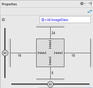
With the ImageView still selected, use the Inspector in the properties panel to change the top and bottom margins on the ImageView to 24 and 8 respectively and to change both the widget height and width dimension properties to AnySize. These settings will allow the layout engine to enlarge and reduce the size of the ImageView when necessary to accommodate layout changes:
Figure 19-10
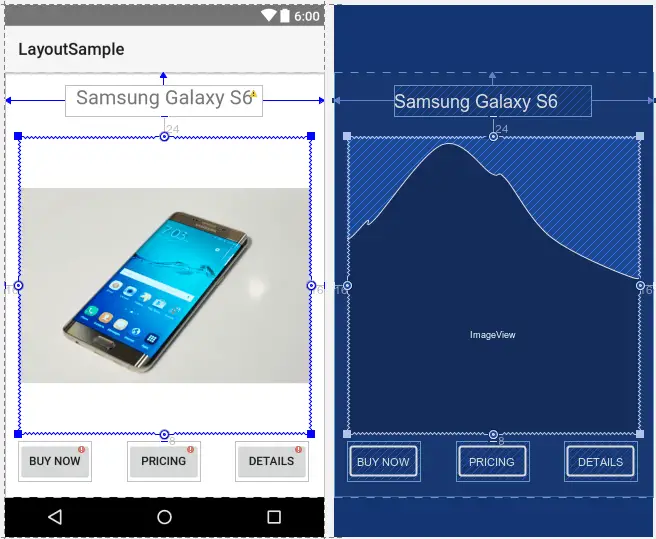
Figure 19-11, shows the currently implemented constraints for the ImageView in relation to the other elements in the layout:
Figure 19-11
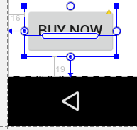
The final task is to add constraints to the three Button widgets. The leftmost button will be constrained a fixed distance from the left and bottom edges of the parent layout. Select this button, click in the left hand side anchor and, while holding the mouse button down, press and hold the Ctrl key on the keyboard. Drag the resulting line to the left-hand side of the layout and release the line to establish a fixed margin constraint. Repeat this step to establish a constraint between the bottom of the widget and the bottom of the layout. On completion of these steps the button should be constrained as outlined in Figure 19-12:
Figure 19-12
Repeat the above process to establish fixed margin constraint connections on the rightmost button so that the bottom and right-hand sides of the button are connected to the corresponding sides of the layout.
All that remains is to constrain the middle button. Begin by connecting the bottom of the middle button to the bottom of the layout using a fixed margin constraint. Finally, establish opposing constraints on the left and right hand sides of the button connected to the nearest sides of the neighboring buttons as shown in Figure 19-13:
Figure 19-13
Testing the Layout
With the constraints added to the layout, rotate the screen into landscape orientation and verify that the layout adapts to accommodate the new screen dimensions.
While the Designer tool provides a useful visual environment in which to design user interface layouts, when it comes to testing there is no substitute for testing the running app. Launch the app on a physical Android device or emulator session and verify that the user interface reflects the layout created in the Designer. Figure 19-14, for example, shows the running app in landscape orientation:
Figure 19-14
The very simple user interface design is now complete. Designing a more complex user interface layout is a continuation of the steps outlined above. Simply drag and drop views onto the display, position, constrain and set properties as needed.
Using the Layout Inspector
The hierarchy of components that make up a user interface layout may be viewed at any time using the Layout Inspector feature of the Android Monitor tool window. In order to access this information the app must be running on a device or emulator. Once the app is running, select the Android Monitor tool window tab (marked A in Figure 19-15) and, once displayed, click on the Layout Inspector button (B) to display the inspector panels.
The left most panel (C) shows the hierarchy of components that make up the user interface layout. The center panel (D) shows a visual representation of the layout design. Clicking on a widget in the visual layout will cause that item to highlight in the hierarchy list making it easy to find where a visual component is situated relative to the overall layout hierarchy.
Finally, the rightmost panel (marked E in Figure 19-15) contains all of the property settings for the currently selected component, allowing for in-depth analysis of the component’s internal configuration.
Figure 19-15
Using the Hierarchy Viewer
Another useful tool for closely inspecting the view hierarchy of an activity is the Hierarchy Viewer. The main purpose of the tool is to provide a detailed overview of the entire view tree for activities within currently running applications and to provide some insight into the layout rendering performance.
The hierarchy viewer can only be used to inspect applications that are either running within an Android emulator, or on a device running a development version of Android. To run the tool on the LayoutSample application created in this chapter, launch the application on an Android Virtual Device emulator and wait until it has loaded and is visible on the emulator display. Once running, select the Tools -> Android -> Android Device Monitor menu option. In the DDMS window, select the Window -> Open Perspective… menu option and choose Hierarchy View from the resulting dialog before clicking on the OK button.
When the Hierarchy Viewer appears, it will consist of a number of different panels. The left hand panel, illustrated in Figure 19-16, lists all the windows currently active on the device or emulator such as the navigation bar, status bar and launcher. The window listed in bold is the current foreground window, which should, in this case, be LayoutSampleActivity.
Figure 19-16
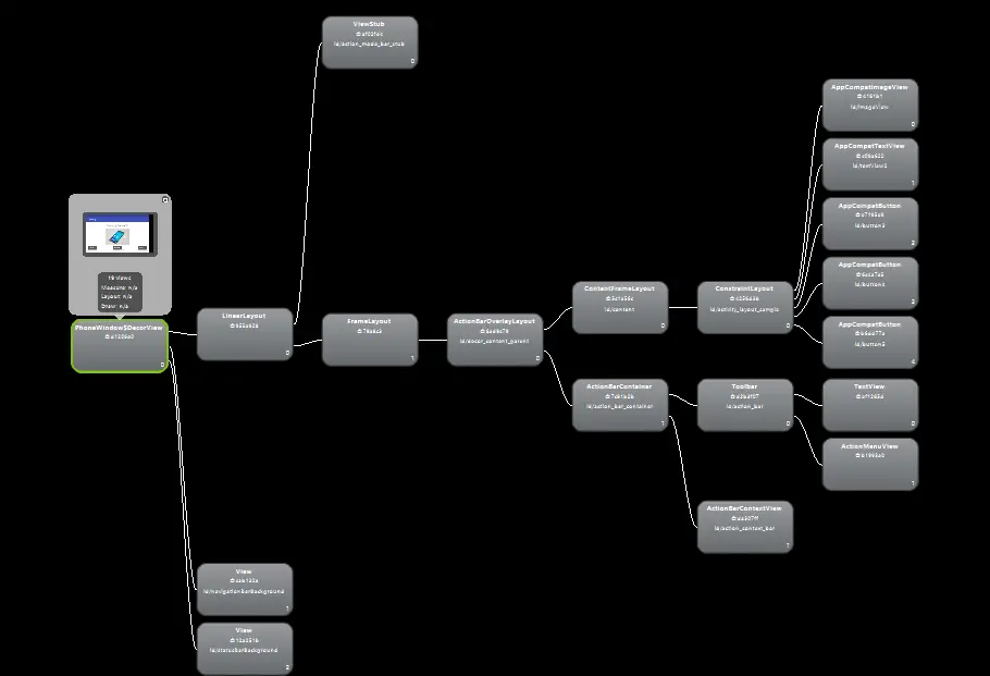
Double clicking on the layout sample window will cause the hierarchy to load into the Tree View panel as shown in Figure 19-17 (note that there may be a short delay between selection of the window and the hierarchy diagram appearing):
Figure 19-17
While it is possible to zoom in and out of the tree view using the scale at the bottom of the panel or by spinning the mouse wheel, in most cases the tree will be too large to view entirely within the Tree View panel. To move the view window around the tree simply click and drag in the Tree View panel, or move the lens within the Tree Overview panel (Figure 19-18):
Figure 19-18
When reviewing the tree view, keep in mind that some views in addition to those included in the activity layout will be displayed. These are the views and layouts that, for example, display the action bar across the top of the screen and provide an area for the activity to be displayed.
Selecting a node in the Tree View will cause the corresponding element in the user interface representation to be highlighted in red in the Layout View. In Figure 19-19 the ConstraintLayout view is currently selected:
Figure 19-19
Similarly, selecting views from the Layout View will cause the corresponding node in the Tree View to highlight and move into view.
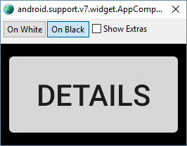
Additional information about a view can be obtained by selecting the node within the Tree View. A panel will then popup next to the node and can be dismissed by performing a right-click on the node. Double clicking on a node will display a dialog containing a rendering of how the view appears within the application user interface. Figure 19-20, for example, shows a button from the LayoutSample application:
Figure 19-20
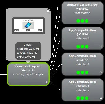
Options are also available within the tool to perform tasks such as invalidating a selected layout view (thereby forcing it to be redrawn) and to save the tree view as a PNG image file. The hierarchy viewer can also be used to display information about the speed with which the child views of a selected node are rendered when the user interface is created. To display this performance information, select the node to act as the root view and click on the toolbar button indicated in Figure 19-21.
Figure 19-21
When enabled, the colored dots within the nodes indicate the performance in each category (measure, layout and draw) with red indicating slower performance for the view relative to other views in the activity. Container views with larger numbers of child views may display red status simply because the view has to wait for each child to render. This is not necessarily an indication of a performance problem with that view.
Figure 19-22
Summary
The Designer tool in Android Studio has been tightly integrated with the ConstraintLayout class introduced in Android 7. This chapter has worked through the creation of an example user interface intended to outline the ways in which a ConstraintLayout-based user interface can be implemented using the Designer tool in terms of adding widgets and setting constraints. This chapter also introduced the Layout Inspector and Hierarchy Viewer tools, both of which are useful for analyzing the structural composition of a user interface layout.
