Difference between revisions of "Implementing an Android Navigation Drawer in Kotlin"
(→Responding to Drawer Item Selections) |
|||
| Line 112: | Line 112: | ||
return true | return true | ||
} | } | ||
| − | <pre> | + | </pre> |
If it is appropriate to do so, and as outlined in the above example, it is also important to close the drawer after the item has been selected. | If it is appropriate to do so, and as outlined in the above example, it is also important to close the drawer after the item has been selected. | ||
Revision as of 18:28, 27 November 2017
In this, the final of this series of chapters dedicated to the Android material design components, the topic of the navigation drawer will be covered. Comprising the DrawerLayout, NavigationView and ActionBarDrawerToggle classes, a navigation drawer takes the form of a panel appearing from the left-hand edge of screen when selected by the user and containing a range of options and sub-options which can be selected to perform tasks within the application.
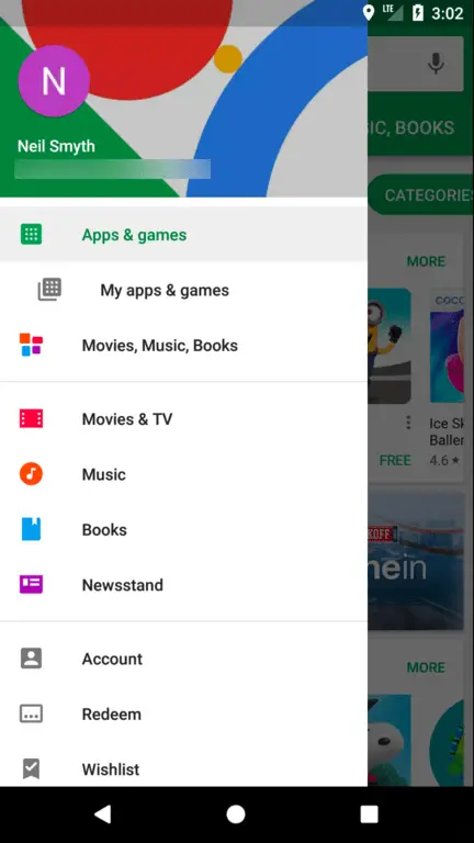
The navigation drawer is a panel that slides out from the left of the screen and contains a range of options available for selection by the user, typically intended to facilitate navigation to some other part of the application. Figure 47-1, for example, shows the navigation drawer built into the Google Play app:
A navigation drawer is made up of the following components:
- An instance of the DrawerLayout component.
- An instance of the NavigationView component embedded as a child of the DrawerLayout.
- A menu resource file containing the options to be displayed within the navigation drawer.
- An optional layout resource file containing the content to appear in the header section of the navigation drawer.
- A listener assigned to the NavigationView to detect when an item has been selected by the user.
- An ActionBarDrawerToggle instance to connect and synchronize the navigation drawer to the app bar. The ActionBarDrawerToggle also displays the drawer indicator in the app bar which presents the drawer when tapped.
The following XML listing shows an example navigation drawer implementation which also contains an include directive for a second layout file containing the standard app bar layout.
<?xml version="1.0" encoding="utf-8"?>
<android.support.v4.widget.DrawerLayout xmlns:android="http://schemas.android.com/apk/res/android"
    xmlns:app="http://schemas.android.com/apk/res-auto"
    xmlns:tools="http://schemas.android.com/tools"
    android:id="@+id/drawer_layout"
    android:layout_width="match_parent"
    android:layout_height="match_parent"
    android:fitsSystemWindows="true"
    tools:openDrawer="start">

    <include
        layout="@layout/app_bar_main"
        android:layout_width="match_parent"
        android:layout_height="match_parent" />

    <android.support.design.widget.NavigationView
        android:id="@+id/nav_view"
        android:layout_width="wrap_content"
        android:layout_height="match_parent"
        android:layout_gravity="start"
        android:fitsSystemWindows="true"
        app:headerLayout="@layout/nav_header_main"
        app:menu="@menu/activity_main_drawer" />

</android.support.v4.widget.DrawerLayout>
Opening and Closing the Drawer
When the user taps the drawer indicator in the app bar, the drawer will automatically appear. Whether the drawer is currently open may be identified via a call to the isDrawerOpen() method of the DrawerLayout object passing through a gravity setting:
if (drawer.isDrawerOpen(GravityCompat.START)) {
   // Drawer is open
}
The GravityCompat.START setting indicates a drawer open along the x-axis of the layout. An open drawer may be closed via a call to the closeDrawer() method:
drawer.closeDrawer(GravityCompat.START)
Conversely, the drawer may be opened using the openDrawer() method:
drawer.openDrawer(GravityCompat.START)
Responding to Drawer Item Selections
Handling selections within a navigation drawer is a two-step process. The first step is to specify an object to act as the item selection listener. This is achieved by obtaining a reference to the NavigationView instance in the layout and making a call to its setNavigationItemSelectedListener() method, passing through a reference to the object that is to act as the listener. Typically the listener will be configured to be the current activity, for example:
navigationView.setNavigationItemSelectedListener(this)
The second step is to implement the onNavigationItemSelected() method within the designated listener. This method is called each time a selection is made within the navigation drawer and is passed a reference to the selected menu item as an argument which can then be used to extract and identify the selected item id:
override fun onNavigationItemSelected(item: MenuItem): Boolean {
    // Handle navigation view item clicks here.
    when (item.itemId) {
        R.id.nav_camera -> {
            // Handle the camera action
        }
        R.id.nav_gallery -> {

        }
        R.id.nav_slideshow -> {

        }
        R.id.nav_manage -> {

        }
        R.id.nav_share -> {

        }
        R.id.nav_send -> {

        }
    }

    drawer_layout.closeDrawer(GravityCompat.START)
    return true
}
If it is appropriate to do so, and as outlined in the above example, it is also important to close the drawer after the item has been selected.
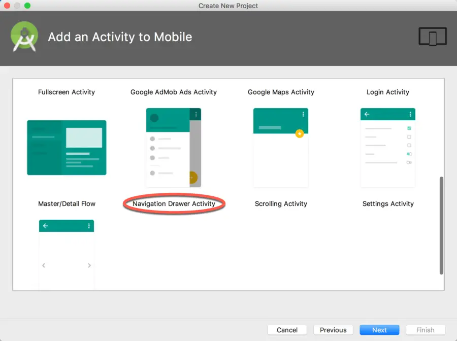
While it is possible to implement a navigation drawer within any activity, the easiest approach is to select the Navigation Drawer Activity template when creating a new project or adding a new activity to an existing project:
This template creates all of the components and requirements necessary to implement a navigation drawer, requiring only that the default settings be adjusted where necessary.
Create a new project in Android Studio, entering NavDrawerDemo into the Application name field and ebookfrenzy.com as the Company Domain setting before clicking on the Next button.
On the form factors screen, enable the Phone and Tablet option and set the minimum SDK setting to API 14: Android 4.0 (IceCreamSandwich). Continue to proceed through the screens, requesting the creation of a Navigation Drawer Activity named NavDrawerActivity with a corresponding layout file named activity_nav_drawer. Click on the Finish button to initiate the project creation process.
The Template Layout Resource Files
Once the project has been created, it will contain the following XML resource files located under app -> res -> layout in the Project tool window:
- activity_nav_drawer.xml – This is the top level layout resource file. It contains the DrawerLayout container and the NavigationView child. The NavigationView declaration in this file indicates that the layout for the drawer header is contained within the nav_header_nav_drawer.xml file and that the menu options for the drawer are located in the activity_nav_drawer_drawer.xml file. In addition, it includes a reference to the app_bar_nav_drawer.xml file.
- app_bar_nav_drawer.xml – This layout resource file is included by the activity_nav_drawer.xml file and is the standard app bar layout file built within a CoordinatorLayout container as covered in the preceding chapters. As with previous examples this file also contains a directive to include the content file which, in this case, is named content_nav_drawer.xml.
- content_nav_drawer.xml – The standard layout for the content area of the activity layout. This layout consists of a ConstraintLayout container and a “Hello World!” TextView.
- nav_header_nav_drawer.xml – Referenced by the NavigationView element in the activity_nav_drawer.xml file this is a placeholder header layout for the drawer.
The Header Coloring Resource File
In addition to the layout resource files, the side_nav_bar.xml file located under app -> drawable may be modified to change the colors applied to the drawer header. By default, this file declares a rectangular color gradient transitioning horizontally from dark to light green.
The Template Menu Resource File
The menu options presented within the navigation drawer can be found in the activity_nav_drawer_drawer.xml file located under app -> res -> menu in the project tool window. By default, the menu consists of a range of text based titles with accompanying icons (the files for which are all located in the drawable folder). For more details on menu resource files, refer to the chapter entitled “Creating and Managing Overflow Menus on Android”.
The Template Code
The onCreate() method located in the NavDrawerActivity.kt file performs much of the initialization work required for the navigation drawer:
val toggle = ActionBarDrawerToggle(
    this, drawer_layout, toolbar, R.string.navigation_drawer_open,
                                    R.string.navigation_drawer_close)

drawer_layout.addDrawerListener(toggle)
toggle.syncState()

nav_view.setNavigationItemSelectedListener(this)
The code obtains a reference to the DrawerLayout object and then creates an ActionBarDrawerToggle object, initializing it with a reference to the current activity, the DrawerLayout object, the toolbar contained within the app bar and two strings describing the drawer opening and closing actions for accessibility purposes. The ActionBarDrawerToggle object is then assigned as the listener for the drawer and synchronized.
The code then obtains a reference to the NavigationView instance before declaring the current activity as the listener for any item selections made within the navigation drawer.
Since the current activity is now declared as the drawer listener, the onNavigationItemSelected() method is also implemented in the NavDrawerActivity.kt file. The implementation of this method in the activity matches that outlined earlier in this chapter.
Finally, an additional method named onBackPressed() has been added to the activity by Android Studio. This method is added to handle situations whereby the activity has a “back” button to return to a previous activity screen. The code in this method ensures that the drawer is closed before the app switches back to the previous activity screen:
override fun onBackPressed() {
    if (drawer_layout.isDrawerOpen(GravityCompat.START)) {
        drawer_layout.closeDrawer(GravityCompat.START)
    } else {
        super.onBackPressed()
    }
}
Running the App
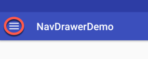
Compile and run the project and note the appearance of the drawer indicator as highlighted in Figure 47-3:
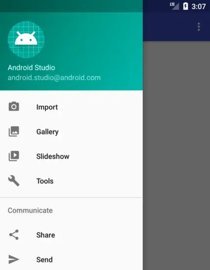
Tap the indicator and note that the icon rotates as the navigation drawer appears:
Summary
The navigation drawer is a panel that extends from the left-hand edge of an activity screen when an indicator is selected by the user. The drawer contains menu options available for selection and serves as a useful application navigation tool that conforms to the material design guidelines. Although it is possible to add a navigation drawer to any activity, the quickest technique is to use the Android Studio Navigation Drawer Activity template and then customize it for specific requirements. This chapter has outlined the components that make up a navigation drawer and highlighted how these are implemented within the template.


