Difference between revisions of "Building an Example watchOS 2 WatchKit App"
m (Text replacement - "<htmlet>ezoicbottom</htmlet>" to "") |
m (Text replacement - "<hr> <table border=" to "<htmlet>ezoicbottom</htmlet> <hr> <table border=") |
||
| Line 224: | Line 224: | ||
| + | <htmlet>ezoicbottom</htmlet> | ||
<hr> | <hr> | ||
<table border="0" cellspacing="0"> | <table border="0" cellspacing="0"> | ||
Revision as of 18:13, 11 May 2016
| Previous | Table of Contents | Next |
| watchOS 2 Apps – An Overview | An Overview of the watchOS 2 App Architecture |
| Purchase the full edition of this watchOS 2 App Development Essentials book in eBook ($12.99) or Print ($27.99) format watchOS 2 App Development Essentials Print and eBook (ePub/PDF/Kindle) editions contain 35 chapters. |
Having outlined the basic architecture for a WatchKit app in the previous chapter, it is now time to start putting some of this knowledge to practical use through the creation of a simple example app.
The project created in this chapter will work through the creation of a basic WatchKit app that does nothing more than display a message and an image on an Apple Watch display.
Creating the WatchKit App Project
Start Xcode and, on the Welcome screen, select the Create a new Xcode project option. On the template screen choose the Application option located under watchOS in the left hand panel and select iOS App with WatchKit App. Click Next, set the product name to WatchKitSample, enter your organization name and identifier and make sure that the Devices menu is set to Universal so that the user interface will be suitable for deployment on all iPhone and iPad screen sizes. Before clicking Next, change the Language menu to Swift and turn off the Include Notification Scene option. On the final screen, choose a file system location in which to store the project files and click on the Create button to proceed to the main Xcode project window.
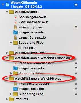
A review of the project files within the Project Navigator panel will reveal that, in addition to the iOS app target, new folders have been added for the WatchKit Extension and the WatchKit App (Figure 3-1) each of which contains the files that will need to be modified to implement the appearance and behavior of the WatchKit app:
Figure 3-1
Designing the iOS App User Interface
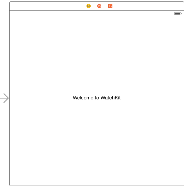
The next step in the project is to design the user interface for the iOS app. This layout is contained within the Main.storyboard file and is listed in the Project Navigator panel on the left hand side of the main Xcode window. Locate and click on this file to load it into the Interface Builder environment. Once loaded, locate the Label view object in the Object Library panel and drag and drop it onto the storyboard scene. Double-click on the label and change the text so that it reads “Welcome to WatchKit” before positioning it so that it is centered in the layout canvas as illustrated in Figure 3-2:
Figure 3-2
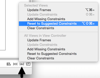
Select the new label in the layout canvas and display the Resolve Auto Layout Issues menu by clicking on the button in the lower right hand corner of the Interface Builder panel as indicated in Figure 3-3:
Figure 3-3
From the resulting menu, select the Reset to Suggested Constraints option. This will set up recommended layout constraints so that the label remains centered both horizontally and vertically within the screen regardless of whether the application is running on an iPhone or iPad display.
The user interface for the iOS application is now complete. Verify this by running the application on an iPhone device or iOS Simulator session before continuing.
Designing the WatchKit App Storyboard
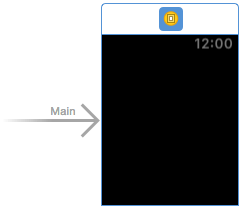
The next step in the project is to design the user interface for the WatchKit app. This is contained within the Interface.storyboard file located under the WatchKitSample WatchKit App folder within the Project Navigator. Locate and select this file to load it into the Interface Builder tool where the scene will appear as illustrated in Figure 3-4:
Figure 3-4
Designing the user interface for a WatchKit app involves dragging objects from the Object Library panel onto the layout canvas. When user interface objects are added to the layout canvas they are stacked vertically. These elements are then positioned at runtime by WatchKit based on the available display space combined with any sizing and positioning attributes declared during the storyboard design phase.
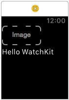
For the purposes of this example, the user interface will be required to display an image and a label. Locate the Image object in the Object Library panel and drag and drop it onto the scene layout. Repeat this step to position a Label object immediately beneath the Image object. Double click on the newly added Label object and change the text so that it reads “Hello WatchKit” such that the layout matches that of Figure 3-5:
Figure 3-5
Before testing the app, some additional attributes need to be set on the objects in the user interface. The first step is to configure the Image object to display an image. Before this can be configured, however, the image file needs to be added to the project. The image file is named [email protected] and can be found in the sample_images folder of the sample code archive which can be downloaded from the following URL:
http://www.ebookfrenzy.com/code/watchOS2BookSamples.zip
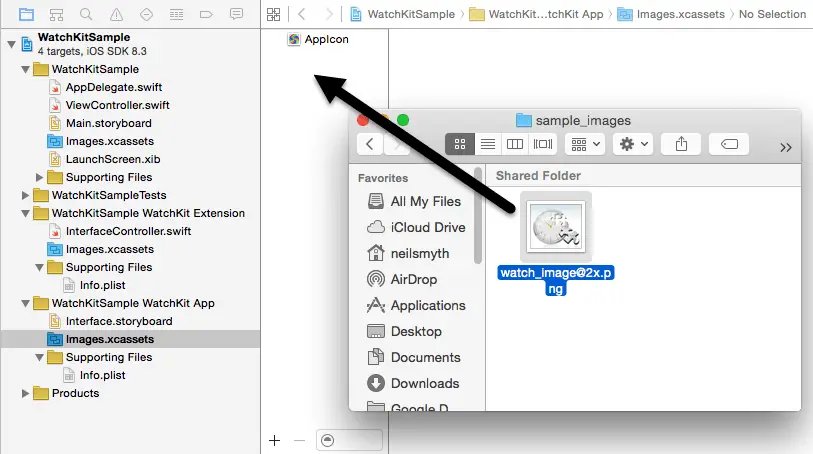
Within the Project Navigator panel, select the Assets.xcassets entry listed under WatchKitSample WatchKit App so that the asset catalog loads into the main panel. Locate the [email protected] image file in a Finder window and drag and drop it onto the left hand panel in the asset catalog as illustrated in Figure 3-6:
Figure 3-6
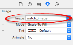
With the image file added to the project, the Image object needs to be configured to display the image when the app runs. Select the Image object in the storyboard scene and display the Attributes Inspector in the utilities panel (View -> Utilities -> Show Attributes Inspector). Within the inspector panel, use the drop down menu for the Image attribute to select the watch_image option:
Figure 3-7
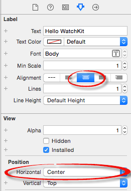
Finally, select the Label object in the scene and use the Attribute Inspector panel to change the Alignment attribute so that the text is centered within the label. Having set this attribute, a review of the scene will show that the text is still positioned on the left of the layout. The reason for this is that the text has been centered within the label but the Label object itself is still positioned on the left side of the display. To correct this, locate the Alignment section in the Attributes Inspector panel and change the Horizontal attribute from Left to Center. Figure 3-8 shows the Attributes Inspector panel with these attributes set:
Figure 3-8
Running the WatchKit App
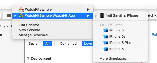
All that remains is to run the WatchKit app and make sure that it appears as expected. For the purposes of this example this will be performed using the simulator environment. In order to test the WatchKit app, the run target may need to be changed in the Xcode toolbar. Select the current scheme in the toolbar and use the drop down menu (Figure 3-9) to select the WatchKitSample WatchKit App -> iPhone 6 + Apple Watch – 38mm option:
Figure 3-9
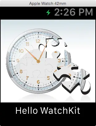
With the WatchKit app selected, click on the run button. Once the simulator has loaded, two windows should appear, one representing the iPhone 6 device and the other the Apple Watch device. After a short delay, the WatchKit app should appear on the watch simulator display as illustrated in Figure 3-10:
Figure 3-10
Running the App on a Physical Apple Watch Device
In order to test the app on a physical Apple Watch device, connect an iPhone with which an Apple Watch is paired to the development system and select it as the target device within the Xcode toolbar panel (Figure 3-11).
Figure 3-11
With WatchKitSample WatchKit App still selected as the run target, click on the run button and wait for the app icon to appear on the Apple Watch home screen and for the app to launch.
| Purchase the full edition of this watchOS 2 App Development Essentials book in eBook ($12.99) or Print ($27.99) format watchOS 2 App Development Essentials Print and eBook (ePub/PDF/Kindle) editions contain 35 chapters. |
Setting the Scene Title and Key Color
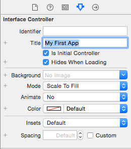
The area at the top of the Apple Watch display containing the current time is the status bar and the area to the left of the time is available to display a title string. To set this property, click on the scene within the storyboard so that it highlights in blue, display the Attributes Inspector panel and enter a title for the scene into the Title field:
Figure 3-12
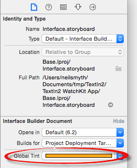
The foreground color of all of the scene titles in a WatchKit app may be configured by setting the global tint attribute for the storyboard file. To set this property, select the Interface.storyboard file in the Project Navigator panel and display the File Inspector panel (View -> Utilities -> Show File Inspector). Within the File Inspector panel change the color setting for the Global Tint attribute (Figure 3-13) to a different color.
Figure 3-13
Next time the app runs, all of the titles in the scenes that make up the storyboard will be rendered using the selected foreground color.
The global tint color is also adopted by the app name when it is displayed in the short look notification panel, a topic area that will be covered in detail in the chapter entitled An Overview of Notifications in watchOS 2.
Adding App Icons to the Project
Every WatchKit app must have associated with it an icon. This icon represents the app on the Apple Watch Home screen and identifies the app in notifications and within the iPhone-based Apple Watch app. A variety of icon sizes may need to be created depending on where the icon is displayed and the size of Apple Watch on which the app is running. The various icon size requirements are as outlined in Table 3-1:
| Icon | 38mm Watch | 42mm Watch |
|---|---|---|
| Home Screen | 80 x 80 pixels | 80 x 80 pixels |
| Long Look Notification | 80 x 80 pixels | 88 x 88 pixels |
| Short Look Notification | 172 x 172 pixels | 196 x 196 pixels |
| Notification Center | 48 x 48 pixels | 55 x 55 pixels |
Table 3-1
In addition to the icons in Table 3-1, icons are also required for the Apple Watch app on the paired iPhone device. Two versions of the icon are required for this purpose so that the icon can be represented on both iPhone (@2x) and iPhone Plus (@3x) size models:
| Icon | iPhone @2x | iPhone Plus @3x |
|---|---|---|
| Apple Watch App | 58 x 58 pixels | 87 x 87 pixels |
Table 3-2
Since the app created in this chapter does not make use of notifications, only Home Screen and Apple Watch app icons need to be added to the project. The topic of notification icons will be addressed in greater detail in the chapter entitled A watchOS 2 WatchKit Notification Tutorial.
The home screen icon needs to be circular and 80x80 pixels in size with a 24-bit color depth. The image must be in PNG format with a file name ending with “@2x”, for example [email protected].
Icons are stored in the asset catalog of the WatchKit app target. Access the image set in the asset catalog by selecting the Assets.xcassets file listed under the WatchKitSample WatchKit App folder in the project navigator panel. Within the asset catalog panel (Figure 3-14), select the AppIcon image set:
Figure 3-14
To add icons, locate them in a Finder window and drag and drop them onto the corresponding location within the image set. For the purposes of this example, app icons can be found in the app_icons folder of the sample code download.
Once the icons have been located, drag and drop the icon file named [email protected] onto the Apple Watch Home Screen (All) image location within the image asset catalog as shown in Figure 3-15:
Figure 3-15
The two Apple Watch app icons are named [email protected] and [email protected] and should be placed in the Apple Watch Companion Settings 2x and 3x image locations respectively. Once these icons have been added the three icon categories in the AppIcon image set should resemble Figure 3-16:
Figure 3-16
When the sample WatchKit app is now compiled and run on either a Watch simulator or a physical Apple Watch device the app will be represented on the device Home Screen by the provided icon (the home screen can be displayed on the Simulator by selecting the Hardware -> Home menu option).
Summary
This chapter has worked through the steps involved in creating a simple WatchKit app and running it within the simulator environment. A WatchKit app is added as a target to an existing iOS app project. When a WatchKit target is added, Xcode creates an initial storyboard for the WatchKit app user interface and the basic code for the WatchKit Extension template. The user interface for the WatchKit app is designed in the storyboard file by selecting and positioning UI objects in the Interface Builder environment and setting attributes where necessary to configure the appearance and position of the visual elements. In order to test run a WatchKit app, the appropriate run target must first be selected from the Xcode toolbar.
Before a WatchKit app can be published, app icons must be added to the image asset catalog of the WatchKit App target. These icons must meet strict requirements in terms of size and format, details of which have also been covered in this chapter.
| Purchase the full edition of this watchOS 2 App Development Essentials book in eBook ($12.99) or Print ($27.99) format watchOS 2 App Development Essentials Print and eBook (ePub/PDF/Kindle) editions contain 35 chapters. |
| Previous | Table of Contents | Next |
| watchOS 2 Apps – An Overview | An Overview of the watchOS 2 App Architecture |
